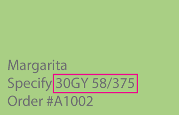
I thought we’d review what we’ve got so far with overtones before we talk about the back-end of the notation. If you look at Margarita below, it’s the 58/375 part that we’ll be discussing in future blog posts.

REVIEW:
- Overtone is a color bias toward one side or another. Clockwise or counterclockwise on a color system’s color wheel.
- The two-digit number at the beginning of The Master Palette notation tells you how far OVER -literally- the color leans towards a neighboring hue parent – can also call this hue bias.
- The Master Palette system quantifies overtone on a scale of 99 to 00.
- A color notation takes away the factor of subjectivity and all the risk of relying solely on how an individual sees color – maybe color acuity is excellent or maybe it’s not.
NEW NOTES:
- A color notation has nothing to do with color formulas – how the colors are made or mixed. In a previous post, I explained that a notation is like a bio for each color. Read the bio and you know the color.
- Every color system has its own custom color wheel and unique set of hue families. Color wheels are really just infographics. Infographics for lots of things not just mixing colors or depicting color relationships. Take The Master Palette color wheel for example. Its function is a map of the system’s hue families. Combined with the 99 to 00 range that literally quantifies overtones, it gives you direction about all of the colors in the collection.
- Overtone, top tone and hue bias are all the same thing. Essentially the corollary to undertone. For every yin, there has to be a yang. The laws of natural dualities.
I made examples for each of the eight hue families in The Master Palette so you can get a feel for how ridiculously easy notations are to use and how über efficient they are for telling you exactly what to expect from each color. You really can do this! Read these other blog posts and add to your color skill set.

What do you think of a white or grayish roof on a white house with black trim. Would this make the house look larger?
What do you think of a white or slightly grayish roof on a white house with black trim? Would this make the house look larger?
Whether a color or color scheme makes a house or room look larger is a matter of individual perception. Limiting lines of contrast is the strategy I use interior and exterior to create an illusion of bigger. If you chop up a room or exterior with a lot of transitions in color, lines of contrast that tends to visually shrink the volume of space. If you do a search, white house/black trim on Pinterest you’ll find a lot of good examples of the color scheme you’re considering.