So. Here we are. Another post about one of my favorite things – Color Order Systems and Notations. I think I might be the only one who defines undertones and their applicability differently from everyone else.
My point of view is different because it’s partly informed by. . . yep, you guessed it. . . Color Order Systems and Notations. Also, scientific observations and theories written by old men that have been dead for a really long time.
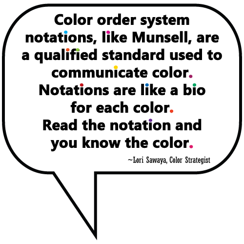
In my last post about Color Order Systems I explained that color notations are like mini bios for colors. Read the bio, and you know the color. Super simple. Says me. And you will too by the end of this post. Promise.

Those who have never heard of color systems invent unique tactics.
Stuff like:
- taking apart fandecks and putting them back together in all sorts of convoluted ways
- collecting wads of tiny paint chips for the sole purpose of nixing most of them
- painting a white border around color samples hoping layers of unseeable color rises to the top
- exhaustively searching for a ‘true neutral’ white or gray chip against which to compare other paint colors
- creating new color infrastructures where magenta is a core neutral color,
I could go on. You can probably think of other examples for this list too.
All to be expected if you think about. What else are people supposed to do?
Without color guidance intervention at the very beginning of their color journey, they’re left to their own devices.
And when people are left to their own devices, they’ll fill in the blanks best they can. They work with what they’ve got so color makes sense to them.
It’s an effort to shift color from something that is confusing to something that is manageable. I totally understand how and why this happens and can empathize, can’t you?
As hard as they work at temporary tactics they could expend the same amount of effort – nay, they could expend far less – to learn about color systems and processes already in place.
Systems and processes that provide objective information that can help them choose the right colors. It’s just most people don’t know they exist.
Don’t know how that happened but I can help with that.
 Right now I’m going to tell you about such a system.
It’s called The Master Palette. You can easily find it at your local Home Depot as well as Glidden, ICI/Dulux, and Akzo Nobel retail destinations.
In close proximity to every Home Depot paint counter where they mix paint, you used to find one of these bolted to an end cap.

It was the “big book” of The Master Palette colors and notations and it has been discontinued.
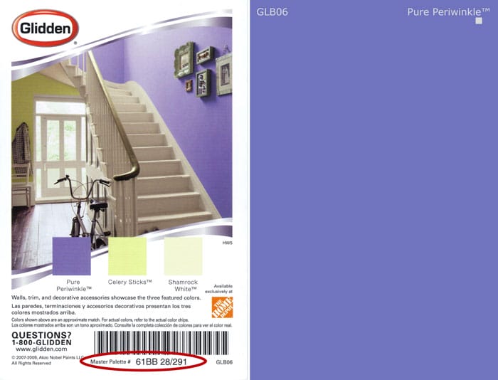
Luckily, color notations for The Master Palette are also on the back of every Glidden paint chip (left side below) in the display rack as well as on every chip in the fandeck.

Notations look like this, for example, 61YY 89/040. That’s the notation for the first white square below. You’ll find the notation on the second line. The first line is the color name. The last line is a reference number, it’s not part of the notation.

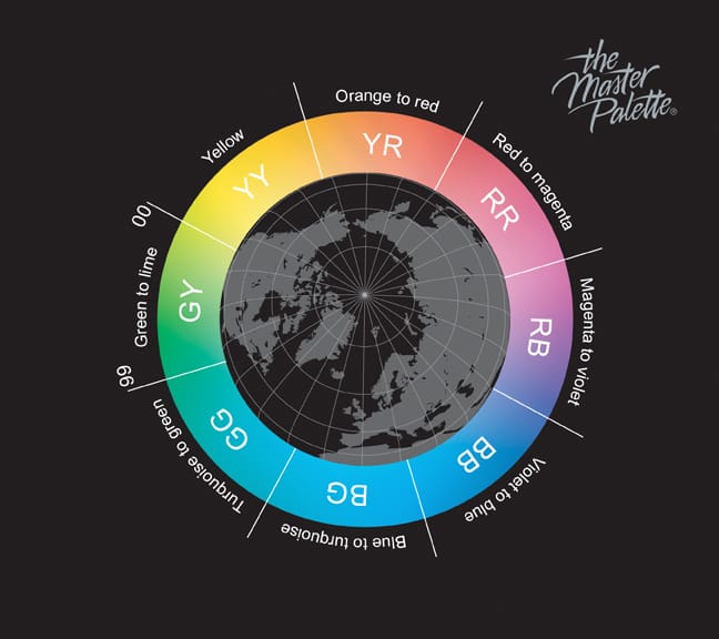
Below is The Master Palette color wheel and it shows the hue families that hold this system together. You can see that each hue family has a two-letter designation.
Now, take another look at the color notations above. Remember notations are on the second line. Do you see the two-letter hue family designation in the notation? How easy is that?

Those two letters erase all the mystery – you don’t have to guess, or compare, or rely on somebody else to figure it out for you.
The notation tells you straight-up what characteristics to expect from each color. There’s nothing hidden under anything, nothing to watch out for, or be afraid of. It’s all spelled out in the notation.
What does that mean -precisely- you ask? How can you apply this to how you think about color you ask? I, my compeer color freaks, have those answers. Let’s take that first row of white paint colors and use it as an example.

These are off-whites. The way we speak to these colors here at The Land of Color is they are all tints of white from the eight hue families that comprise The Master Palette Color System.
They aren’t whites with different undertones because we’re not looking through or under anything. And we’re not guessing about the hue families or debating what tint of color we think we may or may not see. Rather, we know.
We know because the notations tells us so.
Here’s another post that explores the notation further, How to Master Overtones.
I invite you to visit The Land of Color regularly to keep informed about all things color systems. In the mean time, I’d ask that you ruminate the fact that you can find one of the most easy-to-use and compelling color systems at ‘big orange’, The Home Depot.
They have something that some of the most sophisticated paint purveyors do not.
DIYer or pro, you should be asking, “why not?”

Hi Lori,
Just wondering, if I primarily use Benjamin Moore and Sherwin Williams and they don’t provide color notations, how can you use the color notations method then? I know that you have provided a small portion of the notations for BM off whites and Affinity but how about all of their other colors, including the Historical and Classic collections? You say there is a Master Palette book at Home Depot, but it doesn’t have Ben Moore or Sherwin Williams. So what good is that? Thanks for your help.
Hi Cat.
Great question. And, yes, you are correct that the Master Palette big book at the Home Depot will only give you hue family, color notation information about the paint colors in The Master Palette – not any other brands.
I can teach you how to get a color notation for every color in every major paint brand. That’s going to be one of the first modules of our online color consultant training called Camp Chroma.
I’ve devised a method that is super simple. A lot of the tools I use are free or very, very low cost. Most important is consistency. I’ll show you how to get color notations using a consistent method so the notations are not only as accurate as possible, but consistency in method also means you can confidently use notations to compare a color to other colors.
Hang tight – Camp Chroma is very close to launching.
Thanks! Looking forward to it.
I have 5 gallons of a custom beige with gold undertones that I am trying to make into SW Accessible Beige. It was previously mixed to match BM Jute but appeared to green in our home. It has been a disaster and we cannot afford to lose 5 gallons. I had the Jute adjusted by SW and it is very gold now and also darker. Any advise on how to adjust it to lighten the color and adjust the gold to reach Accessible Beige, please? Perhaps adding violet?
Hi Fran,
If you’re looking for options that you can do on your own, I assume you’ve exhausted help from the paint store.
I focus on what the color is when it’s dry so I don’t do any mixing or adjusting of formulas so I’m not the best one to ask. You might want to try adding some untinted base paint. Just know it can take A LOT of white to cut a color it all depends on the colorants in the mix.