Color overtones – a curious topic to explore.
I’ve mentioned before that old dead guys have partly informed and influenced my Color Point of View (CPOV). Old dead guys that left behind theories that are still applicable in today’s color world. A quick word about theory. It would be naïve to write-off all color theory as just a hunch or half-baked methodology. I’m sure I’m not telling you anything you don’t already know when I say that architectural color, color for the built environment, is most human supportive when it’s a balance of art and science. It’s important to me personally to strive for, and share, not only a Color Point of View that’s well defined but also one that’s well informed and balanced.
“In popular usage, a theory is just a vague and fuzzy sort of fact. But to a scientist a theory is a conceptual framework that explains existing facts and predicts new ones.”
And a sound conceptual framework is the magical stardust legitimate color systems are made of.
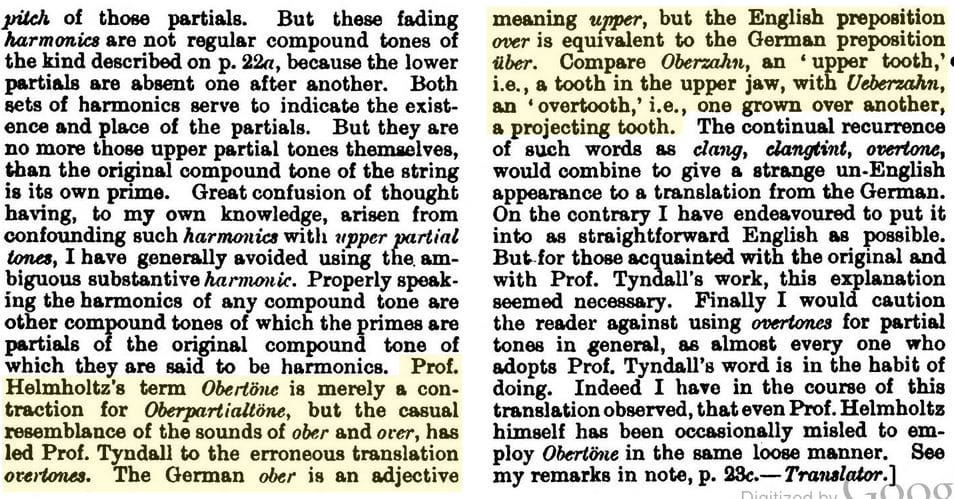
Hermann von Helmholtz (HvH) was a scientist whose theories warrant consideration. To start with, he’s credited with the etymology of the term “overtone”.
 Too cool, right? It gets even better and more interesting when you consider that Helmholtz is also credited with introducing the concept of hue, saturation and brightness. A key color concept still used to this day.

” His famous “Manual of Psychological Optics” appeared between 1856 and 1867, with the English translation appearing 60 years later to world acclaim. Here, Helmholtz introduces the three variables which are still used to characterise a colour: hue, saturation and brightness. He was the first to unequivocally demonstrate that the colours which Newton had seen in his spectrum are different from colours applied to a white base using pigments. The spectral colours shine more intensely and possess greater saturation. They are mixed additively, whereas pigments are mixed subtractively. In each case a different set of rules governs their combination.”3
HvH coined the term overtone AND came up with hue, saturation and brightness – amazing!
Overtone emerged from Helmholtz’s foray into harmonics. Another resource that links harmonics, divine geometry and color together is Michael Todd Sandborn’s “The Origin of Color Theory, Book of Origins – Volume 2” . About 140 pages that include an alternative, complete, corollary point of view about color overtones and undertones. Forewarning, skinny book but not a quick read.
Hermann von Helmholtz is a scientist you should know if you want to further your color knowledge base. The more you learn about him you might even choose to incorporate a little HvH into your CPOV too.
What are the resources you reference that breathes validity and credibility into your Color Point of View? Do you struggle to keep your CPOV balanced, leaning more toward the art part or the science part?

