
What does Pantone’s 2022 Color of the Year, Very Peri, look like?
I’ll tell you all about Very Peri shortly but I have to comment on this photo. It looks like periwinkle monster fur. The reason for choosing it must have been a unique train of thought.
The truth is it’s not easy to convey color online and I like to remind everyone often that you shouldn’t trust content featuring images of paint colors in other people’s homes.
Why not?
The issue is it’s not possible to synchronize everyone’s phones, tablets and computers to display color the same way.
It’s a matter of fact and physics.
That’s what we’re dealing with in every instance of every image of every color online – especially paint colors.
There’s a lot of subjective analysis shared about paint colors and colors of the year because many think how they see color is the same as how everyone else sees it.
If you’ve followed me for any length of time, you know one of my missions is to save people from mining for images and subjective paint color descriptions online and thinking it’s safe to trust what they find.
You shouldn’t.
The color you see online is nothing more than your device’s best effort to make a digital representation of an in real life color.
Then there’s the fact that photos are adjusted before posting. Lightness and colors are tweaked so they look better; you never know how much an image has been manipulated.
Pantone’s Very Peri is extra challenging this year because they created it exclusively for the purpose of Color of the Year. So if you own a Pantone fandeck or swatch book, it’s not in there.
Those who chimed in early with their opinion about what Very Peri looks like couldn’t have seen it. Color commentary based on an online swatch is about as useful as a bucket with a hole in the bottom.
(That’s an observation that I’m pretty sure many would prefer I didn’t point out.)
There are two ways color experts analyze color: visual assessment and color data values and/or hue, value, chroma color notations.
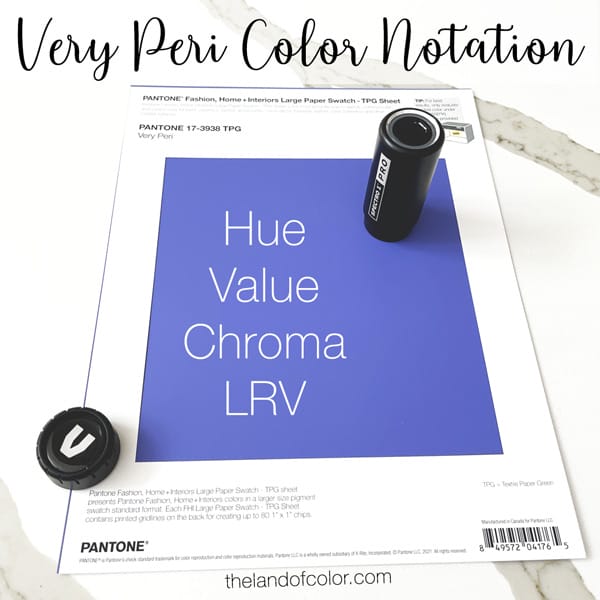
I ordered a chip of Very Peri from Pantone so I could see what it looks like and also measure it with my Spectro 1 Pro spectrophotometer to get the data values and share them with you.
And here they are. I’ll walk you through each attribute.
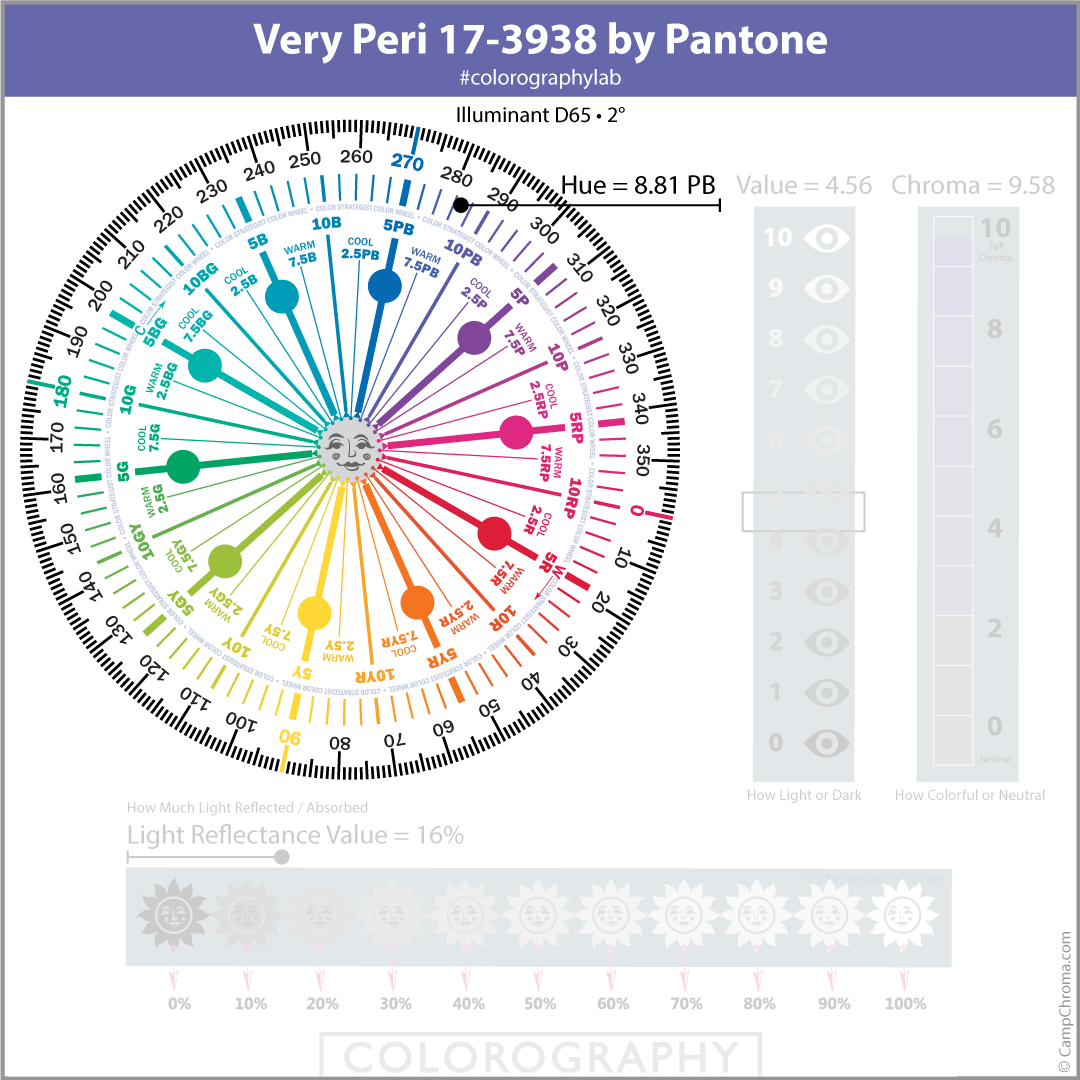
Hue Family is 8.81 Purple-Blue. When we look at Very Peri plotted on The Color Strategist Color Wheel, we can see that it’s at the end of the Purple-Blue hue family over near Purple.
Very Peri could easily be categorized as periwinkle – which explains its name.
The problem with color names is they do a lousy job of accurately describing what colors look like. “Periwinkle” is no exception. What I’ve noticed in comments about Pantone’s Very Peri is people are trying to figure out if it’s more blueish or reddish. Plotting it on The Color Strategist Color Wheel answers that question too; it belongs to the end of the Purple-Blue hue family right on the brink where Purple-Blue meets Purple.
I think it’s slightly more blueish.
But a fair argument could be made that’s it’s neither more blueish nor reddish. Rather, it’s a balance between the two punctuating its inherent perwinkleness.
I contend if the word “periwinkle” is relevant then so is “perwinkelness”.
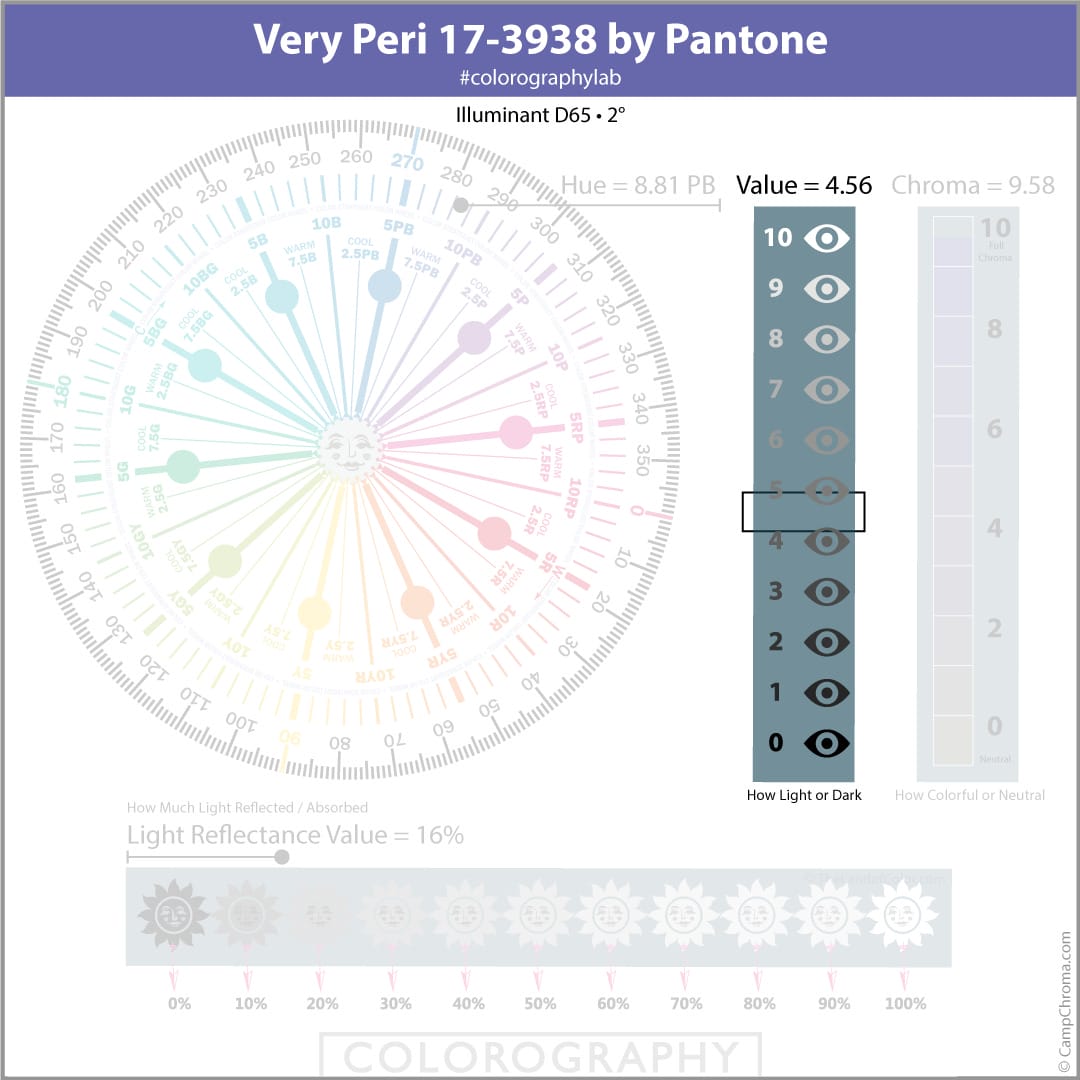
As far as Munsell Value goes, it’s on the darker side with a Value of 4.56. The most practical application of knowing a color’s Value is how it helps you anticipate what kind of mood and atmosphere a color is going to conjure.
For example, Very Peri on all four walls of an average-sized bedroom is going to be dark and it’s going to be dramatic. It could feel dark and dramatically cozy or dark and dramatically heavy. Which way it goes is going to depend on who ya ask.
The Color Strategist Color Wheel also maps out psychological color temperature so you don’t have to figure it out yourself. If you want a deep dive into warm and cool on The CSCW, read this blog post. Briefly, here’s how it works.
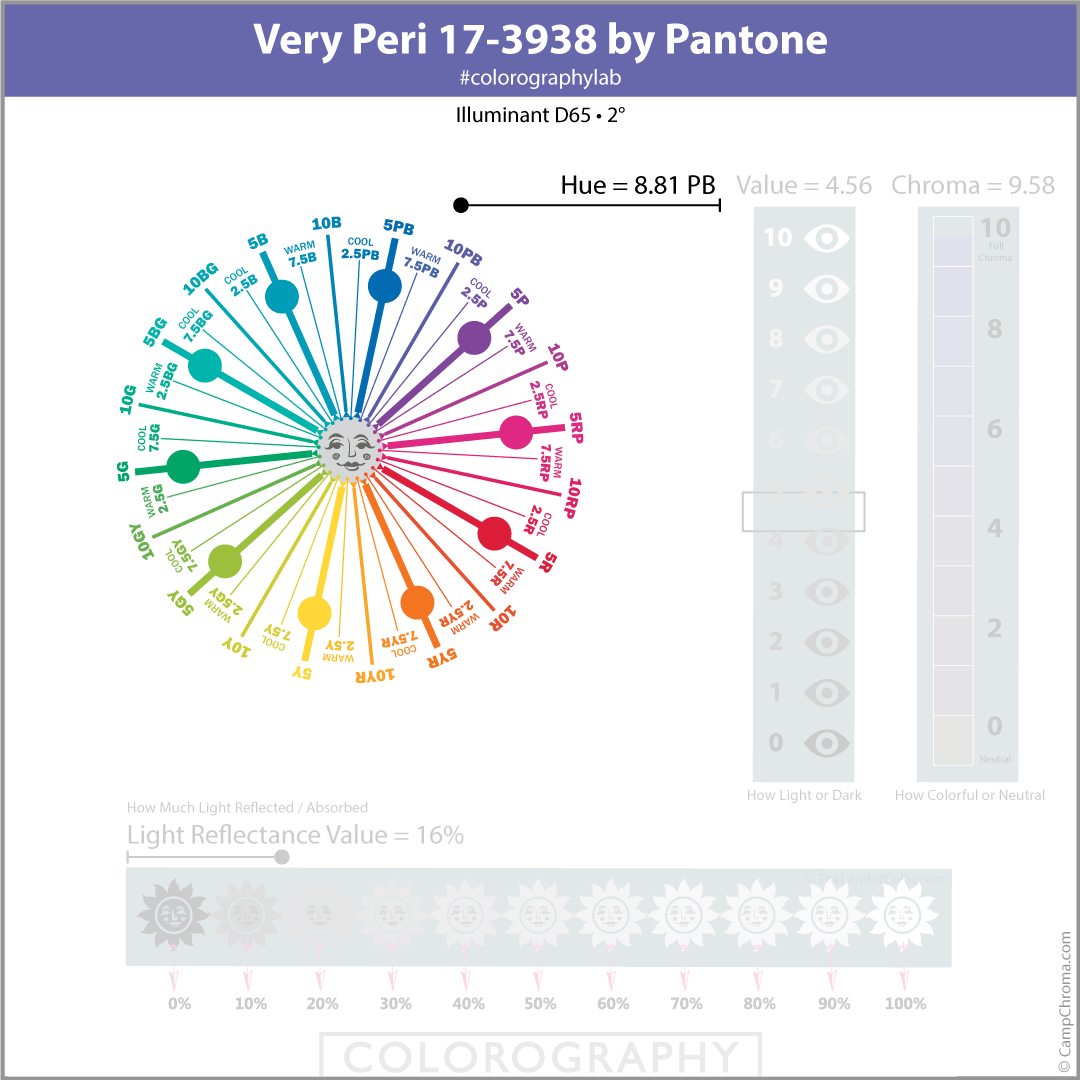
Perceived color temperature is determined by comparing colors – color temperature is not a measurement or piece of color data.
Hue Family, Value, Chroma color notations are fundamentally about comparing colors for the purpose of logically ordering them into an organized three-dimensional framework.
In other words, in order to figure out what hue family a color belongs to and where within that hue family it fits, the color has to be compared to all the other colors in the framework – and there are a BUNCH of other colors.
Which means we can use that function of comparison to anticipate a color’s perceived color temperature with a reasonable degree of accuracy.
Honestly, it’s one of my favorite features of my color wheel.
So, thanks to The Color Strategist Color Wheel we can easily answer the question is Very Peri a warm or cool color.
And it’s an interesting answer.
Because of how Very Peri’s hue family sits so near to the border of a warm Purple-Blue and a cool Purple section on the color wheel, I wouldn’t classify Very Peri as markedly one or the other, warm or cool.
Compared to all the colors in the hue, value, chroma framework of colors, Very Peri has a unique balance of warm and cool. Kinda like it has a unique balance of blueishness and reddishness.
Context is always everything when it comes to all things color but in this case, context is more critical than usual when judging whether Very Peri is perceived as warm or cool.
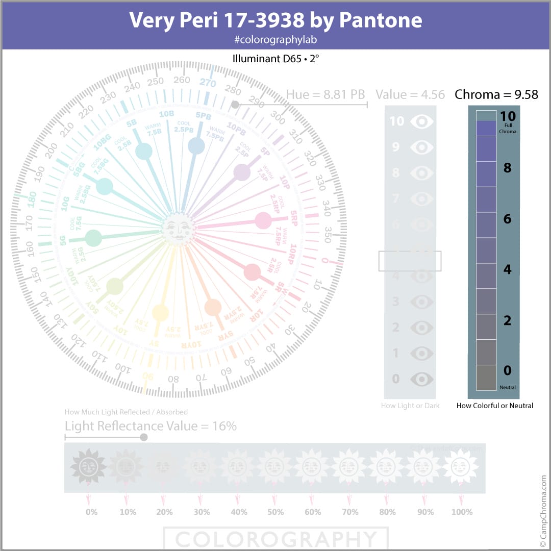
Next is Chroma. Very Peri is very colorful coming in with a Chroma of 9.58 – that’s a healthy bump of chromaticity and you can safely call Very Peri a strong color.
Strong as in not weak.
Not strong as in vivid.
I can get on board with describing Very Peri as a bold color but not vivid because of its low LRV of 16.

Vivid colors – in my opinion – are brighter than an LRV of 16. LRV is a quantity that tells us how much light a color reflects.
That’s all it does.
End of story.
LRV is controversial in color science world with regard to how accurately it quantifies how much light a color reflects.
It’s interesting to know, for example, that while there is an international standard for measuring LRV, respective paint brands are measuring their own colors in their own labs. Which means all things are not necessarily equal if you’re comparing one brand’s LRV numbers to another.
If you analyze the Light Reflectance Values brands have published over the years, you’ll find inconsistent LRV numbers within the same brand for the same colors. Take Chantilly Lace for example. One of my Camp Choma students found a discrepancy between what Benjamin Moore published on its website and two of its fandecks.
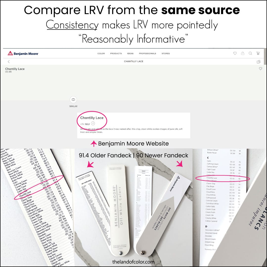
There are strategies to ensure consistency when measuring for LRV and also best practices protocols for using LRV in a color design workflow.
One of those solutions is the LRV Guru app I designed and launched in 2014 to calculate contrast ratios. I partnered with Variable, Inc. when they first launched NODE+ Chroma which evolved into the Color Muse and then the Spectro 1 Pro.
So, I’m certainly not saying LRV is a pointless data point.
Based on my extensive research developing an LRV app and experience applying LRV values, the takeaway here is that LRV is a reasonably informative numeric value that does a decent job quantifying a color’s luminance.
But it absolutely is not the ultimate all-encompassing magical number some people make it out to be. Everyone wants to leverage “color science” – I get it. LRV sounds very color expert-y.
And unlike hue family, value and chroma, LRV is easy to find in fandecks and on the back of some paint chips. But when it comes to all things color science, details matter and “The University of Google” barely scratches the surface of what there is to know about Light Reflectance Values.
Bottom Line – LRV’s one job is to tell you about a color’s reflectance and from there it’s pure inference about how it’s going to interact with available light sources.
LRV indicates if color is going to reflect a greater proportion of light or absorb it.
Doesn’t matter if it’s an abundant, moderate or dim quantity of light, the LRV is the LRV.
It’s unlikely anyone is going to be compelled to paint a room Pantone’s Color of the Year, Very Peri.
Because, for starters, you can’t go buy a Pantone proprietary color from just any paint counter. If you want a Pantone color mixed in a can of architectural paint, it gets complicated.
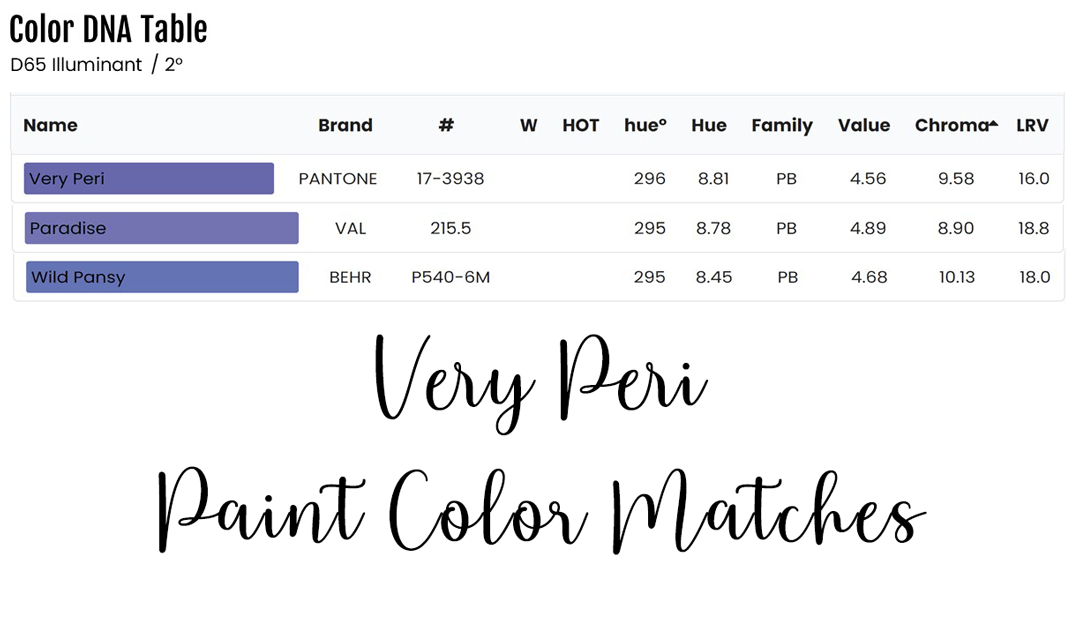
An uncomplicated option is to search existing paint colors for something that’s close to Very Peri. And that’s what I did for you here. There are only two existing stock paint colors that are similar to Very Peri. Wild Pansy P540-6 from BEHR and Paradise 215-5 from Valspar.
I’m sharing the color data profiles from The Color DNA Table so you can compare for yourself.
These two close approximations of Very Peri are bold paint colors. So, I’d say it’s more about a macro inspirational perspective for home design; a spark for softer iterations of Very Peri that are better suited for interior design.
Pantone is a library of colors for graphics (ink) and other product manufacturers.
Not architectural coatings – directly.
Color design experts don’t have an application for Pantone colors unless branding is involved.
Paint brands have in recent years jumped on the color of the year marketing band wagon.
In a way I guess I have too because I have color data info for these 2022 Colors of the Year available in The Color DNA Table: Benjamin Moore’s October Mist, Sherwin-Williams’ Evergreen Fog, Dunn-Edwards’ Art and Craft, Behr’s Breezeway or PPG’s Olive Sprig.
I sense many feel it’s time to move on from the color of the year concept. That it’s a marketing tactic that should be retired.
Personally, I look forward to each announcement because I think it’s fun. It’s fun to see what colors are pulled forward and put in the spotlight for a year.
I know you have opinions about colors of the year. The idea of COTY itself as well as the 2022 announcements. Feel free to share in the comments below.

What an excellent post, Lori! Thank you. As an outspoken COTY crank, I’d also love to see the gimmick disappear.
Thank you, Sandy. I know there are those that agree with you!
Very interesting. But do you happen to have the LAB value of the colour?
Yes. We measured it with a Spectro 1 Pro. D65/2. Lab values show upon the first line of the app’s “Compare” function.
Can do the same with NIX, Color Muse, or ColorReader.