
Alabaster on The Color Strategist Color Wheel
This is what you need to know about choosing wall colors if you have Sherwin-Williams Alabaster SW 7008 on your doors and trim.
We’ll use a color wheel because it illustrates color relationships.
Featured in the image below is a custom color wheel called The Color Strategist Color Wheel that I created; it’s the core of the system I designed for choosing colors.
You can learn how to use The Color Strategist Color Wheel and everything you need to know about how color really works in my Camp Chroma online color training program. Click here to enroll.
As you can see on the color wheel, Alabaster belongs to the yellow hue family – pretty much smack dab in the middle of the yellow hue family.
You can get a Samplize paint sample of Alabaster HERE.
If you partner Alabaster with near neutrals from the same yellow hue family, you have to be super careful about managing the chroma.
Chroma is the amount of perceivable grayness in a color. In other words, chroma is about how vivid/strong or neutral/weak a color looks.
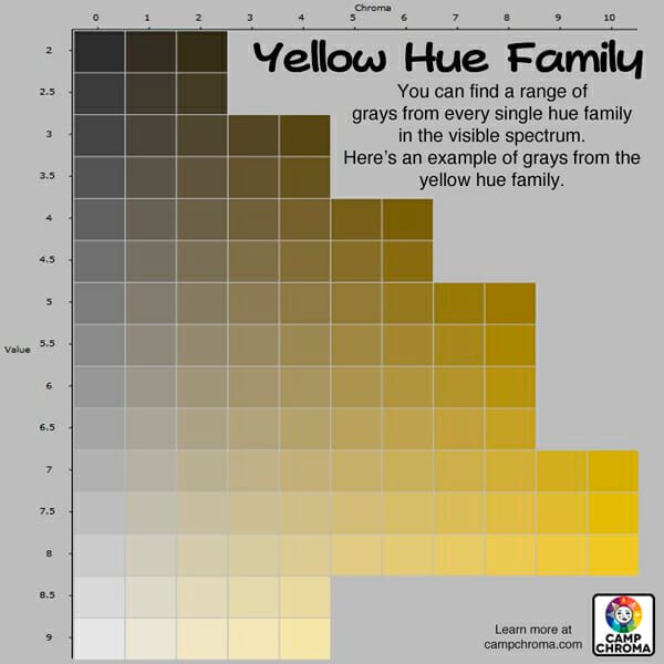
A near neutral wall color from the same yellow hue family neighborhood would have to have a difference in chroma of at least 20 (ish) compared to Alabaster.
Some examples are as follows:

Ethereal Mood SW 7639 by Sherwin Williams has MORE chroma than Alabaster and the difference in chroma is comfortably more than 20. And it’s darker in Value/LRV which also helps Alabaster look crisp and not dingy. Get a Samplize peel and stick sample of Ethereal Mood HERE.
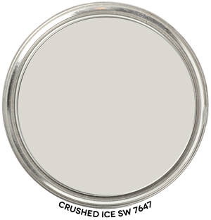
or Crushed Ice SW 7647 from Sherwin-Williams it has LESS chroma than Alabaster. The difference in chroma between these two colors is 19 but it works – that’s what I mean by a difference of 20 (ish). Again, Crushed Ice is darker than Alabaster and that helps too.
Get a Samplize peel and stick sample of Crushed Ice HERE.
That’s how you make Alabaster cabinets, doors and trim look brighter and whiter in comparison to a near neutral wall color from the same hue family neighborhood.
Going back to the color wheel, near neutrals from hue families opposite (ish) yellow will help Alabaster ‘pop’ as cleaner and brighter.
Managing the grayness, choosing colors that are comfortably different in terms of chroma from Alabaster isn’t such a priority using this strategy.
Because contrast of hue will do the hard work to make Alabaster look more crisp in comparison.
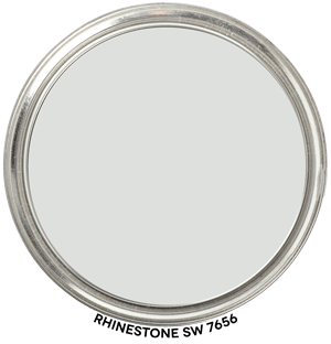
For example, Sherwin-Williams Rhinestone SW 7656. It belongs to the Green Hue Family (G). Want to see Rhinestone in your space? Grab a Samplize sample of Rhinestone HERE.
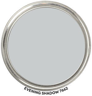
or Evening Shadow SW 7662. It belongs to the Blue Hue Family (B). Click to get a Samplize peel and stick sample of Evening Shadow HERE.
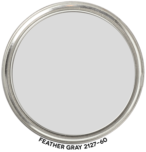
or Ben Moore’s Feather Gray 2127-60. It belongs to the Purple-Blue Hue Family (PB). Get a Samplize sample of Feather Gray HERE.
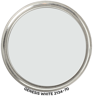
or Genesis White 2134-70 would work too. It belongs to the Blue-Green Hue Family (BG) and you can get a Samplize sample to test it in your space HERE: Genesis White
If you try any of these color combinations, let me know.
Why were you searching for info about Alabaster? Planning to use it on walls, cabinets, trim or everything?

I am installing painted cabinets and can choose a sw color. We are going from honey oak to painted maple and do not want a bright white as I get tons of morning sun in the kitchen. My current wall color is a warm tan ( just can’t remember the name ) in a Glidden paint from years ago. My trim is a marshmallow white . We will need to repaint the walls for sure before the cabs go in. I need a color for walls that works with Alabaster cabinets and a possible green that will be a paint color for a small prep island being installed. My current breakfast table is dark wood top and creamy off white base with same color chairs. Can you point me in direction of some colors? My floors have beige, rust, cream and storm grey colors in a lap that looks like tiles. Thanks so much for input
Have a few rooms with alabaster walls and flat alabaster ceilings. Looking for a good trim/door color to go with, bit struggling to find a white that doesn’t look dirty. Any helpful thoughts? No real loyalty to SW… actually planning on using using Ben Moore Advance for the trim and doors.
The rule of thumb for combing colors of white is there needs to be a difference of 0.20 in Munsell Chroma.
If you subscribe to The Color DNA Table and check the “W” box in the header, the table will only display white paint colors. You can put them in order by Chroma.
Again, you’re looking for a difference in Chroma of 0.20 (ish).
You can also sort the table by brand so you can shop for white paint colors from Benjamin Moore only and put them in order by Chroma so you can see which colors of white will work with Alabaster – as well as the fixed finishes/contents in your space.
The Color DNA Table is the easiest way to shop for the right white paint color: https://thelandofcolor.com/color-dna-table/
Help! I love alabaster trim. I need a cozy warm white or more than while for walls. Northern facing light. Wry warm hardwood floors. Suggestions?
I just bought a color muse and am getting totally different LCH readings for Alabaster. I even followed the settings you recommended. What am I missing?
Probably that I use Munsell Hue/Value/Chroma in Colorographies. Not LCh.
It’s the same information. I just prefer Munsell because it’s so much easier to illustrate.
I’m considering Alabaster for kitchen cabinets in a large, open (to family room) room that is north-facing yet bright due to a wall of windows. If I were to do that, not sure how I would handle the trim. I am concerned that Alabaster trim throughout the entire house would be too yellow in certain areas. I would feel better about White Dove on cabinets AND trim, but my painter does not want to use BM on cabinets. Do you have any trim color recommendations?