What is Chroma in Color?
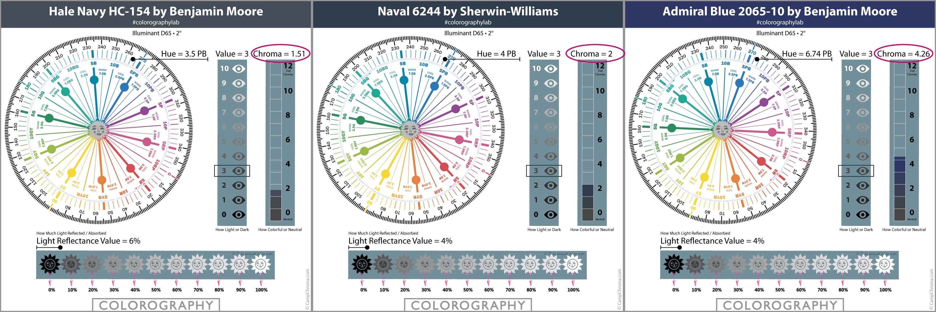
In this case study you will want to focus on two parts of the Colorographies below:
- Hue
- Chroma
When we look at Hue, we can see that all three colors belong to the Purple-Blue (PB) hue family.
When we study their Chroma, we can see that Hale Navy has the lowest Chroma value, 1.51.
Naval has a Chroma of 2.
Admiral Blue has the most Chroma of the three coming in at 4.26.
The Chroma scale draws a picture of Chroma for you so the differences are easy to see at-a-glance and understand quickly.
How Chroma Works with Navy Blue
What the numbers indicate and what the scale illustrates is how strong and colorful these purple-blues are -or- how weak and closer to a true neutral gray they are.
Again referencing the Colorographies, you can see that Hale Navy is the weakest, it’s closer to a true neutral gray of the same intensity.
Admiral is the strongest and most colorful. It’s farther away from 0 true neutral gray.
Naval is in the middle in terms of strong or weak compared to the other two.
Just by glancing at the Chroma number and Chroma scale you can determine if a color is strong, colorful, clean, clear, vivid -or- weak, near neutral, dirty, muddy, or dull.
Ready for another case study? Let’s use a range of whites this time.
How Chroma Works with White

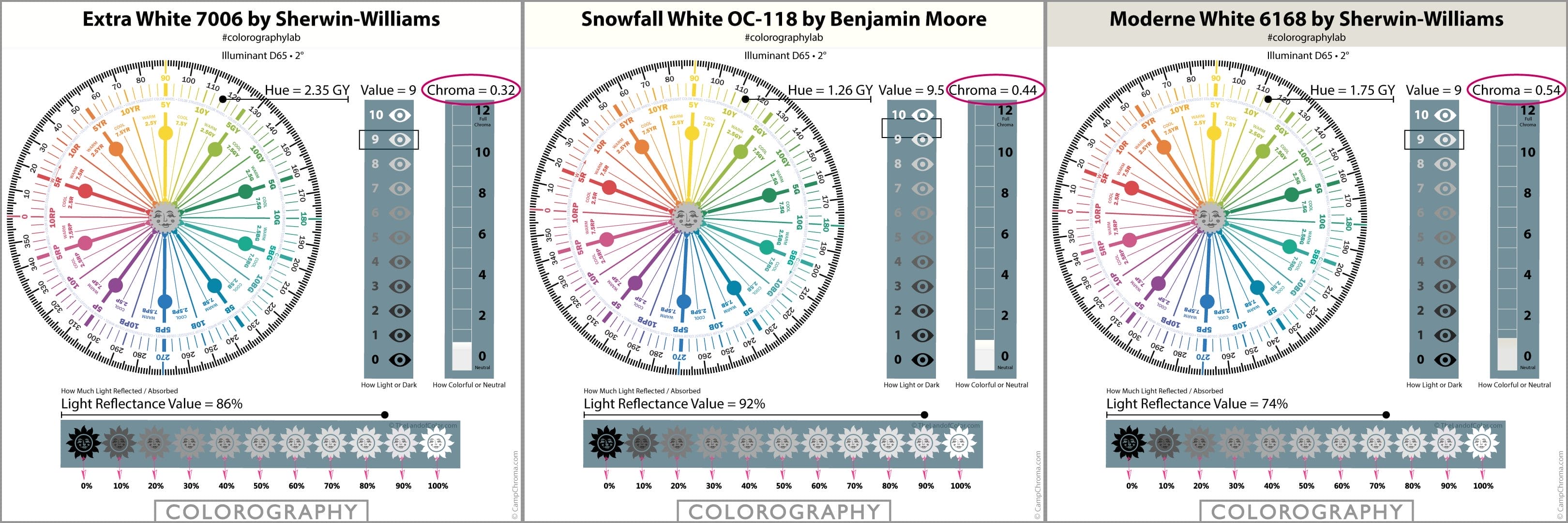
Let’s compare Chroma values for these three colors above.
You can see that small increments in Chromaticity can make a big difference.
All three of these whites belong to the same hue family, they’re organized in the Munsell Color System in the same hue family neighborhood.
They’re similar in Value; except Snowfall White is a lighter, brighter color by just a little bit.
Again, small incremental differences can mean a lot.
Chroma and Paint Colors: The Definitive Guide You Need to Read
Wondering how this applies to specifying paint colors?
Well, there’s a lot you can do with it but let’s talk about one example.
Let’s say we’re looking for a wall color and a white to go with it for the trim, doors, cabinets.
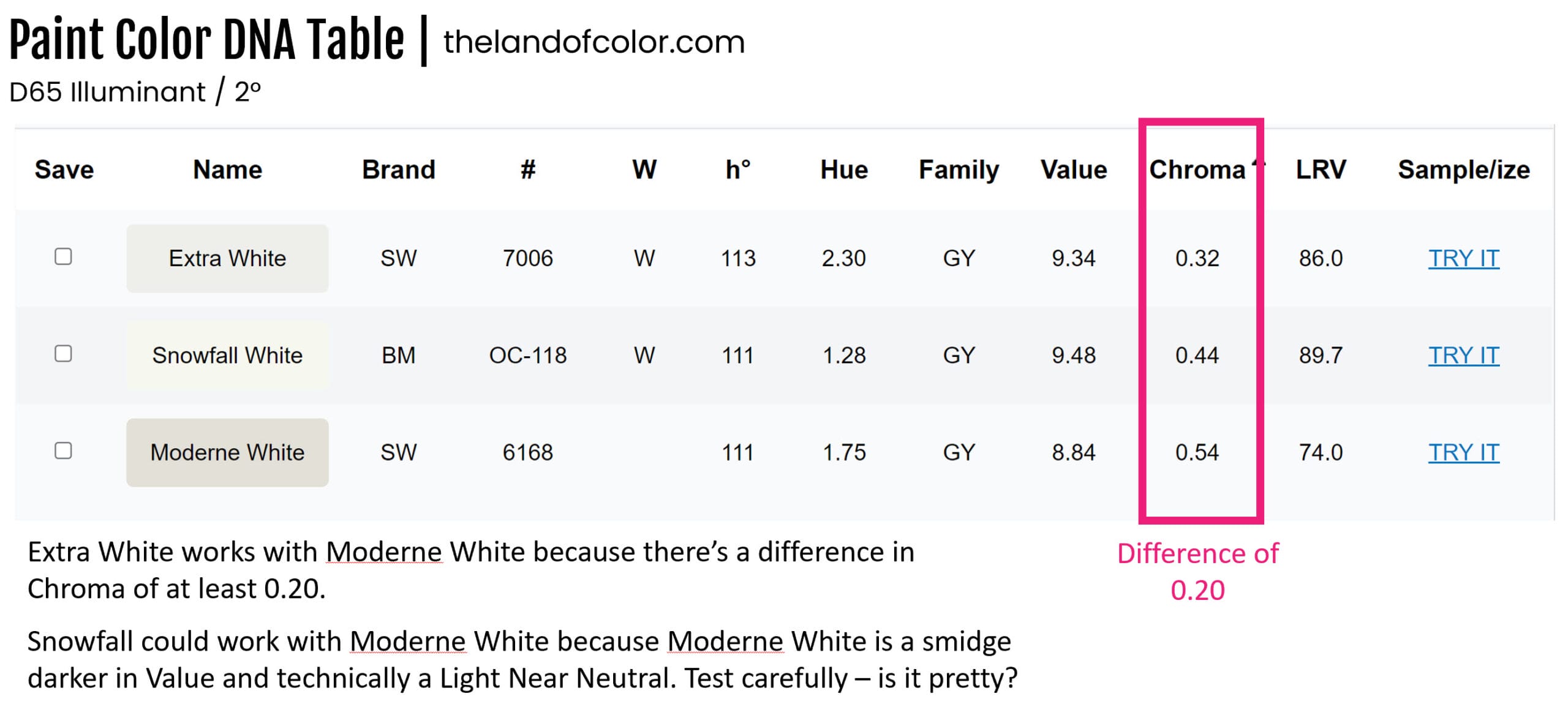
I have a rule-of-thumb for Chroma. I like to see a difference of about 0.20 (ish) between white trim color and the wall color.

Let me explain.
If you want the white trim color to look white, bright, crisp and clean, then you always want your trim color to have LESS Chroma than the wall color – by about 0.20 (ish).
Or we can look at it the other way.
Your wall color needs to have MORE Chroma than the trim.
If you follow that rule of thumb, then your white trim color won’t end up looking dirty or dingy next to the wall color.
Have you figured out why it works that way?
It’s because the trim color with LESS Chroma is closer to a true neutral white than the wall color.
The wall color has more Chroma (or colorfulness) and the white trim color is literally more neutral; which means it’s going to look crisper and cleaner.
So in the case of these three colors, Extra White is a better choice to get a crisper and cleaner white trim contrast with Moderne Gray walls.
Because it meets my 0.20 (ish)Chroma difference rule of thumb.
However, Snowfall *could* also work even though it doesn’t quite meet my 0.20 rule of thumb; it would be worth taking a look at in the space to see what it looks like.
And that’s because even though there is only a difference of 0.10 in Chroma, Moderne White is darker. There is some difference in Chroma, 0.10, and the contrast in Value might be enough to make it work.
So sure, if you’re liking the palette idea of Snowfall White and Moderne White, get samples. If you think it looks pretty in context of your lighting and contents of the room, you’re good to go.
Alternatively, Snowfall White would be a good option for the ceiling if you didn’t want to use Moderne Gray on the ceiling too.
Extra White trim, Moderne Gray walls and a Snowfall ceiling is what I’d recommend first.
Start with Samplize samples of all three colors. Here are the links: Extra White Sample
Snowfall White Sample, Moderne White Sample
WHAT’s the Difference Between LRV and Chroma?
Are you familiar with LRV, Light Reflectance Value? (LRV scales are included in Colorographies too)
If you are, then this Chroma scale that we’re discussing should feel familiar. Let me be clear that LRV and Chroma speak to two completely separate dimensions of color. And I explain in this post about LRV how important it is to not confuse the two.
The similarity I’m referring to is just that they can both be illustrated using a scale format.
Just like LRV, Chroma is an attribute of color that we can measure and illustrate on a scale.
Difference is the LRV scale tells you how much light a color reflects and conversely absorbs and the Chroma scale tells you how strong, colorful and clean -or- weak, neutral and muddied a color looks.
It’s that simple, Chroma tells you how strong and colorful -or- weak and muddied a color will look.
- You don’t have to shuffle samples or chips to see which color is stronger/clean or weaker/dirty.
- You don’t have to guess or struggle or worry that your “eye for color” isn’t skilled enough.
- You can just reference the Chroma value on the Colorography.
Want to know the best part?
As you get more experience working with Chroma values, you organically develop more skill recognizing Chroma differences.
It becomes a reflex.
Consider it on-the-job training for your eyeballs.
Pretty freaking cool isn’t it!?
Where to Find Chroma for Paint Colors?
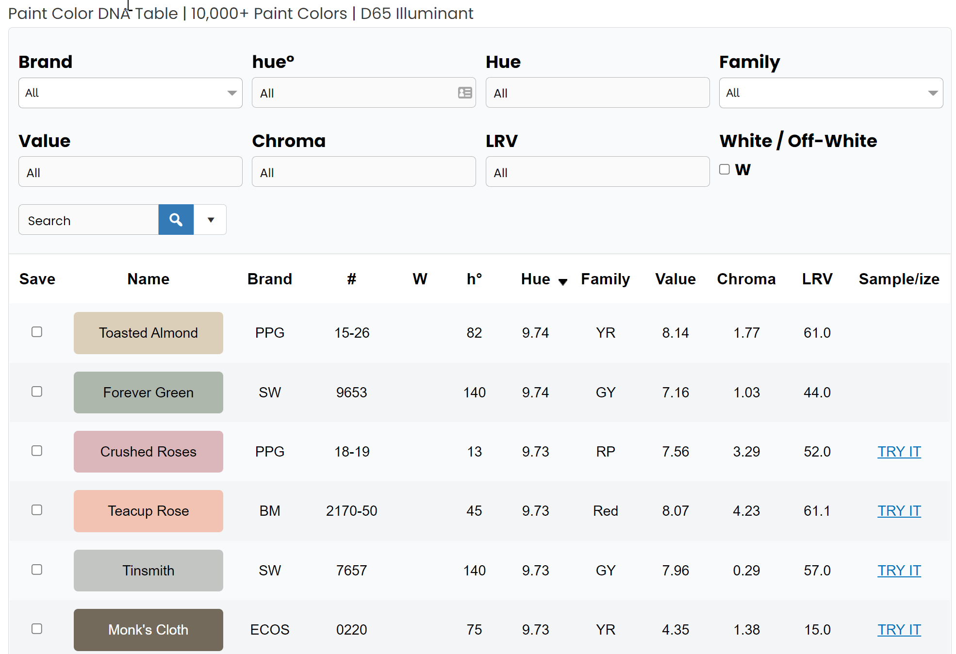
Because understanding Chroma for paint colors is so powerful, I made it easy to find in The Paint Color DNA Table.

It has Chroma values for all major brands including brands that are typically hard to find any information about like Farrow & Ball and Magnolia Home.
It’s the very best color tool you can find.
It’s the best because you can use the filters at the top of the table to search, sort and save paint colors by Chroma — as well as hue angle, hue family, value and LRV.
Paint manufacturers do not provide hue, value, chroma notations for their paint colors. The Land of Color is the only resource for this information and this kind of color tool.
That’s one of the reasons I also created The Colorography Lab. You can find Chroma values for the most popular colors from all major brands in the Colorographies posted there too. Click to check it out.
Beware of other websites like encycolorpedia and myperfectcolor. Because the color data values they publish have issues; namely they’re using the incorrect color space.
If you want to learn more about the science side of color from someone you can trust, sign up or my Four Pillars of Color course.
Knowing which color space or model to use to get successful color design results every time is just one of many valuable nuggets of color knowledge you’ll learn.


Thank you so much for all this great, interesting info! 🙂
Really helpful! Thanks!
You’re welcome, Lois. Thanks for taking time to leave such a nice comment.
What is the difference in chroma is more like 1.12? Would this indicate that the colors should not be used together?
In order for colors to relate, harmonize, go together (however you want to say it), there has to be a thread of relationship. In this example we’re talking about Chroma.
The rule of thumb is colors with the same OR similar Chroma go together.
The Chroma Value doesn’t need to be EXACTLY the same. So there could be that pitch of harmony with a difference of 1.12.
The numeric notations are an incredible framework that describes what colors look like and it also inspires ideas for color schemes; like colors with the same or similar Chroma go together.
What are you me thoughts on Chroma differences for a neutral wall, as it relates to hard surfaces like tile? Do they need to have very similar chroma values if they’re in the same color family? Or is it OK to tone the wall way down with a significantly lower chroma?
Hi Angela,
Great question. Color harmony hinges on color relationships.
If the wall color relates to the tile in terms of hue family – you have a thread of color relationship established. You’re good.
If you want to tweak that pitch of harmony a notch deeper, you can align Chroma too.
Because colors from the same hue family go together and colors with the same or similar Chroma go together.
Think of hue, value and chroma as a framework of individual channels that you can use to manage color.
As long as ONE of those channels align, there is a color relationship.
BUT you do not have to align more than one attribute if you don’t want to.
Here’s a video for you on my Instagram: https://www.instagram.com/tv/Cb7RjNRoU1m/?utm_source=ig_web_copy_link