This is what they’re saying about the new Farrow & Ball paint color showroom, “Working in three dimensions seemed like a step in the right direction.”
Yes, it is in the right direction.
Displaying paint colors on three-dimensional forms in a paint color showroom is smartly innovative.
Why?
Because we see color in three dimensions – it’s how our vision system works.
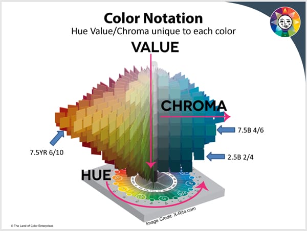
Which means the very best way to categorize color is according to its three dimensions: hue, value and chroma.
In recent decades, the only innovations in architectural coatings have been in terms of paint and chemistry.
Zero innovation when it comes to color and the experience of finding the right colors.
Zero.
But this new showroom makes me think there’s reason to be hopeful.
Could displaying color on three-dimensional forms be the best way to expose people to the knowledge that color is multi-dimensional and elastic in appearance?
I think so.
Giving people a three-dimensional paint color shopping experience is the perfect introduction to the fact that THE most useful way to categorize color is also three-dimensional.
Again, because that’s how our vision system works.
Albert Munsell figured it out for us over 100 years ago and no one has come up with anything better – nothing else comes close to his amazing color system!

The best way to define, describe and communicate color is to put it in order it by Hue, Value and Chroma.
Hue, Value and Chroma all together is called a color notation.
Hue family is indicated with two letters like the YR you see in the image above. After the Hue, 7.5YR, is 6/10 which is Value/Chroma.
It’s a simple system to learn. For example, this blog post about Chroma.
I teach you critical fundamentals about color notations and how color works in The Four Pillars of Color.
The color education every design professional should have.
Because using color notations is the fastest way to streamline – and improve – your color workflow.
Almost immediately after starting my trainings, you’ll save time because shuffling through a volume of paint chips becomes unnecessary. Improvement #1 of many.
You can breathe a sigh of relief when you learn that you no longer have to tediously compare one color to another guessing about attributes.
If you’ve ever thought to yourself “there must be a better way”, you were right. There is.
The result you get from taking The Four Pillars of Color course is you will confidently complete color design work faster, more accurately, and ultimately be able to serve more clients.
You’ll have more time to make more money and you’ll be more confident in the colors you specify while you do it.
So, hooray! for Farrow & Ball’s new paint color showroom.
Definitely a step in the right direction, don’t you think?

I like this display. I am working with a muted color for my walls and stronger colors for visual accents and art. I have worked diligently to get the right color to blend in shade to not be too blue or green. This would be so helpful.