This is a look many are reaching for right now.
Lessons have been learned with bright, neutral whites. Now the color design challenge is how to round off the sharp, visual edges created by super neutral white-on-white installations.
In Kitchens in particular homeowners are wanting warmer whites and wood; I’ve mentioned the white & wood mix many times on my Facebook page.
The shift has been raging forward for almost a year now. Wood beams, vent hoods, and a mix of stained cabinets.
The most desperate (IMO) gesture to find some relief from all the white-on-white surfaces are wood accessories like vignettes of giant cutting boards – anything of over sized proportion in an effort to bring in some balance.
Totally understandable.
If homeowners don’t want to add in warmer whites, then the question they have for me is how can we skew the balance, the proportion so it’s more natural-looking, organic in feel stained wood and less in-your-face-bright-white.
Important to note, they don’t want ALL stained wood. They just want some balance. If you think it’s just interiors, it’s not.
The white and wood mix is very much about exteriors too – and it’s a color story that continues to pick up momentum.
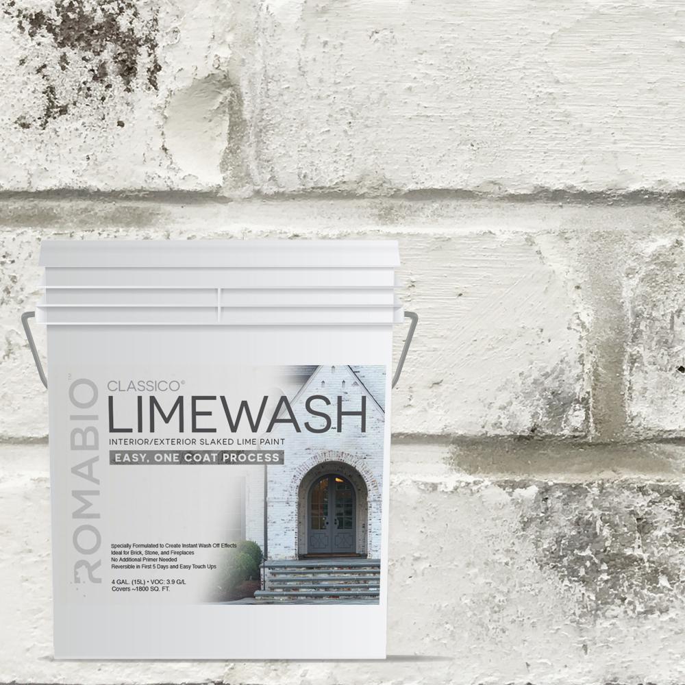
Painting brick white using a product like Romabio BioDomus is the solution many homeowners have been looking for to give their brick exteriors new life. For example, this is a rendering I did for a client in August 2017 – about a year and a half ago.
The Romabio BioDomus color I recommend is Avorio because it’s very similar in appearance to Benjamin Moore’s White Dove OC-17. I think RomaBio is a fabulous solution for changing the color of unfortunate brick – which is why you’re seeing this affiliate link on my blog!
Painting brick is always controversial. I’ve recommended Romabio a bunch of times to homeowners on the Garden Web and there’s usually someone who chimes in with a plea to not paint the brick.
My design advice will always be if the brick is an unfortunate color – or a mix of unfortunate colors – then paint it. It makes no sense for a homeowner to live with brick that isn’t pretty. Life is too short. Especially when there are really good solutions to change it, like Romabio.
If your brick is pretty, like a classic red brick, then there are other things we can do to make it feel fresh.

You can purposefully create a palette of bright white and creamier off-whites to update a white-on-white look. Success is just a matter of choosing the right warm white to go with the bright, clean white. The idea may seem overwhelming but I can find the right warmer white for you if you don’t want to try to tackle it on your own. My “Which White is Right” package is where you want to start.
These days if a homeowner has a choice between a main palette based on bright white or off-white, it’s more off-white. Think Benjamin Moore’s Simply White instead of Chantilly Lace. With a barely there whisper of a warm, creamier near neutral on the walls.
Deciding which creamier near neutral should go on the walls depends on the floor, other fixed elements and the contents of the room. Again, something I can help with if you need it.
More detail and textures are also part of the cure to an overuse of white. Like the subtle details on these cabinets from Medallion Cabinetry.
In the midst of the bright white and grays frenzy, what I learned from Frank Mahnke at the International Association of Color Consultants (IACC) seminars really never stopped rolling around in my head.
White-on-white, white with gray is severe. It comes with a price that’s paid in visual ergonomics. It wears on people’s sensibilities. When they’re done with that color experience, it’s like a switch or a spider landing on their arm – they just want it off as fast as possible.
The recent blizzard of white and how people have responded to it reminds us that it’s important to consider individual tolerance for color first and foremost and pay less attention to trends.
Just because white-on-white works for a specific color tolerance and design aesthetic doesn’t mean it’s a good fit for everyone.
Psychological affects of color matters.
I’m so grateful I completed the IACC seminar series with Frank. What I learned there definitely helped shape my color point of view about human supportive color for the built environment.
Color inspiration from The Cabinet Corner, Inc. on Facebook.


