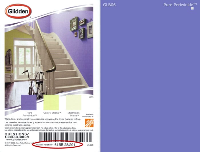
As promised in this blog post about The Master Palette Color System, I’m going to start breaking down the numbers in its notation. I left off talking about the double letter part of the notation that tells you all about a color’s hue family.

Before the double letters is a two-digit number and it will be between the range of 99 and 00. This two-digit number is giving you direction about the color’s overtone.

We need to take a huge detour and discuss how to master overtones. Up to this point, I have been talking a lot about undertone. How I define undertone and where it belongs in the hierarchy of color structure. You are about to learn why it is so important I make sure you understand where undertones fit in my Color Point of View. It’s a corollary kind of thing. Corollary means “a proposition that follows directly from the proof of another proposition.” (dictionary.com)
In other words, if I’m going to passionately tell you what undertones are and how they fit into my Color Point of View, then I need to be able to tell you with equal conviction about overtones. Otherwise, it’s a half-baked Color Point of View. Alternatively, could describe it as a Yin and Yang thing, two complementary principles, can’t have Yin without Yang and vice versa. This pattern occurs often with regard to all things color. Examples:
- Saturated and Unsaturated
- Chromatic and Achromatic
- Light and Dark
You can probably think of a few more.
A definition of color overtone is even rarer to find than one for undertone. If after the other blog post you suspected I was a color freak had a unique way to explain how color works, what follows should clear up any doubts.
Both overtone and undertone are physical aspects of color. In addition, both are used as a figure of speech to describe a color sensation or experience. Figure of speech or could call it experiential.
When you grasp the concept that you can use the terms overtone and undertone two different ways, physical or experiential, you start to understand why there’s confusion surrounding the terms.
An example of the physical is an artist squirts a blob of gouache paint from the tube and thinly spreads it across a white canvas revealing a tangible undertone. The undertone can then be manipulated and leveraged in the work by the artist. Physical.
An example of a figure of speech is how I describe the terracotta roof tiles on my house. At certain angles, the tiles have a dusty white overtone like an old faded basketball. In reality, the tiles aren’t at all dusty or white but that’s how they look – they remind me of an old basketball. I’m telling you they look dusty white in an attempt to impart how I’m experiencing the color of the tiles. So, even though you can’t see the tiles, I’m giving you information to form an idea of what they look like. Experiential.
Bet you never in a million imagined a tube of gouache paint and an old basketball would help you better understand the two faces of the color terms overtone and undertone.
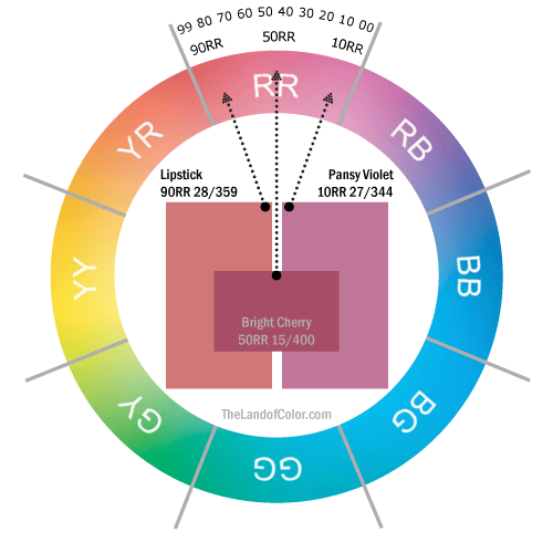
The part overtone plays in The Master Palette, and color systems in general, is physical. The two-digit number at the beginning of the notation tells you how far OVER -literally- the color leans towards a neighboring hue parent – another name for this is hue bias. Let’s look at an example. Remember the range is 99 to 00.

The color Lipstick has an overtone of orange (YR on the wheel). Pansy Violet has an overtone of purple (RB on the wheel). Less magenta or truer, more primary reds than Bright Cherry can be found right around the 99RR mark, migrating past the gray line on over into the YR Hue Family neighborhood.
The notation takes away the factor of subjectivity and all the risk of relying solely on how an individual sees color – maybe color acuity is excellent or maybe it’s not. With notations, varying degrees of color acuity and/or savvy are mitigated because you don’t have to look and then make your best guess. Instead, you know that Lipstick leans more yellow than the purple-ier Pansy Violet because you can simply read it in the notation.
You really can do this! Read these other blog posts and add to your color skill set.
