Have you ever wondered why paint colors look so different once you get them home?
Or maybe it was siding, tile, or carpeting samples that seemed to shift color so dramatically that you were convinced you must have picked up the wrong sample and brought it home by mistake.

Many may reach for the term metamerism (me ‘ta merizm) to explain. Which is close but not exactly on the money.
Metamerism is often defined as a phenomenon that occurs when one color changes in appearance when viewed under different light sources… and that’s not correct.
When ONE color changes in appearance when viewed under different light sources, it’s simply a matter of change the light and you change how color appears. It’s called inconstancy.
Some colors are naturally more inconstant than others. That’s just the nature of color.
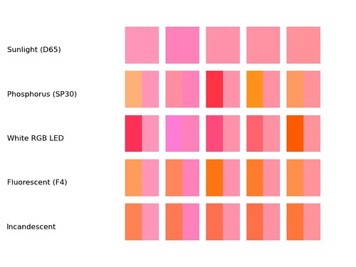
Metamerism correctly defined is a phenomenon that occurs between a PAIR of samples, not just one color.
Two color samples when compared appear to match under one light source but they don’t match under a different light source. For example, the pair matches in the showroom’s fluorescent lighting or but do not match under the LEDs in your kitchen.
This is an infographic from one of the Lessons in my online color course.
It’s not metamerism unless you’re comparing a PAIR of color samples.
Here’s a great case study of metamerism; this is a question I got a while ago from a reader.
“I thought I had the ‘undertones’ matched up with my carpet and paint color but when the paint went up on the wall, the color completely changed. We checked to see if the color was mixed right and it was. Why does it look like the colors blended and matched when I compared the color samples but it looks like a different color on the wall?”
There’s a lot to correct and unpack there in terms of “undertones” but THE question to ask is where were they working and matching up the colors?
Remember, the light is boss and if you change the light, you will change how the colors appear.
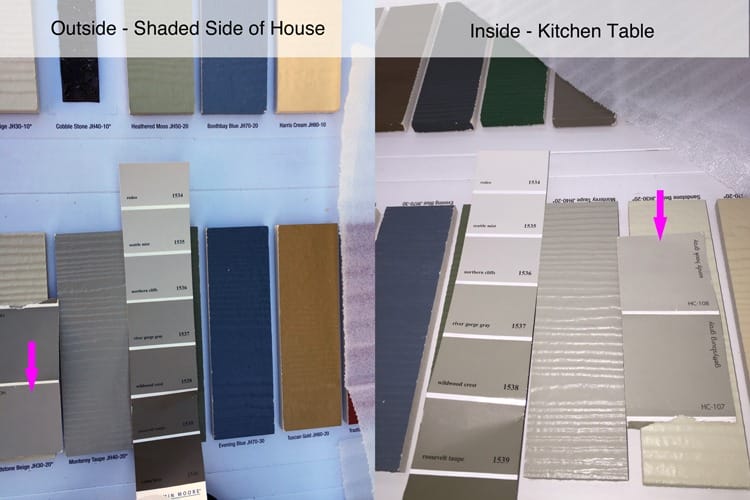
This is another case study and I’m posting these photos knowing it’s ridiculous to try to compare color digitally.
However, there’s a chance you might at least get a sense of how the siding sample and paint chip of Sandy Hook Gray change in appearance under the two different light sources.
Sandy Hook Gray HC-108 looks like the perfect color to go with the siding when compared inside on the kitchen island. But when the samples are moved outside and propped up in a vertical orientation, Sandy Hook Gray shifts and looks more red-purple, especially when compared to the siding that it seemed to match so well indoors.
So, what happened to that static, definitively assigned “green undertone” this homeowner thought she was going to get with Sandy Hook Gray?
Good question.
Color appearance is elastic, not static.
That’s why it’s imperative you have a system, a framework for defining, describing and organizing color that is also elastic.
To figure out what happened, we need to peel into the measured, scientific attributes of Sandy Hook Gray.
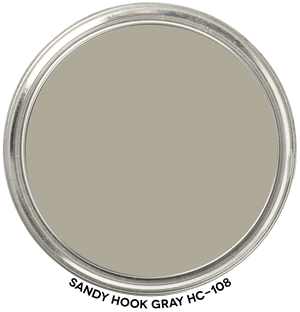
Sandy Hook Gray belongs to the Yellow hue family, it’s at the beginning of the (Y) yellow hue family, right near the end of the yellow-red (YR) hue family.
Hue Family is determined by measuring the color using an illuminant called D65. It is an international standard that is objective and repeatable.
More about D65 in a minute.
Near neutral paint colors like Sandy Hook Gray commonly shift and look purple in certain qualities of light – no surprise here.
No surprise because we know Sandy Hook Gray’s hue family and because hue family is determined objectively using a consistent light source, the hue family provides a consistent, reliable framework to study and analyze color.
It’s because of that organized framework that we can observe and note how colors from this Hue Family neighborhood render in different lighting conditions.
Just because Sandy Hook Gray had a purplish appearance in this case doesn’t mean -absolutely- that it has static, “purple undertones”.
Sandy Hook Gray is not definitely purple.
Same as Sandy Hook Gray does not in fact have green undertones.
What happened is under a dramatically unbalanced quality of light, like the shady north side of this house, Sandy Hook Gray appeared purplish, plum-brown and no longer matched the siding.
That’s really all there is to the story.
The solution is choose a near neutral from a different Hue Family.
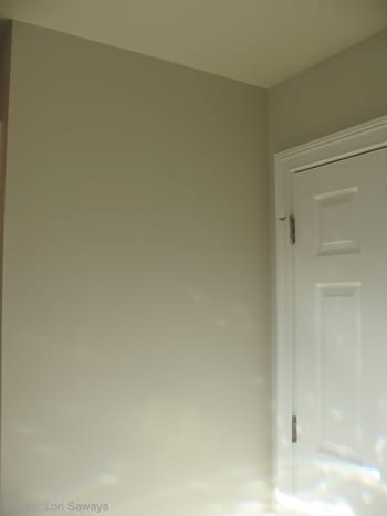
Fact is, some colors are more inconstant than others and it has to do with how the color itself is made.
You need to understand that just because the colors appear to match under one light source, that’s no guarantee they’re going to match in another.
The more unbalanced the inherent light, the greater odds of metamerism.
By unbalanced i mean the light source shines more wavelengths from one or two areas of the visible spectrum.
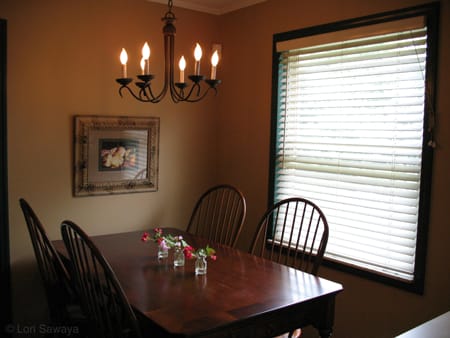
It might shine more wavelengths from the yellow and red areas, for example. Your typical light bulb, called tungsten or incandescent, is like that; it looks so warm and cozy because it beams a lot of yellow and red wavelengths.

Many types of fluorescent fixtures shine more wavelengths from the green and blue areas of the visible spectrum and that is what makes a room look kind of cold and institutional.
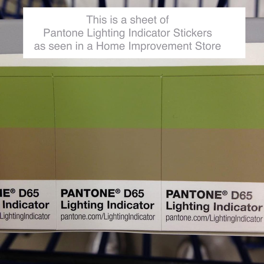
That’s what one of my color expert colleagues experienced when she was shopping at a home improvement store. Of course, being a color expert she happened to have a sheet of Pantone Lighting Indicator stickers with her.
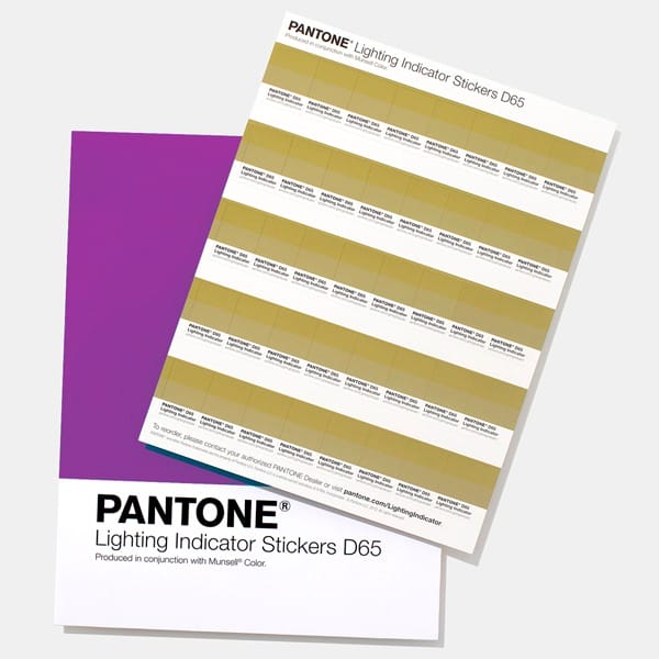
These stickers are handy for lots of things. Actually, they’re a great example of using tools based on color science and applying it to everyday color decisions. Or as I like to call it, “practical application of extraordinary color expertise”.
How these stickers work is very easy. Remember I said we’d talk more about D65?
You can choose D50 or D65 stickers.
D50 is good for graphics and printing. D65 is great for textiles, paint colors, architectural color design in general.
Here you can see how the illuminants differ.
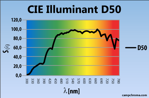
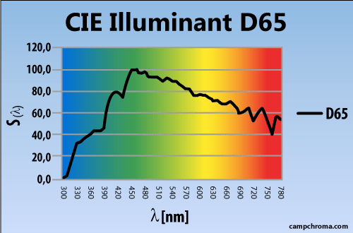
Yep, they’re called illuminants. D65 and D50.
Illuminant is a color science way of categorizing the appearance of different light sources and labeling them so you know what wavelengths in the visible spectrum they will produce.
Here’s the crazy thing, D65 and D50 aren’t physical light bulbs.
They’re mathematical lighting scenarios. In other words, average qualities of daylight have been quantified and transformed into numbers. Transforming a quality of light into numbers means we can use equations to help us understand how colors render under different sources of light.
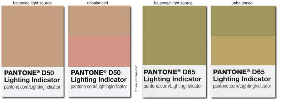
These stickers are a great example of color tools based on science. The D65 stickers were created to respond to a D65 quality of light and same for D50.
If the stickers show two colors, you know the lighting conditions are somehow unbalanced and not ideal for color assessment tasks.
In my experience, there is a range with these stickers.
One extreme is like you see in Karen’s picture – very obvious difference between the upper and lower half of the sticker.
The other extreme is a ‘just noticeable difference’. You can still see the upper color is different from the lower half, but it’s not nearly as extreme as what Karen captured in the Home Improvement store.
The closest I’ve gotten to seeing the sticker all one, even color of green is outside.
Even under the Ott Lite at my desk, I can see a slight difference between the two halves of the sticker.
The range of extremes of how the sticker appears is a scale. It’s useful, at-a-glance information that indicates how dramatically the light source could affect the color(s) you are evaluating.By the way, a D65 quality of light mimics daylight around noontime.
I bet you’re wondering what’s so special about daylight around noontime – why D65?
I know I wondered why the color scientists pinpointed this specific illuminant.
In non-technical terms, D65 is a comfy quality of light that our eyes adjust to easily.
That’s the short answer. Going a little deeper, I can tell you more about how that works:
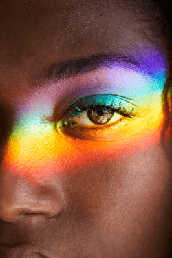
The D65 illuminant is essentially about adaptation. Adaptation is how quickly and easily our eyes adjust to a change in lighting conditions. A movie theater is a good example; you go to an afternoon matinee and come out of a darkened movie theater into the daylight and your eyes have to adapt to the new lighting conditions.
The D65 illuminant simulates a quantity and quality of daylight to which our eyes easily adapts.
It is slightly cooler maybe bluer than direct sunlight whereas direct sunlight looks orange or pale amber.
 Simply put, D65 is a standard illuminant for architectural color assessment because it works well with our vision system.
Now, what if I told you there was a way to know what every paint color out there was intended to look like; what its “true color” looks like under the home-base, control light source, D65?
 #mindblown
Once you know how to get that information, you can use it to navigate to the right paint color choices every single time – and fast. Sounds amazing doesn’t it?
If you’re excited to learn more, click this link. I teach you about hue families, lighting and illuminants, and more in The Four Pillars of Color course.
SUMMARY
- Typically, a single color shifting in appearance is a matter of change the light and you change how the color appears. It’s called inconstancy, not metamerism.
- Metamerism is defined as a phenomenon that occurs between a PAIR of samples, not just one color.
- Organizing color by Hue Family gives you a powerful framework to work from. Whereas undertones, as most people apply the theory to specifying colors, is just somebody’s best guess about what a color looks like under whatever random light source they happen to be looking at it under.
- A Pantone lighting indicator sticker is a tool you can use to get a general read on the lighting conditions. They’re handy stickers that will alert you when you’re in poor, unbalanced lighting conditions for making color decisions.
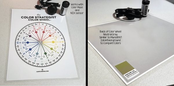
- You can buy the stickers here: https://www.pantone.com/lighting-indicator-stickers-d65 . I also include a Pantone lighting indicator on the back of The Color Strategist Color Wheel. You can buy one here.
If you want to learn how color works, then Camp Chroma is the place for you. Camp Chroma is the best and the only science-based color training program for architectural color design.

You can read what recent graduates had to say about the course here: Camp Chroma Testimonials

Fabulous post! Would love to hear how you’ve corrected such unbalanced lighting conditions. I’ve found that the low-natural-light, fluorescent-lit environments of some newer homes are among the most challenging. It seems like everything looks muddy and washed out in such spaces.
Hi Juli,
I’m a fan of full spectrum paint colors. They come locked and loaded to respond to whatever quality and quantity of light there is to work with. Most of the time, that’s the answer. Whether it’s C2, Ellen Kennon or Benjamin Moore’s Color Stories, there is something in there for everyone and every lighting situation.
You can also play the formula game a little. As you well know, I don’t believe there is any useful information to be had by looking at the list of colorants that went in the can. The ‘laws of substance uncertainty’ guarantee there is no possible way to know what’s going to happen when you mix one or more colorants into a can of base; you have to mix the color, paint a sample, let it dry and then evaluate what happened in the can.
However, I have one exception to my rule about formulas and that is black.
It can be worthwhile to ferret out regular paint colors from regular fandecks that do not have black in the formula. Or, ask the paint store colorists if they *can* mix a custom color for you using alternative colorants instead of black.
As always, you have to be very cautious with custom mixed colors because they are unmeasured. They have no spectral data that indicates LRV and no information about lightfastness and stability for use exterior. You essentially know nothing about how that color will behave and hold up over time.
So, tweak and custom mix colors with extreme caution.