Simultaneous Contrast Discussion
I have to be honest.
I’ve never been impressed by the work or texts by Josef Albers. I realize that’s a super controversial thing to say out loud on a color-focused blog. But hear me out.
The art is pretty and attractive – very.
But his texts lacked substance for me.
So, you put colored squares on top of each other and next to each other and *poof* how the colors are perceived change.
A cool phenomenon for sure but I found the 2-dimensional parameters small-scale and shallow.
Because once you get over the affect of shuffling pieces of colored paper, then what?
Not much.
Wondered if it was me.
Discussing Albers’ interaction of color sounds so very damn artsy and creative and color science-y.
And a lot of folks in the architectural color design space like to talk about Albers, simultaneous contrast, and the interaction of color.
It’s sensationalized in color training courses ad nauseam.
Shoot, even Frank Mahnke talked about it when I completed the IACC-NA seminars in 2005.
But I never could correlate simultaneous contrast, the interaction of colors with color in the built environment.
How did those concepts actually apply?
Practically Applying Simultaneous Contrast
Color in the expanse of the 3-D built environment is different from packaging for a product, an object, a mosaic, or a painting…

… where the visual field of a color palette is trapped within some kind of boundary, like a picture frame.
I never saw the connection. Let me rephrase that – I never saw a rational connection.
Rational like quantifiable dimensions of color like LRV and Chroma.
How to See Simultaneous Contrast
With that said, I absolutely believe it’s worth exploring the concept of simultaneous contrast and how colors change each other, interact with each other.
And it’s cool to do hands-on exercises so you can see it for yourself. Which is why I too include the topic with exercises in my Camp Chroma color training.
But I’m always looking for more information about it.
Color Interaction in the Built Environment
Recently I found two resources that spoke to my misgivings about the importance of simultaneous contrast – again – as it applies to the 3-dimensional built environment.
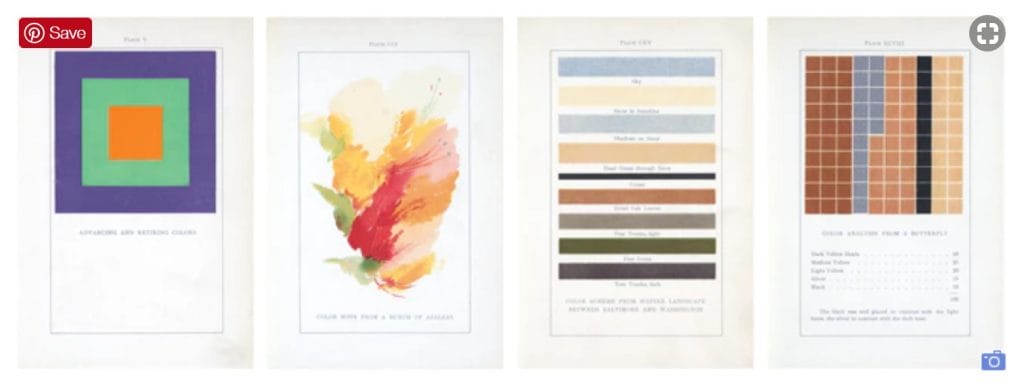
First, a book by Emily Noyes Vanderpoel (1842-1939). She was an artist, collector, scholar, and historian working at the dawn of the 20th century.
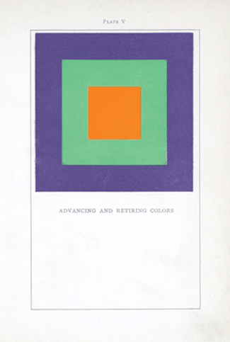
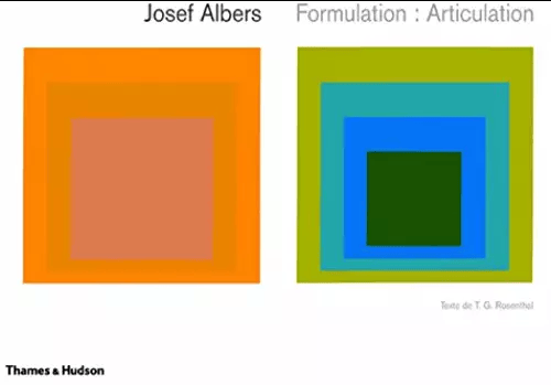
Her book, was first published in 1901. If you do the math, it means that Emily’s square format theories predate Josef Albers’ iconic Homage to the Square by some fifty years.

Yep, you read that right — Her square format predates Josef Albers’ iconic Homage to the Square by some fifty years.
Emily did this:

50 years before Josef Albers did this:

If I didn’t wonder about this before, I do now.
I wonder if the reason I feel Albers’ work lacks depth is because he spun-off the idea from someone else. Namely Emily Noyes Vanderpoel.
That’s what happens when an idea is adopted outside of the originator.
A lot is lost in the translation and it’s just not the same, it never rings as clear or as true.
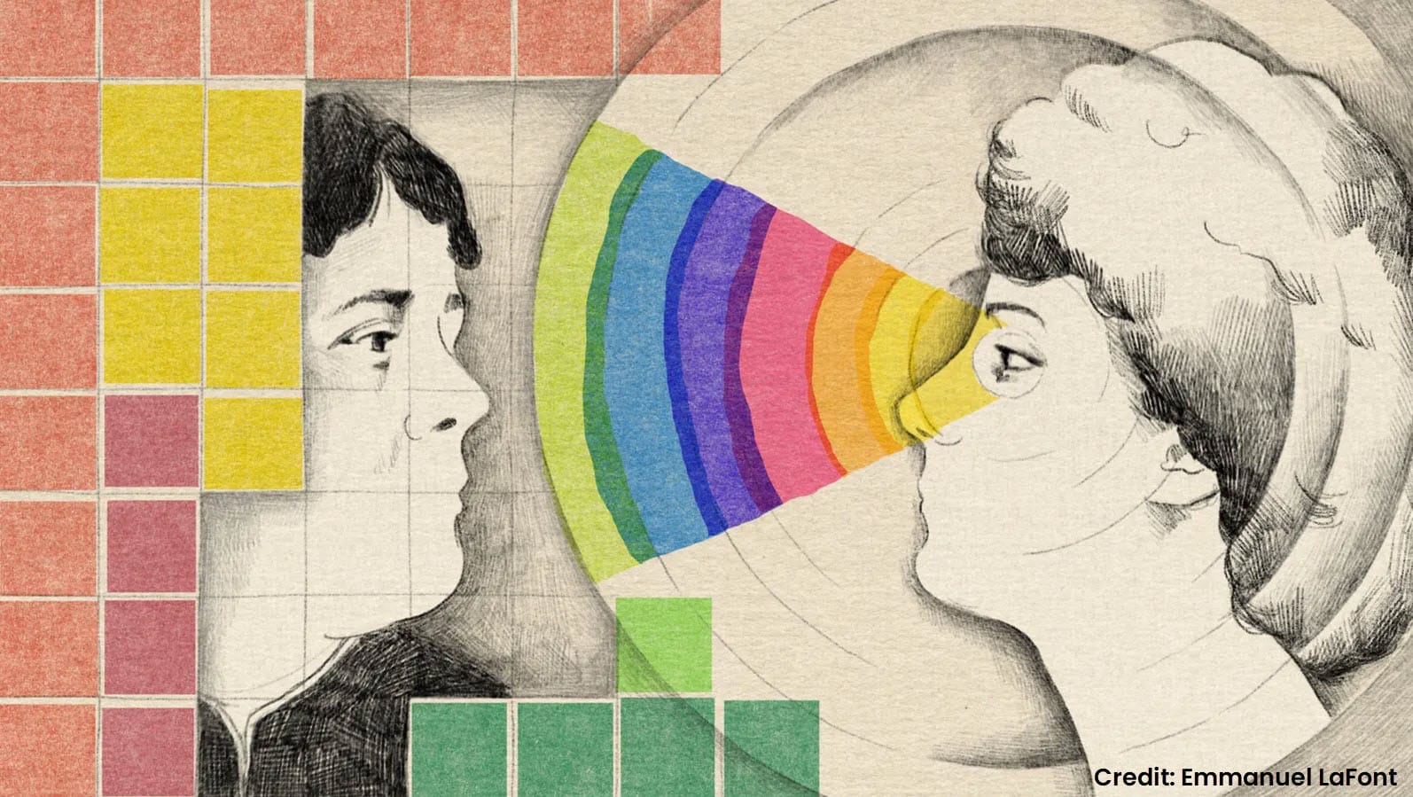
Women Who Redefined Color Are Missing from History
Before we move on to that second resource I mentioned, it’s worth noting that Emily Noyes Vanderpoel isn’t the only woman who has been left out of the reported history of color studies.
Studies that significantly contributed to the present day knowledge base of how we see color and how it works.
In fact, five years before Johann Wolfgang von Goethe’s Theory of Colours, the English artist Mary Gartside published her own challenge to the ideas of Isaac Newton – but, writes Kelly Grovier, she has disappeared from history.

Simultaneous Contrast has Limited Influence
The second resource I want to share is a paper coincidentally co-authored by three women, To Colour the Virtual World – Difficulties in Visualizing Spatial Colour Appearance in Virtual Environments by Beata Stahre, Monica Billger and Karin Fridell Anter.
When I got to page 13 and saw this paragraph, I was like, now THIS makes a lot more sense.
In three dimensions simultaneous contrast has, however, been shown to have limited influence on colour appearance.[22]
Instead, colours in an enclosed space affect each other through interreflection, which makes differently coloured surfaces perpendicular to or opposite each other to appear more similar 22] (Figure 9). In rooms with the same inherent colour on all walls the inter-reflections instead tend to make the colours appear stronger and darker than the corresponding colour samples [29]
This aligns a lot more with the scale, proportion and dimension of the 3-D built environment than what happens when two squares of color are placed on top of or next to each other.
Over romanticizing the art of seeing color, mixing color, creating with color, the psychology of color often gets in the way of practical application of good theories.
Yes, the “art of seeing color” matters.
But so does perspective.

Joseph Albers wrote his color theory book after Michel Eugène Chevreul (1855), which I’m surprised you did not mention. Chevreul’s color theory work originated from textile dying issues, as he was a chemist. I can imagine he was aware of the interplay of light and its effects on different textures, depths, distances, and lighting in an applied world. Albers focused his theory on the 2D surface. The women you mention here more than likely were aware of Chevreuls work and contributed their two cents after, as Albers did.
I do agree with you about women being lost (as always) to time and male dominance in the fields of art and science. I will go a step further and suggest that women of color are particularly sensitive to color, as most are born, live, and work in areas close to the equator where light rays are shorter and colors appear more saturated, and because of their minority status, in addition to being female, have really missed being highlighted in history.
The reason why I didn’t mention Michel Eugène Chevreul is because I don’t see how Chevreul is relevant to this conversation about Albers and Noyes Vanderpoel.
I love Chevreul, actually have a ‘cheat sheet’ in my color training course based on his work; there’s a lot to talk about for sure. Maybe another blog post for another day – thanks for bringing it up! 🙂