What You Need To Know

Full spectrum paint color is the latest buzz on everybody’s lips. I was introduced to full spectrum paint colors in 2004. When this method of color mixing was first introduced to the mass market, It was no easy task helping people understand how it differed from traditional paint store practices. Many said that full spectrum paint color was just a fad. They were wrong. Full spectrum has gone mainstream with brands like Benjamin Moore and C2 adding full spectrum color palettes to their offerings.
Is there really a difference between regular paint colors and full spectrum paint colors? Is the extra cost worth it? My point of view has not changed in the last decade; “YES” full spectrum paint color contributes to crafting unique and custom interior atmospheres. After I became a tad obsessed with why this color mixing method was different and how it worked, I decided to try my hand at mixing a few colors. Started in my kitchen and quickly realized the endeavor was going to be a lot bigger than I thought so I moved the mess project to my basement.
What I learned during the year I dedicated to experimenting with full spectrum paint colors was that it was easier to buy it from existing vendors. Turns out mixing paint colors was not how I wanted to spend my time. There have been several twists and turns along the way on my color journey and the diversion delving deep into full spectrum color is one of my favorites. In this blog post, I share some of the highlights of what I discovered when my color journey took a sharp right turn into the world of full spectrum color.
What is Full Spectrum Paint Color?
Definition of full spectrum paint color

It seems like “full spectrum” defines itself, doesn’t it? “Full” implies all of something. “Spectrum” in mathematical and engineering circles can mean an infinite array of some sort or another. However, for the average person milling about in paint and color circles “spectrum” brings to mind ROYGBIV, the visible spectrum. In case you don’t know ROYGBIV, it is the clever acronym for the spectral order of color in the rainbow: red, orange, yellow, green, blue, indigo and violet. Although I admit it is hard to fit full spectrum paint colors into a neat and tidy box, there’s no denying what “full spectrum” implies to the consumer.
Most important to note is the method of full spectrum color mixing means no black is used in the formulas.

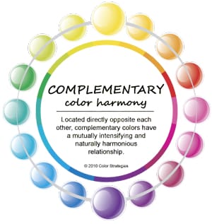
Some color wheels incorrectly suggest that the only way to mix color is ‘around’ the wheel on the outskirts. Color is actually mixed in chords using color relationships, like complements, to alter tone and create a sophisticated aspect of nuance. Full spectrum color fully leverages the method of mixing in chords eliminating the need for black. Because black absorbs light wavelengths and does not contribute to reflecting light back into the space.

There is a unique bundle of wavelengths of daylight beaming in from windows and doors as well as light bouncing around the room from artificial light fixtures. Known as spectral power distribution (SPD), those sources of light, natural and artificial, define the amount and quality of light in interior rooms.

Full spectrum paint colors have a unique and varied bundle of wavelengths too but instead of beaming wavelengths, they are reflected wavelengths. This is called spectral reflectance; it’s like the color’s fingerprint. Partnering the unique bundle of beaming light wavelengths with a robust bundle of reflected paint color wavelengths floods the space with a full and subtly diverse range of color and light.
I recently designed and launched an app called LRV Guru™. Understanding how color is measured, those spectral distributions and reflectance curves, is how and why I was able to conceptualize the app. What I know for sure is the day is not too far away when hand-held devices like the Color Muse that works with the LRV Guru™ app will also work with apps that show you a color’s fingerprint; so you will be able to measure any color and see how well it is or is not balanced. The expectation for all paint colors is a full spectrum fingerprint, the questions will evolve and involve matters of balance.

“A ‘neutral’ gray is not simply a black-white mix, but an equal mixture of all the visible spectrum(r-o-y-g-b-i-v) colors. A spectrophotometric measurement of such a gray will show it to contain approximately equal amounts of those spectrum colors. Non-neutral grays, however, have unequal amounts of the spectrum colors, causing a cold or warm color shift under different lighting conditions.” ~RPImaging
This is an example from GTI. It’s a Munsell Neutral Gray N7/N8 Paint. It’s their ‘true neutral’ gray architectural paint – you can buy it here. Look at the spectral data they provide for the two colors. A full fingerprint of all wavelengths present and measured. Even though we don’t know how Munsell’s gray is mixed, its formula, the spectral graph shows us it registers a robust, almost perfectly even spectrum. It’s possible to measure and compare the color data for all paint colors. Qualifying them as “full spectrum” – or not. It’s just no one has done it yet. But what’s important is it could be done. We might be to a point where some kind of standard data profile for full spectrum paint colors would be useful.

There is also the holistic, New Age spin. Again, the intent of color mixed full spectrum is to mimic natural daylight. Applied to walls, full spectrum paint brings the energy of natural daylight and all the healing and nurturing benefits that are inherent of light.

Standard stock colors use an average of 3 to 4 colorants which means their reflective qualities and abilities are predictably less robust when compared to colors that use a balanced mix of more colorants. Stock colors are more constant and shift less as the light changes throughout the day. To date, colors that appear more constant have been the #1 goal of major paint manufacturers.
One purpose of color science and color labs is to find ways to plot and manage color so it is constant and predictable. Color constancy is the intent with which paint manufacturers create their stock colors. At the most basic level, constancy is achieved by using the fewest colorants necessary.
If you can engineer a color to be more constant and predictable, then you can engineer it to be inconstant and highly responsive so it shifts and morphs as the daylight changes in your house throughout the day. That really sums up the difference between “regular” paint formulas and fulls spectrum paint formulas.
Regular paint brands rely heavily on black colorant because it is the faster – and cheaper – way to change a color. That’s the main reason why black is such a staple in all commercial tints. Paint manufacturers choose to mix their colors with black colorant because it is inexpensive and adding even a small quantity of black aids with hiding ability and produces more consistent and constant wall color. Hiding ability is often mistakenly associated with quality paint ingredients. Black colorant is, again, cheaper and using it in their colors can create an illusion of higher quality, high-hiding paints.

In addition to the nurturing benefits of living in the GLOW of balanced wall color, full spectrum paint enables you to create atmospheres that will gracefully morph and adapt – like a chameleon.
Chameleon colors are an advantage because they offer flexibility – like when you are settling into a brand new home, or acquiring furnishes and decor as budget allows, or need the perfect *neutral* to sell your house.

Great article Lori. Thanks for all the relevant info I love to read, over and over. The full spectrum paints are beautiful, CSP paints don’t sell as well as expected at the paint store and the only reason has to do with price.
I was a lithographer for 35yes this is so fun. Color is as beautiful to the eye for me as is music is to my ears and moods. More of life’s gifts thank you, Tom Greene.
With all the angst revolving around “my gray walls turned blue/purple/orange/etc.” why would anyone want a full-spectrum paint? It would seem that the color morphing more than a regular paint would exacerbate the problem. Am I missing something (probably!)?
With full spectrum you can just let the angst go.
Because you know it’s going to shift and morph throughout the day and seasons.
It’s a more organic approach to color; it’s choice to embrace the shift vs. fighting it.
Ok, got it!