** The video from Benjamin Moore that this post referenced and quoted has been removed from YouTube. There is still good information here so I’m leaving it up despite the missing video.
I’ll start with the positive. It’s good to hear that Benjamin Moore has turned a new leaf and has started incorporating hue / value / chroma into their color conversations – definitely new behavior for them.
The Affinity collection is well-curated, pretty and easy to use. Agree with that 1000%.
Now for some constructive observation:
- Chroma is about colorfulness.
- Colors don’t have gray “in” them. Rather, colors are grayed, toned, dulled down, knocked back so they become grayed. Some may argue that it’s a matter of semantics, but thinking that colors have gray “in” them will do nothing but mess with your head. Especially if you’re serious about understanding how the whole hue/value/chroma thing works. If you have a habit of speaking to color like that, stop it.
If the Affinity collection was “formulated” so all the colors work together, and/or all the colors relate on one or more of the 3 attributes hue, value and chroma, then someone is going to have to convince me. Supporting graphics will get you extra points. Because I see no evidence of any of that whatsoever.
We combined art – with very skilled color specialists using their years of experience; and science – mathematical models that confirm the relationships among colors to create the Affinity Collection.
Alrighty then.
I’m sharing the color notations with you (scroll down) so you can take a look for yourself. The claim that the colors were specially formulated so all the colors share one or more of the three key attributes used to be on the Benjamin Moore website but they’ve since deleted this from their page talking about the Affinity collection.
But that’s where all these quotes came from, it wasn’t just the video that’s been deleted. A lot of somebodies must have thought it was all true but I’m scratching my head trying to understand what, why, how, where or whom that happened. I don’t get it.
We have taken the guesswork out of selecting colors by carefully creating a palette where all of the colors share three basic traits which are attributed to color.
All of the colors? Really?
Actually, these 144 colors are all very different from each other – truly from one extreme to the other on all three key attributes. I know you’re just dying to know how extreme.
Let’s start with hue.
Including that attribute doesn’t even make sense because there’s an almost complete rainbow in the collection.
No fancy science or mathemagician skills needed for this one, people – just look at the gosh darn deck.
So, take hue off the table completely. Now we’re down to two attributes.

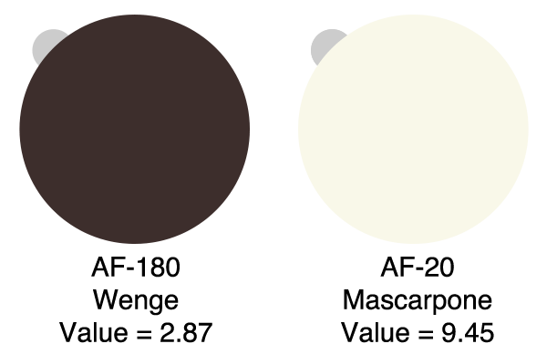
Value is up next. Sort the table below.
Lowest value is AF-180 Wenge V = 2.87. Highest Value is AF-20 Mascarpone V = 9.45.
And there is every value in between those two extremes.
Does this look like “all the colors share three basic traits which are attributed to color”? Even the severely color vision impaired would get this one right.
We’re moving on to Chroma. Here’s the quote again as a reminder:
We have taken the guesswork out of selecting colors by carefully creating a palette where all of the colors share three basic traits which are attributed to color.
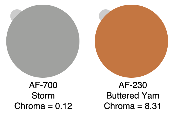
Chroma extremes start with AF-700 Storm C = 0.12 which is the lowest chroma in the collection.

Highest chroma is AF-230 Buttered Yam C = 8.31.
Without any of the magical math stuff, it’s obvious that there’s quite a range when it comes to chroma.
We’ve covered all three attributes, hue, value and chroma and discovered that the 144 colors in the Affinity collection do not all “share three basic traits.”
What you will find within the collection are pockets of close consistency in value and chroma.
Again, I agree the Affinity color collection is well-curated and pretty but I absolutely don’t agree that you can choose any combination of colors from the Affinity collection and you’re guaranteed a fail-safe or no-fail result.
That’s just crazy talk.
I want to be clear that I’m not picking on Benjamin Moore. It’s a coincidence that I just finished the color notations for the Affinity collection when I saw this video and then the website.
Every brand out there suffers from the exact same gaps in color knowledge – it is by no means an affliction unique to Benjamin Moore.
Much like the Affinity collection, the industry is comprised of extremes. Out in front you have talented designers and charismatic marketing folks. Have to assume somewhere there is a group of color scientists that are never heard from or seen.
In between the art and the science there is a huge gap. And Ben Moore’s video and web page happened to be the perfect illustration of that gap.
It’s just what happens when one puts an inordinate amount of importance on the art part and chooses to ignore the science part.
There must be a balance of both art and science.
Which is why I created Camp Chroma. The notation database below is an example of what’s going on over there. That gap I’m talking about is pretty big, but I’m confident I’ll be able to shore it up quite a bit.
One last word about the notations. I had asked several paint brands for notations and it came as no surprise that the majority had not one fat clue what I was talking about.
Ended up I did manage to get a couple sets of notations. Once we had them here at The Land of Color, it was apparent that much like other things in the paint industry, there isn’t really a standard for converting paint colors to Munsell notations.
Add in factors of different equipment involved, calibration variances etc. and we just could not use the data.
Even though converting to a hue, value, chroma notation is not an absolute, the answer is for sure “X” kind of situation, there’s a whole lot to be said for a consistent method.
So, that’s why we’re doing the conversions here at The LoC; it’s the only way to objectively compare color.
Color systems, color notations and similar topics are included in my The Four Pillars of Color online color training course.
In the mean time, I encourage you to discover how easy it is to uncomplicate color and take control by subscribing to the Color DNA Table of sortable notations.
Your monthly subscription grants you access to the powerful Color DNA Table.
Hue, Value, Chroma and LRV notations are formatted into a sortable table. For example, if you want to search for all the colors from Benjamin Moore that belong to the Green-Yellow hue family, you can do that! Sort on a single attribute or two or three. Click the arrows in the headings area to put columns in ascending or descending order.
Search thousands of the most popular paint colors. Brands featured are mostly Benjamin Moore and Sherwin-Williams with a few colors from other brands.
New colors are being added to the list regularly.
Cancel any time.

Is it because they are all toned down, and that even the neutrals are not bright? I’m sure I didn’t say that right. I have Affinity and have been staring at it and another one deck for months now, hence why I will be taking your Camp Chroma Online Training Preview Webinar. The more I look at all the paint colors ‘everywhere’, the more confused I a become.
Hi Cindy Sue,
First, thanks for signing up for the webinar. The webinar and first Camp Chroma Course offering focuses on Hue Families and Color Systems.
What you’re asking about is value and chroma. Learning modules tackling those two aspects of color will follow shortly after the Hue Family and Color Systems module, so hold tight for those.
In the meantime, to answer your queston . . . No, the colors in the Affinity collection are not necessarily all toned down. The collection actually has a broad range from near neutral to quite colorful. The color in the collection with the least amount of chroma is Storm, the color with the most is Buttered Yam. If you click on the “chroma” header in the notations table above, it will put the entire Affinity collection in order from least colorful to most colorful. Put your Affinity chips in that order and you’ll easily see the progression from least colorful to most colorful.
You can also sort the table by value (click “value” in the header to do so). The color order will be different from the chroma order because sorting on value will order the colors from lightest color, which is Marscapone to the darkest color in the Affinity collection which is Wenge. From the chroma color order, reorder the chips by VALUE and you will see the progression from light to dark.
Chroma and value are not the same. Chroma answers the question how colorful or chromatic is a color compared to a neutral gray – it’s about grayness.
Value answers the question how light or dark is the color compared to a grayscale that starts with pure white and ends with black – it’s about whiteness and blackness.
Hope that answers your question for now – you can probably see how it’s necessary to go deeper with value and chroma and why they will have their own learning modules in the Camp Chroma Courses.
Hello Lori,
I appreciate your deep quest for understanding color.
Two questions:
I use the LRV numbers to figure out the value of a color. I wonder why in your table the value numbers are not on the 0 – 100 scale?
Second question: where on the Ben moore website did you find the Chromatic value of a color and in what scale does it come in?
Thank you very much and I would love to be more educated through your webinars
I use the LRV numbers to figure out the value of a color. I wonder why in your table the value numbers are not on the 0 – 100 scale?
First, LRV and Value are not the same thing. In a Munsell Hue/Value/Chroma notation, the value scale is 0 to 10. Value in this case, is determined by comparing the color to a grayscale – it is a perceptual assessment. LRV, reflectance value, is a measurement, not a perceptual assessment. When you use a device to measure a color’s spectral data, LRV is included in the data captured and it is identified as CIE Y. So, in spectral data terms, LRV is CIE Y. Thus the CIE Y column in the table above is LRV.
where on the Ben moore website did you find the Chromatic value of a color and in what scale does it come in?
None of the spectral data information found here at The Land of Color came from paint manufacturers. Paint manufacturers are paint experts but they most certainly are not color experts. Understanding value, LRV and chromaticity is not complicated – color isn’t complicated. It just takes some explaining. More explaining than possible here in the comments section. Course 1 in my Camp Chroma online training program covers all these topics and more. If you’re interested in learning more, signing up for Camp Chroma would be the thing to do. campchroma.com
I have spent about five years trying to narrow my choice of yellow/gold without success. I am now looking at LRV between 73 and 76 but BM doesn’t have a search engine for it. They don’t even include it on most chips. I hope you categorize all BM paints soon! We’re already halfway through the gray period. We’ll be in the next fad soon.