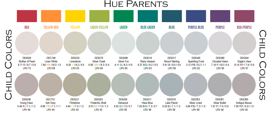
Last week I posted my point of view on color undertones. The post got rather long so I left this part out. I have been sharing my approach about hue families and order systems on select public decorating forums for some time now. Although hue families and color order applies to pretty much everything, on the forums the discussion usually revolves around paint.
The one thing I like to impart to my readers is that order systems exist and are there to help. You do not have to reinvent the color wheel and try to paste together your own method; you just need to learn how to use the systems already in place.
If you are a color professional or avid DIYer, there are tweaks you can make to your favorite collections, but overall its best to leave the colors ordered as is. And don’t get sucked down the rat hole of trying to decode paint formulas – it is of no value and a complete waste of time and effort. The base and colorants in the can are moot because unless you work in the paint store, you should not concern yourself with mixing color. DIYer or professional, the only thing that matters is the final, cured paint color. I suggest you take advantage of the paint pro’s. Let them worry about bases and formulas; let them do their job mixing color for you.
For now, I want to dig deeper into what I have been telling my forum friends about how color displays are ordered by hue family. If you want to speculate if a color is going to lean a bit green or blue or yellow or orange (you get the idea), all you have to do is look at how it is ordered among the other colors. Is that color you call beige ordered in the yellow section of the display or fandeck? Then guess what, its hue bias is yellow. . . and that’s why that chip is located in that spot. . . in that display or fandeck.
Each paint brand puts its own twist on ordering their colors. Some begin the display with red while the brand down the street may start their display with purple. The little twists do not matter if you know to expect them and if you have a basic understanding of color order. Which, I hope at this point you are starting to develop.
When a brand chooses to order colors in a fashion that does not follow spectral order, it makes things more challenging. No worries. Just remember the color strategy I shared with you in last week’s post which is compare color swatches to hue parents.

Comparing to hue parents is a ‘that which is like unto itself is drawn’ construct and the hue bias of any color will come forward. It is important to know that a comparison to hue parents yields a different result from comparing to black, white or gray. Black, white, and gray are known as achromatic and this group comes with its own bucket of worms in terms of color comparison.
If it’s not obvious by now, I think the most unwise thing a paint brand can do to their color display is mess with a classic color order. Many times you will see the near neutral paint colors pulled out of the standard order and placed in a special display off to the side. . . or whatever. Not a good plan.
I can guarantee that a spectral-based color order system is not the source of any degree of color confusion and it’s okay to leave it alone. Because if people do not understand how to use a basic color order, it is very unlikely they are going to “get” some convoluted interpretive method with no logical basis in measured attributes. Simple color order is the best choice because no amount of reorganization and/or special groupings of paint chips will ever be enough to overcome a lack of fundamental color know-how.
My suggestion is put or leave colors in a proper order and invest in training staff so they can educate everyone who comes through the doors about how the ALREADY IN EXISTENCE order system is predicated on commonly understood spectral order and built to facilitate the color selection process. The fact that colors are repeatable and reproducible is all the indication one needs to know that a color order system does indeed exist and the next step is to leverage that system. Once that is under control, then it’s possible to creatively feature groups of colors based perhaps on season, or trends, or theme, etc.
If you are a color professional and would like to know how you can leverage the color system you have to work with, I can help.
You really can do this! Read these other blog posts and add to your color skill set.

