Do you struggle trying to decide if a color is warm or cool? You’ll be happy to know I have a solution for you.
Since psychological color temperature isn’t a measured attribute, methods for determining warm and cool are typically inconsistent and erratic – which is a big part of the reason why so many find warm and cool colors confusing.
Unfortunately, that’s just how it goes with any process that’s based on visual evaluation and subjective categorization of color.
Without a system, you’re stuck tediously comparing one color to another. One… color… at… a… time.

When it comes to architectural color specification, bigger is better. We need a bigger context for comparing a lot of colors at once because there are so many colors to choose from. Curated, designer palettes aren’t much help. If you don’t understand warm and cool colors, it doesn’t matter if you’re shuffling through 2 or 2,000 chips because either way, you don’t know what you’re lookin’ for.
In this post I outline a simple system built to manage an infinite number of colors and I’ll also show you exactly how to figure out if a color is likely to look warmer or cooler.
In order for what you’re about to learn to make the most sense, I need to share the story of The Color Strategist Color Wheel I designed (CSCW for short). It was awarded an official copyright in 2022 – that was an exciting day!

It was 2008 ish when I realized I needed a special at-a-glance color tool. Nothing like it existed so I had no choice but to make it myself.

The first versions of my color wheel were ‘wire-frame’ in design. As I started sharing it with the world on various forums and posts, I learned that while the ‘wire-frame’ worked for me (because I understand the Munsell Color System and know it like the back of my own hand) it wasn’t intuitive for everybody. I needed to fill in more blanks for others who weren’t as familiar with the color system that is internationally known as “The Gold Standard” of color systems.

The next version included more information but I really wasn’t focused on the colors – because I know what Munsell hue parents look like. Close was good enough for how I used hue families in my day to day. The spokes of color were just place-holders. Which was fine for me. But again, I was sharing this tool with the world and I needed to improve the design for YOU. It wasn’t just about me any more.

The next evolution considered you, the user, even more and also all the not-so-fun-but-necessary business of branding and copyright and I tweaked the colors so they represented Munsell hues better. As most of you know, colors render differently on different devices and monitors.
That played a part in my dragging my feet when it came to working on the colors. Because in the grand scheme, how much does it really matter since digitized color is device dependent and the colors are gonna look different depending on each person’s device and/or monitor. Not to mention I never dreamed I’d have it printed.
I was a graphic designer for over 10 years and understood with each click where this thing was going. Just thinking about what it was going to take to print this color wheel gave me hives. The number of colors alone was overwhelming.
Many say there are 100 hue integers in the Munsell system – 10 per each of the 10 hue families. Which is true. But there are actually 120 colors – 12 per each of the 10 hue families. People forget to count the half hues, 2.5 and 7.5.
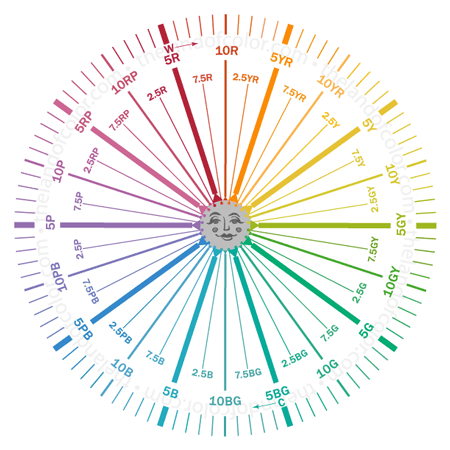
This is the final iteration of the CSCW color managed for printing. You get a 6-inch CSCW in your course kit when you sign up for my color training course, The Four Pillars of Color and you can also buy a 6-inch Color Strategist Color Wheel of your own in the online store. Poster size and a smaller 5-inch is available.
This final iteration also includes warm and cool notations – a unique feature for a color wheel. This handy information on the CSCW enables you to drill down a notch from splitting the color wheel in half and calling one side warm and one side cool.

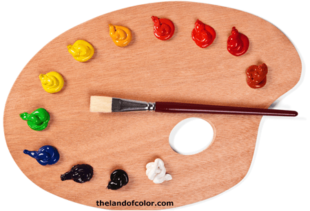
The common color wheel you see above is what most people think of when they think of a color wheel. All color wheels have a purpose and this one is about mixing colors – says so right on the front, “A guide to mixing color”. It has nothing to do with specifying color for the built environment except for maybe how it maps out classic color harmonies.
This color wheel should not be used to teach anything but basic, traditional color mixing theories.
Honestly, not convinced it addresses harmony and color mixing all that well but the fact is this is the color wheel people are most familiar with and they have been taught to split it in half and call one side warm and the other cool. And that’s the extent of what most people know about color temperature.
Instead of splitting a color wheel in half and looking at warm and cool as a continuous spectrum from one side to the other, there’s a better way to do it – especially for specifying architectural color.
And that better way is warm and cool is a spectrum within each hue like you see below.
5Y (yellow) is at 90° on the CSCW. Can you see how there are warm yellows and cool yellows? Also warm greens and cool greens? You get the idea. However, it’s important to note that the warm and cool designations don’t come from color measurements like LRV or a hue, value, chroma color notation. As mentioned, psychological color temperature isn’t a measured attribute.
Since psychological color temperature isn’t a measured attribute, let’s talk about where the temperature designations on The Color Strategist Color Wheel came from.
First, I had to establish the warmest and coolest spots. After that, it was just a matter of alternating warm and cool around the wheel.
I don’t have a specific reference for this, but I knew 35° to 40° in the LCh color space is often identified as the warmest point on a color wheel. LCh degrees representing the LCh color space is another feature I added to the final version of the CSCW. So, that’s where I started. Once I determined the hottest spot, the coolest was automatically established on the opposite side.
The inside of the CSCW aligns with Munsell hue families and the outside is LCh degrees or hue angles. The warmest point at 35° ends up being 10 R, the end of the Red Hue Family — which automatically plotted 10 BG as the coolest spot because it’s directly opposite.
Here are the color “rules” I considered next. I knew about “double primary colors” and there are many resources that speak to it but I really like how it’s explained in this video by Gamblin Colors.
Specifically, if you establish the warm and cool spots on the color wheel, temperature bias for all other colors will fall into place. And this is how Gamblin describes finding the warmest point:
- Reds do not get cooler on the yellow side until they are no longer red.
- Yellow and orange get warmer as they approach red
- Orange gets cooler as it approaches yellow
Once I walked through these rules word-for-word and step-by-step, it made perfect sense and it also aligned with other theories that identify the warmest point right around the 35° mark. The individual concepts validated each other and it was obvious that these are useful guidelines to follow to sort the hue families in to warm and cool categories.
What all that boils down to, is the warmest red and the warmest orange had to meet right at that 35° mark.
And THAT meant the same thing had to happen directly on the other side of the wheel, the coolest blue-green would have to meet the coolest blue. So, that’s why warm and cool double-up in these two places on the CSCW.
What’s neat is if you fold the wheel in half, the patterns of warm and cool color temperature are mirror images of each other. What this demonstrates is how the CSCW organically maps out complementary warm and cool HUE FAMILY color relationships for you. Geometry stuff is so awesome.
 The bottom line is color temperature is relative. Whether a color is warm or cool can only be answered by comparing that color to other colors.

That’s exactly what we’re doing when we use a Munsell color notation to plot a color on the CSCW and look to see if it falls in a warm or cool hue family section. What’s happening is we are organizing that color into a system of other colors – the Munsell Color System to be exact.
That system of other colors, Munsell, creates an organic context for COMPARING those colors to each other.
The result is we have an objective context to compare and determine a baseline color temperature.
We have a reliable and repeatable process to get an initial read on how a color could be perceived – either warm or cool.
Understanding how this works means you can make a pretty darn good guess whether a color will end up looking warm or cool once it’s in the room next to the colors of fixed finishes and other contents in the space.
This skill is especially useful when your objective is to design a color plan that has a balanced, human-supportive mix of warm and cool colors.
Next, let’s get into a little more detail about that system of colors that creates this organic context for comparing colors.

Doing one-offs, eyeballing comparisons of just one color to another, only answers one question – and that is, “Which one of those two colors is warmer than the other and which one is cooler?” And that’s not enough, that’s not a big enough answer for an architectural color designer.

Color for the built environment is a much bigger context than just comparing one color to another so it’s not always practical to only compare two colors at a time; a larger scale comparison provides a broader, more meaningful sense of cool and warm.
As you now know, how we do that is by figuring out where a color belongs in terms of hue family within a large color system or library — and not just any old kind of color system will do.

It needs to be a library of color that is perceptually equidistant, one that was designed based on human visual perception. The only library of colors like that is the Munsell Color Order System.
Not knowing how to identify and combine warm and cool colors is a major pain point for many homeowners and color professionals alike.
Traditional methods for determining warm or cool are a small-scale comparison, just two colors at time juxtaposed to each other – it’s tedious and trying.
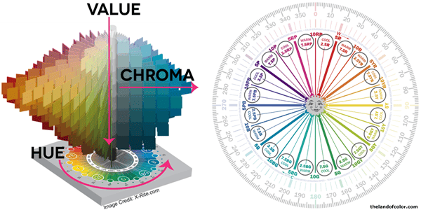
 But it’s different when you know how to navigate color within the Munsell Color Space because you have an organized framework of infinite colors all ordered to align with the three dimensions of the human vision system which are hue, value and chroma.
It’s that system of order that naturally provides context for an infinite number of colors.
The organized framework of the Munsell Color System gives us the bigger scale context we need to compare colors. Using notations, like you see in the Colorographies below, we can compare colors based on hue, value, and chroma. As an extra bonus, that context also provides a way for us to compare and get a sense of color temperature.
If you know a color’s hue family, you can use the CSCW to anticipate its color temperature – if it’s going to appear warm or cool in situ.
It’s just that simple.
Not only can we use the framework of the Munsell Color System to compare colors to help us decide warm and cool, we can also use the notations to help us create harmonious warm and cool color combinations.
As you can imagine, that requires more in depth understanding than I can convey in blog posts. That’s what Camp Chroma is for. I teach you all about color notations and color harmony in my online color training course, The Four Pillars of Color.
