This will blow your mind. Ready?
We can quantify how we see color!
What kind of sorcery is this? Well, it’s not magic but it is color science and that’s almost like magic and now you know what a lot of color professionals don’t.
Many consultants, artists and designers don’t understand color systems, color spaces, color notations like hue, value, chroma and LRV.
And because they don’t understand where color notations come from and how they work, they think color notations and data values are somehow divorced from how we see color; that the color notations and data values that result from using science to measure color somehow represent some thing that is abstract, prescribed, rigid, formulaic.
So, that’s what this blog post is about.
The purpose of this blog post is to educate those who think color notations and data values are prescribed, abstract, rigid, formulaic and divorced from human perception.
We’ll start with a question.
Color measurements quantify how the human vision system perceives color because what else could they be about?
I want you to really think about that question.
What else could drive ANY kind of study about color other than how we perceive and experience it?
Given this new context to think about color science and color measurements do you see how completely ridiculous it is to argue that color notations/data values are too far removed from the human perception of color to be meaningful or useful?
Because, again, what else could color measurements possibly be about other than the human perception of color?
It’s a matter of knowing.
Most consultants, artists, and designers have never learned about color systems and spaces. They’ve adopted titles like color expert and color consultant based on their own personal first-hand experience only.
The problem is they don’t know what they don’t know.
Understanding color data values and notations is a specialized and niched kind of expertise.
A kind of expertise that looks overwhelming and intimidating from the outside — which is exactly WHY it’s so niched.
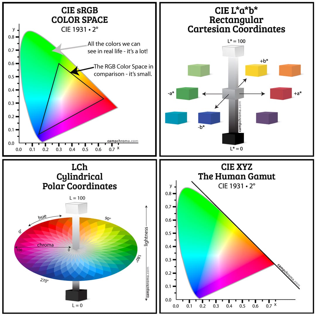
The numbers, diagrams, charts and graphs scare off a lot of people because no one has ever told them that all those things are just an effort to illustrate how our eyeballs and vision system works and if you’re reading this, that’s a good thing. Know why?
Because now you know – you just learned that all those things are simply illustrations of how our eyeballs and vision system works and there’s no reason to be intimidated.
You now know what so many others do not.
That means YOU can easily make an evidence-based approach to color YOUR unique value proposition because you know something that many in the crowded color consulting space don’t know.
Once you’re aware of something, you start to notice more instances of that something.
Like when you buy a car and suddenly you notice cars the same color as yours.
It’s the same with color notations and values. Once you’re aware they exist, you start noticing them. I have a few examples to share with you.
When you look up a Dunn-Edwards paint color on their website, this is what it looks like. Dunn-Edwards is the only paint brand that publishes the Munsell hue, value, chroma color notation and LRV for all their colors on their website as well as in their fandeck. Everything you need. Clear. Concise. Uncluttered.
Even the meta description for Dunn-Edwards’ colors (the Google snippet) is informative and tidy. This is how it’s done and other paint brands should follow Dunn-Edwards’ lead – someone at DE knows what they’re doing. I think they’re freaking brilliant. That color notation is a powerful one-liner and announces “We are paint experts and serious about color.”
Next up is the California Paints website. Smaller, independent paint manufacturers can license color palettes. At one time California Paints licensed the Dunn-Edwards Perfect Palette. Not sure when they stopped but now they license the Color Is palette from The Color Guild.
California Paints shares the CIELAB values on their website which is great – that is if you know how to read and use CIELAB values. Although everyone should understand the CIELAB color space, many don’t. If you want to learn what CIELAB is and how it works, I teach you all about it in The Four Pillars of Color Course over in Camp Chroma.
A done-for-you Munsell notation would be a smarter move for California Paints. Including CMYK and RGB values for paint colors is a waste because those values are irrelevant to color for the built environment. The hex code does, however, come in handy when creating paint swatches for mood/inspiration boards. More about that in a minute.
Last note for California Paints is they aren’t categorizing their colors by hue family correctly – they almost have it right and they get bonus points for trying. Cannon Ball actually belongs to the Green-Yellow hue family. If they’re going to reference CIELAB values, then they should use the ten Munsell hue families to categorize their colors because Munsell was the template for CIELAB. Additionally, to say “Grey” is a color family is confusing and incorrect. Grayness is about chroma, not hue family.
Every fully chromatic (saturated) hue parent can be grayed down to create a range of child colors as you can see in the infographic above. I used Dunn-Edwards colors and pulled the notations from the fandeck.
These two paint brands stand in marked contrast to brands like Behr who as you can see doesn’t even publish LRV. This is what it looks like if you look up a Behr color – nothing helpful. What is on the page is weird. What’s with all the swatches of light blue?
Overall, Behr’s website and color tools in general are the least helpful. There’s a confusing collection of fandecks and color palettes and some colors aren’t in a fandeck at all; some colors can only be found in a brochure – their collection of brochures is equally frenetic. Seems there are too many cooks in the Behr color tools kitchen. They need to scrap everything they have and start over with ONE, clear, concise vision.
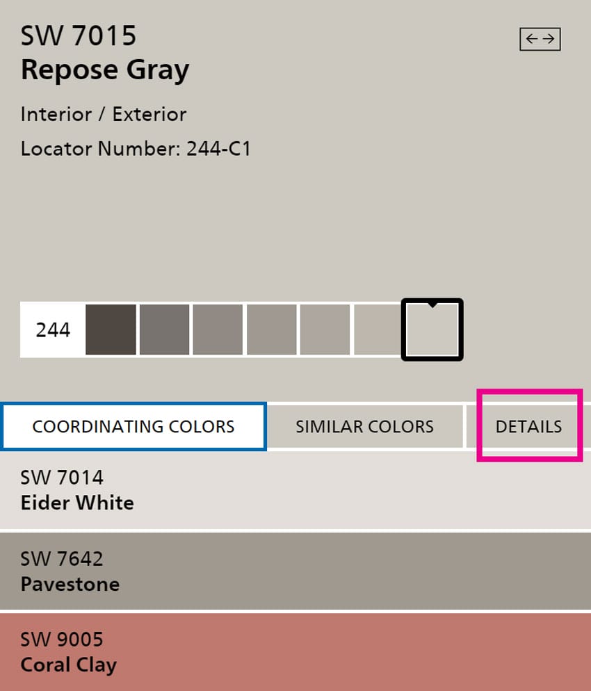
Next is Sherwin-Williams. Another example where they’re close but there’s room for improvement. This is what pops up when you search a Sherwin-Williams paint color. In this example, it’s Repose Gray. In the first view, you get coordinating colors. The biggest waste – and where they could make a major improvement – is the line with the Locator Number. No one gives a flip about that number. Instead, this would be the perfect place for a hue, value, chroma color notation or at least LRV.
To find LRV you have to click on “Details” and then wait for another page to pop up – it’s not user friendly.
As promised, here’s more information about digital color swatches and using RGB Values and HEX Values.
The point of my sharing these examples is to show you that color notations and data values are indeed out there and in use.
Despite the fact that some applications are better than others, there is a thread of consistency in the use of color notations and values from brand to brand.
How is that possible?
And that leads us back to the purpose of this blog post.
I’m going to tell you how it is possible to quantify how we see color. Actually Rolf G. Kuehni and Andreas Schwarz explains it, I’m just passing along the details:
“The human eye has a thin membrane, the retina, which contains the light sensitive cells. The retina has two major components: the rods and cones. The cones are sensitive to colors. There are three types of cones in the human eye, each contains a different photopigment with peak response to a particular part of the visible spectrum. Thus, by differential transmission of nerve impulses upon stimulation, the cones are able to encode information about the spectral content of the image so that the observer experiences the sensation of color. Each individual has a different spectral sensitivity.
-and-
When a given reflecting material [like a paint color] is viewed under given conditions of surround and illumination, the effect of the photon flow from the object on the three cone types can be expressed with three numbers (representing the degrees of activation of the three cone types).” Source – Color Ordered: A Survey of Color Systems from Antiquity to the Present | By Rolf G. Kuehni, Andreas Schwarz
We can brilliantly express a complex and many-dimensional human visual experience with three numbers called XYZ trichromacy values.
We can mathemagically transform those XYZ trichromacy values into different color space and system formats, like CIELAB, LCh, and even a Munsell hue, value, chroma notation. The “Y” in the XYZ values is LRV so it’s good to go as is.
XYZ trichromacy values are a direct quantification of the physical human visual response.
Which is how and why it’s possible to quantify how we see color.
-and-
Which is how and why different formats, like CIELAB, LCh, LRV, and even a Munsell hue, value, chroma notation are far from prescribed, abstract, rigid, formulaic and divorced from human color perception.
All of it literally starts in your head.
…because where else could it possibly come from?
