Share

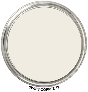
Swiss Coffee 12 by Behr Hue Family
In context of its Hue Family neighborhood, 3 Y, on The Color Strategist Color Wheel. The pink arrows point to where it fits in among the other colors according to its Value 9.33 rounded to 9.25 and Chroma of 0.74 rounded to 0.75.
Swiss Coffee 12 by Behr Review
Swiss Coffee 12 belongs to the Yellow Hue Family. If you look where it plots out on The Color Strategist Color Wheel above, you can see that it’s at 3.24 Y which is almost to the middle of the Yellow Hue Family.
What this means is in a balanced quality of light (meaning there’s a nice mix of all the wavelengths in the visible spectrum) Swiss Coffee’s appearance could be described as warm and creamy. It’s technically an “off-white”.
You can order a tester pot to test Swiss Coffee 12 in your space from The Home Depot.
🎨 Color Review: Swiss Coffee (Behr 12)
Before we get into real-life applications, let’s look at Swiss Coffee’s factual color DNA:
Colorography Overview
Brand: Behr
Color Name & Number: Swiss Coffee 12
HEX: #F3EFE3
L (Lightness): 94.3
C (Chroma): 6.1
h° (Hue Angle): 96.0°
Munsell Hue Family: 3.2Y
Munsell Value / Chroma: 9.25 / 1.0
LRV: 83
Average Perceived Color Temperature: Warm
Vibes: Off White, Near Neutral, Soft
How It Behaves in Real Homes
General Vibe / Emotional Impressions: Swiss Coffee feels calm, understated, and timeless. It brings a sense of quiet warmth without tipping into strong color territory.
Popular Rooms / Surfaces Used: Frequently used for whole-house walls, trim, ceilings, and cabinetry. A go-to white in traditional and farmhouse interiors.
Standout Testimonials or Patterns: Users love its versatility, especially in older homes where its low chroma helps it harmonize with vintage finishes. It rarely feels stark or clinical.
Lighting and Finish Observations
Natural Daylight (north, south, etc.): In north-facing light, it remains soft and stable. In southern exposures, it can take on a pleasant creamy cast.
Warm Light (incandescent / sunset): Becomes cozier without looking yellow.
Cool Light (LED / overcast): Holds up well without turning gray or sterile.
Sheen Effects (flat, satin, gloss): Higher sheens reveal its warmth more strongly; flat finishes feel more muted and restful.
Common surprises or “gotchas”: In some cases, it may read slightly more yellow when placed next to crisp whites—especially on trim.
Comparisons to Other Whites / Neutrals
Compare to Simply White (Benjamin Moore OC-117): Simply White is lighter (L=95.0), cooler (h°=99.6°), and slightly higher in chroma (C=7.8). Swiss Coffee is warmer and more muted.
Compare to White Dove (Benjamin Moore OC-17): White Dove has similar lightness (L=91.7) and chroma (C=6.3), but with a hue angle of 99.3°, making it perceptibly cooler and closer to a true off-white neutral.
Compare to Alabaster (Sherwin-Williams 7008): Alabaster is slightly darker (L=90.2), higher chroma (C=8.4), and shares a similar hue family (2.9Y), but is bolder and more vivid in feel.
Swiss Coffee holds a strategic place in the soft-warm quadrant of the spectrum, defined by its low chroma, high lightness, and Warm designation.
Strategic Application Notes
Best Used For: Whole-house walls, ceilings, and trim when a soft, cozy backdrop is desired. Excellent for pairing with warm wood tones, antique finishes, and creamy palettes.
Avoid If: You need a crisp or clean white to contrast with cool finishes or modern aesthetics. It won’t deliver that sharp edge.
Looks Best With: Warm taupes, muted olives, dusty blues, and rich wood tones. Try it with colors like Accessible Beige (SW 7036), Revere Pewter (BM HC-172), or Misted Green (BM 2138-50).
Final Takeaway
This is a great choice if you want a white that quietly supports rather than steals the show. Be sure to test it near bright whites—its warmth will be more noticeable in contrast. It’s not just a pretty color — it’s a strategic move when timeless warmth is the goal.

