This my latest project. The blue sky has not been Photoshopped – that’s what it looks like just about every day here when I’m doing exterior color consultations in Phoenix. It is glorious!
Built in 1936, this exterior strikes me as leaning to the more modern extreme on the Art Deco design spectrum. The front door is actually around the corner to the left of the big picture window. Here’s the original shot.
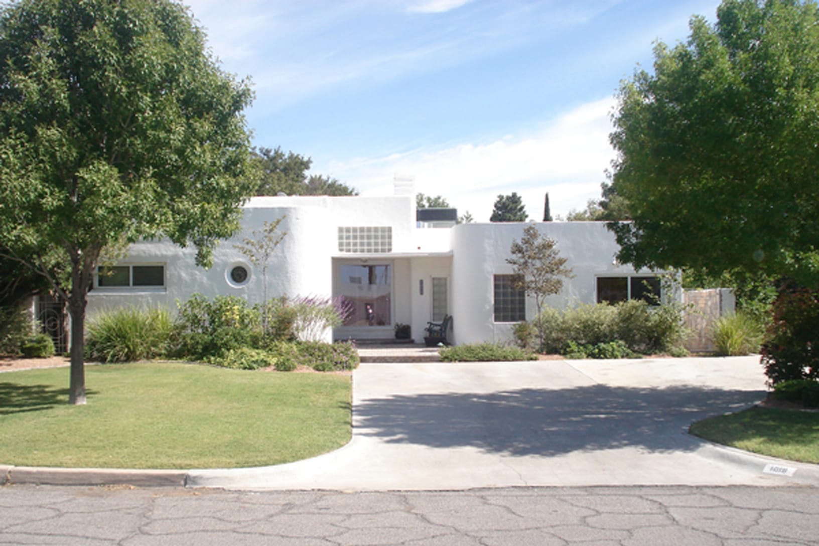
Art Deco came on the heels of the curvilinear and nature-inspired Art Nouveau design era. Art Deco has a poignant attitude and that attitude is communicated through sharp corners and pattern. Shapes like chevrons, precise and sometimes intricate patterns created from a variety of angles. It’s a refined juxtaposition of organically inspired embellishment and the well-edited. It’s a balance and sophistication that often stands in stark contrast to other design styles. This is the photo prepped and ready for virtual color. Gates are now black.
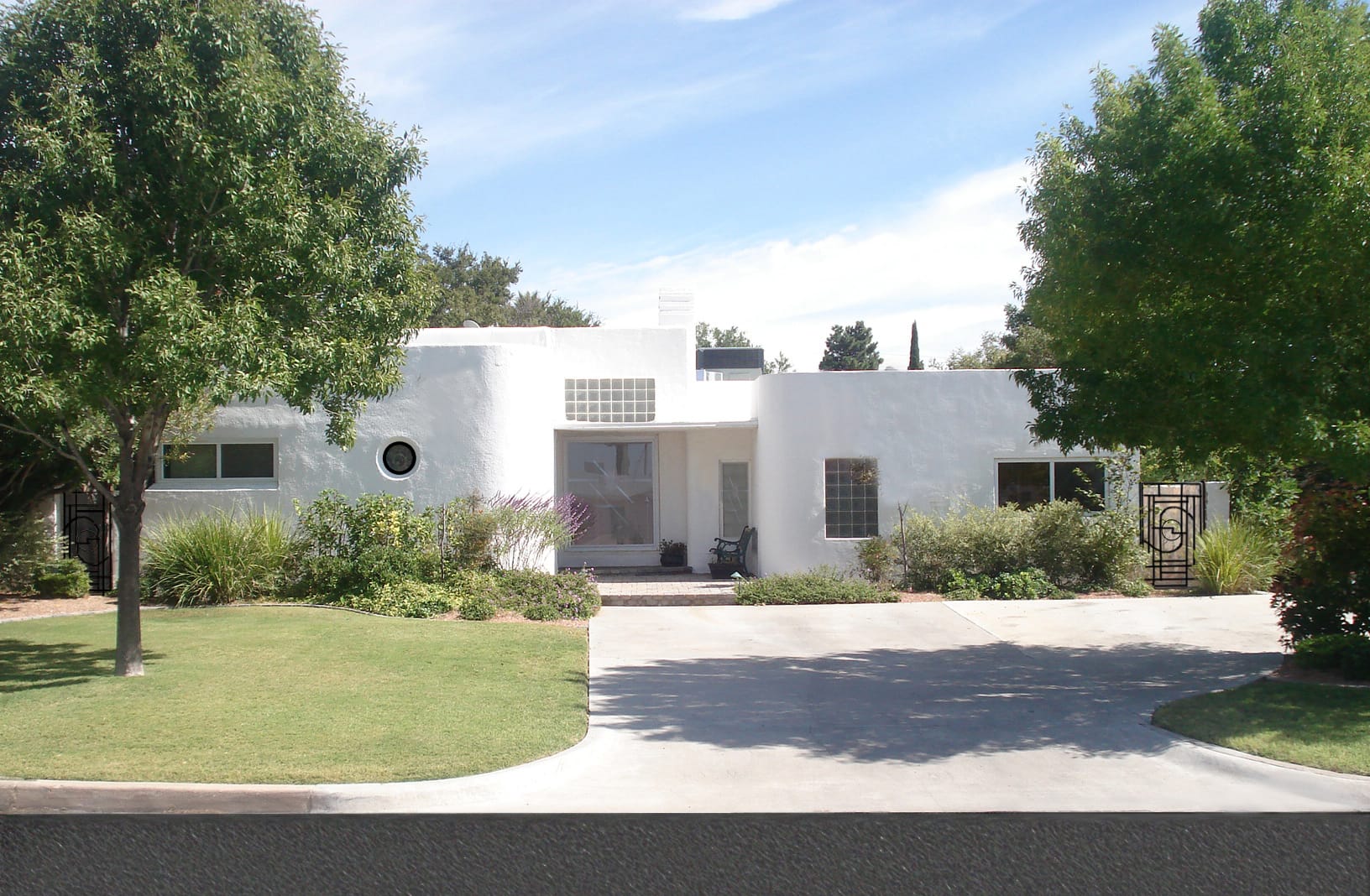
Colors classically associated with this period in design are mostly deep and saturated with a few lighter, muted and pastel colors in the mix. Short list of examples: Loden Green, Dark Reds, Light blue, Salmon, Apricot, Aubergine, Lilac, Golden Yellow to Yellow-Orange.
Black also played an extremely important role in defining the look of Art Deco. Could go so far to say it was the age of the outline. Could also argue that the use of black is where Art Deco gets its air of sophistication, glamour with restrained luxury. Metallics were significant as well. An interesting mix of chrome, brushed nickel, dulled brass, and shiny brass are all period appropriate.
In an effort to find the right balance between the new landscaping and the expanse of main body color, I painted several virtual colors. Color names aren’t relevant because color varies so much from monitor to monitor.
Do you have a favorite? By the way, they chose Urban Nature AF-440 (Tap for Samplize Peel and Stick Sample).
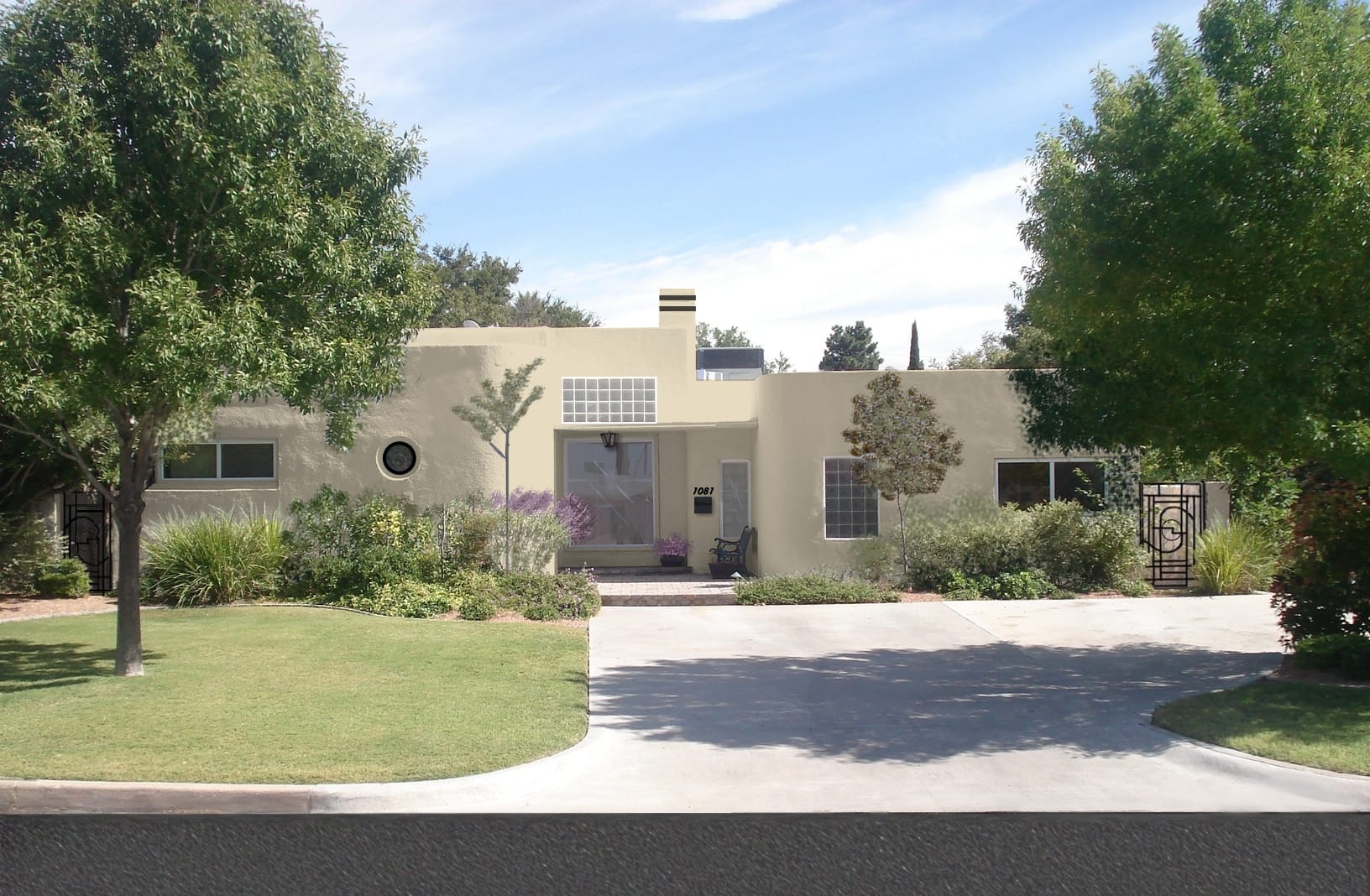
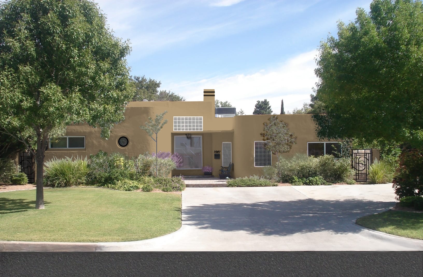
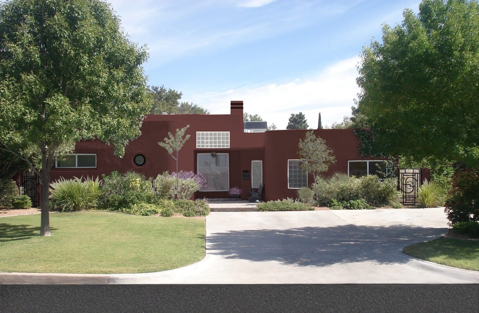

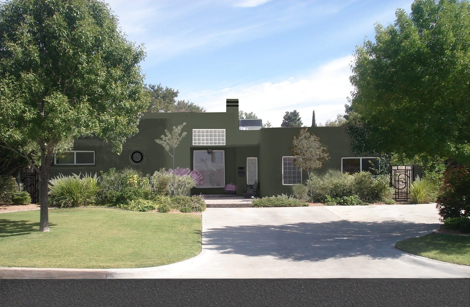

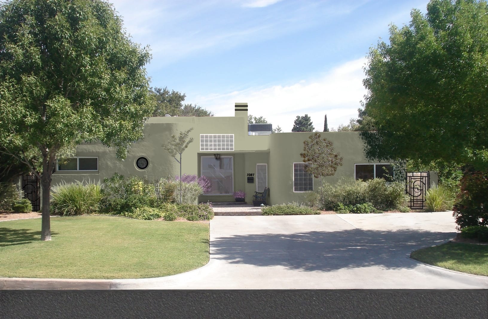
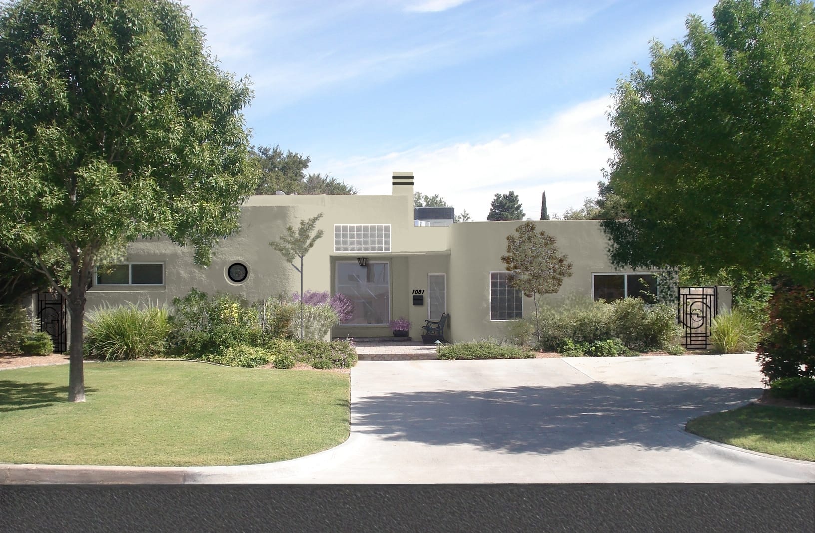

What a neat project. I think think the dark valued, highly saturated options kill the beautiful curvilinear shape. My fave is the third from the last. It’s beautiful atop the big purple shadow created by the tree and its purple sage flowers.
LS –
Let the color buffet begin –
The color palette options you’ve provided for Daxe and Esther are “color virtuoso” quality!!
“Buttercream” is classic while it creates color ‘umph’ for the home’s body/field and does not reflect ‘temperature’ sensitivity in its sunny, hot Texan environment.
“Cinnabar” is sassy but a tad invasive to the home’s structure.
“Tulip Leaves” is refreshing. The soft, yellow-green enhances the home’s ‘authenticity’ in pastel-form favoring golden yellows.
“Loden” has stolen my heart. An organic, moderately-deep value green that reminisces strong characteristics of Art-Deco style uniting common, Texan-stucco substrate.
Your suggestion of black ‘eyebrowing’ detail is completely modish + stylish.
ooh, such tough decisions. Kudos to you for some fabulous options- I second Paula’s compliment about adding the black touches- grounds the building and adds some great accents (especially that super cool gate)
When I think of Art Deco, I always think of the “aubergine, lilac” family paired with greens for some reason. (http://ow.ly/2YzEE) Expanding on Elizabeth’s comment about the lovely purple shadows against the lush green surroundings, just for kicks, i’d love to see something in that range
I like Baguette too- it seems to reflect a natural material like clay, out of which the stucco could have been made
Can’t wait to see what you and your clients decide to do!
I like Tulip Leaves best since, on my monitor, it looks like a grayish green, soft like the color of herb foliage. It looks like it fits into the landscape. The really light colors look good on screen, but might cause glare in the bright sun. I think the reddish and brownish shades make it look too much like adobe, which is a whole different style.
Thanks for your input everyone.
Wanna know their top three choice so far? Tulip Leaves, Mossy Olive, and Loden.
Will keep you posted. Also, the Jenk’s project posted in a previous post is completed. We’ll have “afters” up shortly.
Later,
L.
My $0.25 is with the Loden. I love that the eye sweeps across the landscape making everything on equal ground.