This is how a Color Strategist evaluates Pantone’s Color of the Year 2015, Marsala
First, let me say in November 2013 I really thought Marsala’s color family had a shot. Here’s the blog post I wrote predicting the color of the year. Glad to see it step forward for 2015!
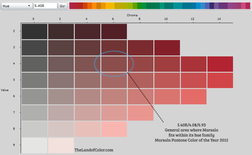
I think it’s most helpful to show you where Marsala falls in context to its own hue family. I would say the best way to describe it with words is a desaturated cordovan. (sRGB values)

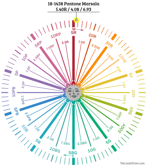
Here’s what Marsala looks like plotted on a color wheel of Munsell hue families. It’s great to have a look at a color in context of its own color family like the first image above but it’s also handy to have a look at it in relationship to other colors, a full spectrum point of view. Marsala is on the warm side of red cruising over in the direction of yellow-red (a.k.a. orange). Which would explain why some may get a sense of browness from Marsala. The common definition of brown is a low value orange – in other words dark orange.
Marsala is in the red hue family, on the warmer side, and has a low-ish value of 4.08. So, where it’s located within its hue family and falls on the color wheel explains where overtones of dark orange/brown are coming from.

What most people want to know is what paint colors are a good “match” for the color of the year. Here’s a comprehensive list including Delta E Values so you know how different the paint colors are from the digital chip of Pantone’s Marsala (RGB, not sRGB values).
Doing conversions for Pantone’s proprietary colors is a little bumpy because of the minimal information Pantone provides. However, hex codes/RGB and sRGB values are enough to do decent estimates. Bottom line is we have to live with factors of “ish”; sometimes close enough has to be good enough.
Hope you find this information useful. Please Pin and share! And as always, if you have questions ask in the comments or send me an email. I love your feedback.


Ha, only you can do that, Lori!
Thank you for the good info!!!
I’m feeling like the only one in the universe liking this color, or should I say, I’ve always liked this color…
I like it too, Hannah. 🙂 Really, it’s about what you do with it. It can easily look dated but so can every other color used in the wrong (or right depending on your point of view) context.
cabbage rose quilts and fluffy floral duvets. kind of an older/mature color.