Oh, this poor man!
O’Connell, 71, wanted to paint the home a cranberry color, but the paint color he purchased did not sufficiently cover the white primer. Instead of looking like cranberry, he said, it looked pink or red.
Painting your home seems simple enough, right? Decide on a color, go buy some paint, and get going. Unfortunately, Mr. O’Connell’s situation is not uncommon.
When things don’t go as planned for interior or exterior projects, many homeowners blame the paint.
In Mr. O’Connell’s situation I can’t say one way or another if the Behr Paint purchased failed in some way or not. I wasn’t there to assess the situation.
Maybe it was the Behr paint, maybe it wasn’t.
If Mr. O’Connell were one of my architectural color clients, I would have advised him against “cranberry” for his home’s exterior.
If he insisted, I would have created a paint and color strategy to ensure a successful end result.
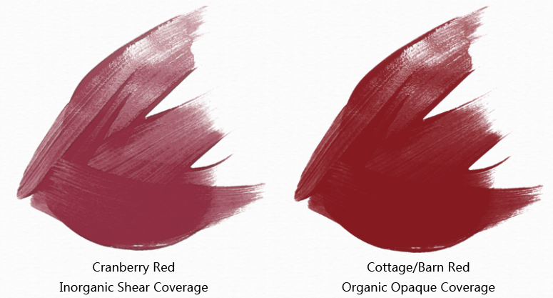
In reading the article two things jump out as big red flags — or maybe that should be big cranberry flags. First, the color “cranberry” is often mixed using inorganic colorants.
Inorganic colorant molecules are transparent resulting in paint colors that go on very sheer and do not cover well.
Second, the article mentions painting the cranberry color over white primer. A sheer paint color and white primer are an evil combination.
Starting out with a white surface means it will take a ridiculous number of coats to hide the white.
Sometimes when using sheer colors, an acceptable level of opacity is never achieved because the white undercoat is so bright and reflective that it telegraphs through multiple of coats of paint.
In Mr. O’Connell’s case not only was the transparent cranberry color not an ideal exterior color strategy but the paint plan had flaws too.
The paint strategy should have supported the color strategy. Let me explain.
If a sheer cranberry was the must-have color, then the paint strategy should have been start with a medium gray primer.
A gray primer has markedly less reflectivity compared to white and will aid in reaching color opacity faster. Not fight hide like white does.

This whole situation could have been avoided just by choosing a different red.
Instead of a transparent cranberry color, I would have advised him to choose an exterior specific red mixed with opaque organic colorants.
Organic color molecules aren’t transparent like inorganic. So, a red that was less purple-y cranberry and more brown barn red would have been a far more efficient color choice.
If you want the perfect paint and color strategy for your home or business, contact me to discuss your project.


Yo, it is I, Denis J. O’Connell – Home Depot Concord, NH sold me the white oil primer to go with the Cranberry Satin IN THE SAME TRANSACTION, at THEIR BEHEST. Behr in CA, later, upon contact at Home Depot’s insistence, stated that Home Depot SHOULD have sold me a Cranberryish oil primer. Then when I switched to a Flat Home Depot Concord AGAIN sold me a Grey primer and NOT a Cranberryish primer. Then when I bought Behr’s ULTRA it too failed to cover the Cranberry Satin; that’s when I quit! Peace. Denis.
How can a consumer tell which colors are organic and sheer and which ones are not?
Excellent question. It’s best to buy paint from a professional paint store like Sherwin Williams or Benjamin Moore so you can take advantage of advice from the paint pro’s behind the counter. They could advise you about organic and inorganic pigments.
On your own as a consumer you need to get to know the color tools made available to you. Sherwin Williams, for example, marks paint colors that are not suited for exterior use with an “I” in a diamond right on the color chip. The “I” indicates that it’s an interior color only – cannot be used exterior.
I just was a part of a conversation on a home stagers forum on Facebook where I answered a question about a good yellow for an exterior front door. I mentioned that one has to be careful because not all colors in the display can be used exterior. My comment met some disagreement from a handful of the professional stagers on the forum. They insisted that any color could be mixed for use on an exterior. They are wrong and it’s a perfect example of how even those who work professionally in the architectural industry can make a mistake with color. Stagers aren’t color experts. Like I mentioned before your best bet as a consumer is to educate yourself as much as possible so you are able to select the right professionals for further support and information.
Thank you for your reply and the excellent education on color from your blog!