Updated 02/2022 |Published 12/2013
Sometimes I feel sorry for gray because it’s so misunderstood. Even its spelling isn’t crystal clear. Are you in the g-r-e-y or g-r-a-y camp? And then there’s the issue of colors labeled as gray. Colors that are indeed colorful, not achromatic (achromatic means no color).
Colors often labeled as gray are simply colors that have been toned down so far from their saturated hue parent that they are nearer a true neutral gray than they are to their purer hue parent.
This is where the term “near neutrals” comes from. Chromatic grays is another term that’s used to categorize these uber veiled colors. With the term chromatic gray, it’s not uncommon to see a descriptive name in conjunction with the word gray to help distinguish the color’s hue family, e.g. blue-gray or green-gray.
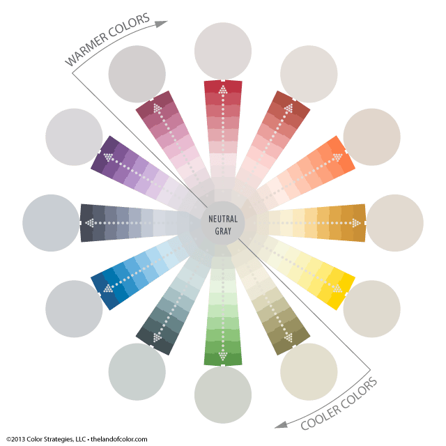
When working with near neutrals, it can be really hard to see any colorful clues that identify what hue parent the toned down, barely colorful color came from. Hue parents like the ones in this illustration, red, orange, green, etc. By the way, every single color below is a paint color from a collection that uses a formal order system complete with color notations.
We have color notations for all major brands in The Color DNA Table. Subscribe and look up as many colors as you want – you can also buy Samplize peel and stick samples right from the table!

How Does the Neutral Color Wheel Work?
On the outside ring there are 12 circles of near neutral colors. I pulled the near neutral colors from inside the wheel to the outside ring and placed them next to their hue parent so you can better see the relationship. One near neutral from each hue family.
The circles of near neutral colors are all approximately of the same value and chromaticness or colorfulness; it’s so close we can say the circles are of equal greyness. We know we can say that because each color has a notation that includes value and chroma.
Consistency in value and chroma or how grey each circle looks isn’t just because I think so, they are all within a very snug range according to the standards of their order system. The notation reads like this: hue / value / chroma. For example, the first one is 9.26 R/8.6/0.6. R = Red hue family.

Despite their hue family and color temperature, warm or cool, all 12 colors in the circles are about the same when it comes to gray scale value and chroma/colorfulness. Light Reflectance Value is different from gray scale value, and as expected, the LRV numbers are higher for warmer colors and lower for cooler colors; that’s because the spectral wavelength for each hue varies and some hues are naturally darker in value, some are naturally lighter.
Neutrals and Natural Values
The natural value tendencies might be the reason why some people think blue-greys, green-greys, violet-greys and red-violet greys look more grey than colors with hue parents from the warmer side of the color wheel which (depending on your monitor) can be seen more easily on black and grey backgrounds as you can see below; same neutral color wheel, two different backgrounds.

Much different from the white background. It is a matter of context as to why some colors might look more grey than others.
What we know from aligning the colors next to respective hue parents, along with the notation from the color order system that gives us specific information about each color, is that -independently- these colors are pretty much equal in the grayness department, no one more colorful than another.
Gray is Never Just Gray
So, the next time you think it’s just grey maybe think again. Better yet, and for the sake of color relationships and schemes, remember our neutral color wheel examples and think hue family first, grayness second.
And one more thing, never, ever compare colors to white in order to try to identify hue bias. The ideal situation is you can compare to large chips of core hue parents in a color collection. In general, a neutral gray background is best, black is second best, and white is just evil in this case so don’t do it.
Final reminder: We have color notations for all major brands in The Color DNA Table. Subscribe and look up as many colors as you want – you can also buy Samplize peel and stick samples right from the table!

I’m curious about your thoughts on the sherwin williams color Cityscape. It seems to me to be a blue gray with a smidge of green. I’d like to know how to determine a complimentary color for shutters. I am thinking Blackfox and I want a reddish door. Your color wheel tells me a reddish door might be perfect. Am I right?