Share
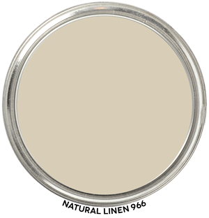
Hue Family Natural Linen 966
Here’s Natural Linen 966 by Benjamin Moore in context of its Hue Family neighborhood, 2 Y (Yellow), on The Color Strategist Color Wheel. The pink arrows point to where Natural Linen fits in among the other colors according to its Value of 8.07 rounded to 8.00 and Chroma of 1.54 rounded to 1.50.

🎨 Color Review: Natural Linen (Benjamin Moore 0966)
Before we get into real-life applications, let’s look at Natural Linen’s factual color DNA:

Colorography Overview
Brand: Benjamin Moore
Color Name & Number: Natural Linen 0966
HEX: #D5CBB7
Lightness (L): 82.1
Chroma (C): 11.2
Hue Angle: 89.2
Munsell Hue Family: 1.76Y
Munsell Value / Chroma: 8.07 / 1.54
LRV: 60
Average Perceived Color Temperature: Warm
Vibes: High Value, Faded, Grayed
How It Behaves in Real Homes
Natural Linen offers a laid-back elegance. While its name might suggest a textile-like warmth, this color reads more neutral and calm in situ. Many users appreciate its flexibility—it can soften modern interiors or complement more traditional spaces without calling attention to itself. It’s frequently described as serene and natural, giving rooms a sense of ease and lightness without being stark.
Lighting and Finish Observations
In natural daylight, especially northern light, Natural Linen leans airy and neutral, never overly crisp. Under southern sun, it can take on a slightly creamy appearance, but its low chroma keeps it understated. Incandescent lighting adds warmth, but the color retains its soothing quality. Cool LEDs and gray daylight tend to flatten it slightly, emphasizing its subtle yellow hue family. In eggshell or satin sheens, it maintains softness with a touch of polish.
Comparisons to Other Whites / Neutrals
Compared to White Dove (OC-17), which has higher lightness (93.2) and lower chroma (5.0), Natural Linen is way more colorful, deeper, and more grounded. Its hue angle of 89.2 puts it in the middle of the Yellow hue family, and White Dove isn’t too far away at 101.
Strategic Application Notes
Best Used For: Bedrooms, open living spaces, whole-home continuity, soft modern or transitional schemes.
Avoid If: You need high contrast, bold definition, or rich warmth—it’s not a standout, it’s a soft companion.
Looks Best With: Brushed brass or nickel, light oak or ash wood tones, soft white trim like Chantilly Lace, or muted blues and greens.
Final Takeaway
This is a great choice if you want a quiet, approachable neutral with a serene edge — but be sure to sample it in natural and artificial light. It’s not just a pretty color — it’s a strategic move when softness and cohesion are your goals.

