- Where Do I Find LRV for Paint Colors?
- Why is LRV for Paint Colors Important
- What is LRV – Light Reflectance Value?
- Light Reflectance Value Chart
- Does Cutting Paint Color Formulas Change LRV?
- What is the Difference Between LRV and Value?
- LRV and White Paint Colors
- Why is LRV Controversial?
- How is LRV Different from Chroma
- How Do You Use LRV to Choose Paint Colors?
- LRV and Exterior Paint Colors
- Vinyl Safe Paint Products
- How do Color Pros use LRV for Paint and Material Colors?
- How Do I Get LRV for Stuff Other than Paint Colors?
By: Lori Sawaya, Color Strategist | Albert R. Sawaya II, EE, MBA • Metrology Expert
Where Do I Find LRV for Paint Colors?
LRV is the acronym for Light Reflectance Value. LRV quantifies the lightness and brightness of a color.
The Paint Color DNA Table has LRV for all major brands including hard to find Farrow & Ball LRV and Magnolia Home LRV. It’s super affordable and the very best color tool there is.
It’s the best because you can use the filters at the top of the table to search, sort and save paint colors by LRV — as well as hue angle, hue family, chroma and value (if so inclined).
Value, by the way, is NOT the same as LRV and we’re gonna get into that in a minute.
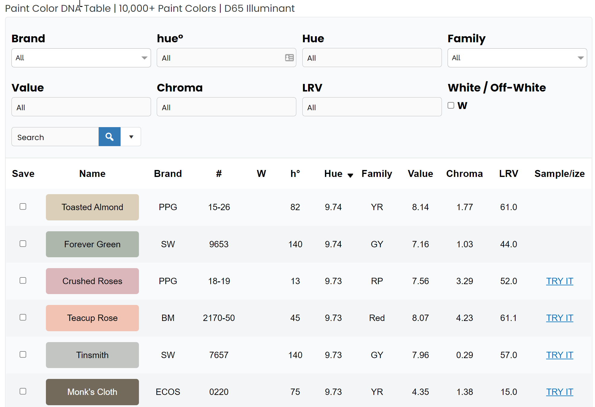
In addition to the Paint Color DNA Table, you may have noticed these three letters on manufacturer’s color specifications, on the back of paint swatches or noticed an entire column dedicated on precious few square inches of space available in the index of paint fandecks.
Why is LRV for Paint Colors Important
Paying attention to a color’s LRV can prevent poor color/paint color selections by helping you evaluate how much light a color reflects and determine how that color will contribute to the overall aesthetic and atmosphere.
Read on to learn how.
For example, choose a color with a higher LRV if you’re going for a light and airy vibe instead of dark and moody.

It works the other way as well; choosing a color with a lower LRV means the color will be darker and align better with a moodier look and feel.
What is LRV – Light Reflectance Value?
Don’t panic. No color science-y jargon ahead. I’m breaking it all down for you.
Light Reflectance Value (LRV) is the total quantity of visible and useable light reflected by a surface in all directions and at all wavelengths when illuminated by a light source. (I suggest you don’t copy and paste this definition – shouldn’t have to say that but I do. You can always look it up yourself. I referenced British Standard BS 8300:2001/A1:2005)
Simply explained: LRV quantifies the lightness and brightness of a color.
Light Reflectance Value Chart
LRV runs on a scale from 0% to 100%. Zero assumed to be an absolute black and 100% being an assumed perfectly reflective white.
An absolute black or perfectly reflecting white does not exist in our everyday terms. Approximately speaking, the average blackest black has an LRV of 5% and the whitest white 85%.
LRV is a measurement that tells you how much light a color reflects. If you do the math, you can figure out how much it will absorb too. 100 – LRV = % absorbed. Simple, right?
Again, LRV runs on a scale of 0% to 100% so 50% would be a mid-value paint color. Fifty percent LRV is the common lightness/brightness guideline for residential interiors.
Below the mid-point of 50%, and you know the color will tend to be darker absorbing more light than it will reflect back into the room. Thus, an interior lighting plan that accounts for the darker paint color should be a priority.
Colors with LRV higher than 50% will be lighter and will reflect more light back into the room than is absorbed.
I’ve considered putting this on billboards in major cities. I’m kidding (kind of).

LRV has one job. It tells you what proportion of available light a color will reflect.
That’s it.
That’s all it does.
And it doesn’t matter how much light there is. A little or a lot, the LRV is the LRV; if a color has a LRV of 55%, it’s going to reflect 55% of however much light hits it.
That only makes sense – because how could a color reflect more or less than the quantity of available light at any given time? (rhetorical question for effect)
Does Cutting Paint Color Formulas Change LRV?
Yes. The new color created would need to be measured to get its LRV. There is no way to predict how its luminance will be different from the old color.
Whenever you cut an existing formula, you are creating a new color because all 3 dimensions of color, hue, value and chroma will be affected.
Color is 3 dimensional (hue, value, chroma) and all 3 dimensions of the color will change – not just the part you don’t like.
You don’t know what part – or parts – of the color will change or by how much until you have the color mixed, let it dry and look at it. Read this blog post about why it’s not a good idea to tweak colors.
What is the Difference Between LRV and Value?
There is a difference between Value and LRV. It is not a matter of semantics, folks. You need both metrics to comprehensively evaluate a color’s lightness and brightness.
Which is why I include both LRV and Value in all the Colorographies over in The Colorography Lab and The Paint Color DNA Table too.
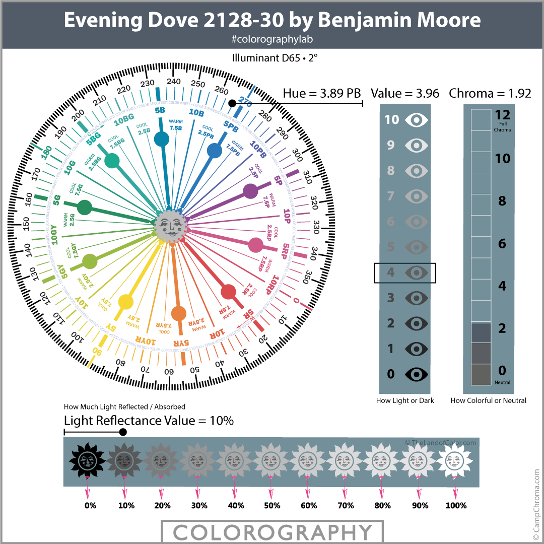
Unlike LRV, Value is not a measurement. It’s a judgement of visual lightness, how a color looks compared to a grayscale.
Here’s how it works: Value describes how the quantity of light (LRV) reflected from a surface looks compared to light reflected by black (0%), white (100%) and various steps of neutral grays in between.
Because LRV is a measurement, it flat out tells you how much light a color reflects.
Note my Value scale has eyeballs because Value indicates visual lightness, how light or dark a color looks.
My LRV scale has sun shines because it flat out tells you how much light a color reflects.
There are no coincidences here at The Land of Color. Threads of color science and expertise are deeply woven in everywhere.
LRV and White Paint Colors
News flash. Some yellows can measure up into the 80’s or 90’s just like colors of white and off-white. The proof is in the pudding as they say and colors of yellow, my friends, is all we need to prove that LRV says NOTHING about how white, neutral or colorful a color is.
For example, this statement is incorrect: “The higher the number, the more light that paint color reflects. This means that the more “white” a paint color is, the higher the number will be on a scale of 0-100.”
That is NOT what a higher LRV number means.
This is incorrect too: “Choosing a color with a higher LRV can be a challenge. Shades of white will have a high light reflective value, picking up the colors around them.”
The amount of light that a color reflects has absolutely NOTHING to do with “picking up the colors around them”
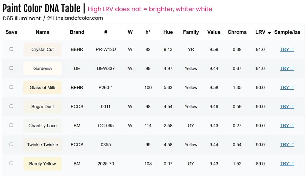
Note where Chantilly Lace OC-65 falls on the list. We pulled the most current LRV value from Benjamin Moore’s updated website.
Before you race off to the comments to tell me that so-and-so blog or so-and-so video says Chantilly Lace has a LRV of 92.2, take a look at this graphic that includes a screen shot of Benjamin Moore’s old website.
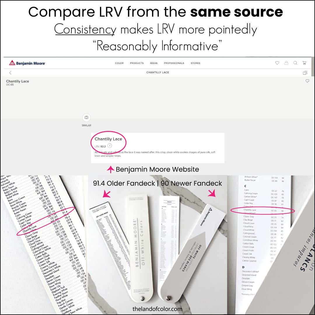
So, what the heck is up with that?
I could speculate why there are three different published LRV values for Chantilly Lace. But it doesn’t matter, kind of not a big deal, and I’ll tell you what to do about it shortly.
What I do know for sure is this is an example of why LRV is a controversial topic in color science world.
Why is LRV Controversial?
The controversy has to do with the accuracy of Light Reflectance Values. How they’re measured, the standards, the science, the math, the instrumentation, the whole LRV enchilada is debatable.
Consistency helps.
Understand that LRV is “reasonably informative” and it’s plenty accurate enough for a color design application. If you know how to use it correctly.
That goes for all color data values, not just LRV.
If LRV is critical for an application, the thing to do is get the values from a single source. Everyone in the loop needs to agree that the single source identified is the agreed upon standard. In a word, consistency.
With regard to paint colors, you shouldn’t compare LRV values from different brands and think the values are telling you minute differences in luminance. (Luminance is an umbrella term for Value and LRV)
Because they don’t. Because the values are from different sources.
Easyrgb.com is a source I recommend for lots of things but it’s especially useful for consistent LRV info for paint colors. How and why is too much for a blog post but I teach you all about that and more in The Four Pillars of Color course.
If you’re in a position where LRV matters so much that you need to identify a standard to get everyone in the loop on the same page, you should be taking my course immediately.
If you’ve learned more from this one blog post than you have anywhere else about LRV or color in general, my course will blow your mind – money back guarantee.
I have a pro tip to share right now. Instead of saying Chantilly Lace is the whitest white from Benjamin Moore because it has a LRV of 92.2, it’s better to say Chantilly Lace has a LRV in the 90 to 92 range.
Tight LRV ranges makes comparing LRV values from different brands more realistic, meaningful and useful.
Also, when Benjamin Moore updates their website with new LRV numbers (likely), you don’t have to worry about that old blog post or video waxing poetic about Chantilly Lace and its astronomical 92.2 LRV and how that means it’s the whitest of white of all the paint colors in the land.
Here’s a little more controversy. Bloggers and vloggers toss around color science jargon like they know what it means. I suspect most of them are copying and pasting the same bad information from each other — without realizing who they lifted the info from more than likely made up most of it for the sake of writing a post about LRV.
Or they copied and pasted from here and in the process of changing it around so it didn’t scream plagiarism, the mangled result is everything but correct. Simply citing a source with a link never killed anyone by the way.
There isn’t an abundance of quality science-based information out there on the interwebs about LRV written for the layperson. Color scientists write for other color scientists.
Not homeowners who are totally confused by the undertones theory, tired of the visual gymnastics trying to see undertones someone said they’re suppose see, and tired of spending money on samples..
Unless you’re digging deep into the science of measuring colors for LRV, there isn’t a whole lot to say.
LRV tells you how much light a color reflects. End of story. That’s not sensationalized enough for an exciting blog post and certainly not keywordy enough for Google.
Also, may I remind you that the science behind LRV is controversial and the few who understand why might not want to deal with the fallout. (apparently I’m feeling prepared because this is one of the longest blog posts I have ever written)
How is LRV Different from Chroma
Here’s another problem. Many conflate LRV with Chroma and attempt to apply LRV values to describe how strong or weak a color looks. Some refer to it as more white or gray, clean or dirty, vivid or dull, bold or muted, etc.
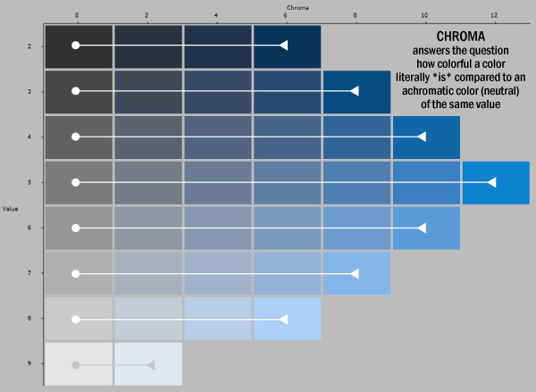
Don’t worry, I’m going to make sure that’s not you and that you know how Chroma is different from LRV. >>> When you’re done here, go read this post where I explain why Chroma is the correct way to talk about how strong or weak a color looks.
Saturation and intensity also speak to the colorfulness dimension of color but when we’re talking about paint and material color, Chroma is the better term to use. Not saturation. Maybe intensity (ish). And – for the love – absolutely not LRV.
One of the biggest mistakes I see with LRV is assuming that it’s some kind of safeguard against choosing vivid, gaudy colors. Homeowner Associations (HOA’s) are the most confused about this.

Let’s talk about yellow again. Choosing a yellow that is too strong and vividly assaulting is a common mistake.
People choose a yellow from a small chip thinking they’re going to get a color like a stick of butter but instead they end up with crime-scene-tape-yellow. LRV won’t prevent that from happening. You know what will?
Chroma. Seriously, go read the article.
If you’re on an HOA and here trying to figure out how to make LRV work for your community, call me.
How Do You Use LRV to Choose Paint Colors?
Benchmarks.
When sampling paint colors, pay attention to Light Reflectance Values as you try different hues, tints, tones, and shades. Use LRV as a framework to map out lighter and darker; track what you like or don’t like about the paint colors you’re sampling.
It will help you define what’s too light or too dark so you can zero in on the right color.
LRV and Exterior Paint Colors
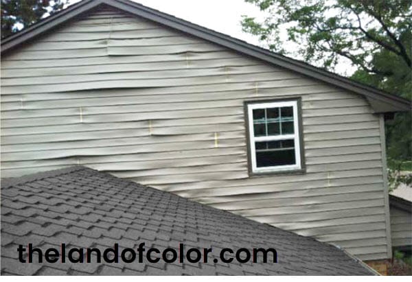
This one is a big one. You need to read color specifications for exterior products. For example, vinyl siding. Painting vinyl siding with a color that has too low of an LRV, that absorbs too much light and energy and thus retains too much heat, could result in warped siding.
All exterior products have color specifications. Siding, windows, doors, garage doors etc. have color specifications that states a requirement of paint colors with an LRV of (some #) or higher. It’s usually in the range of 55 to 65.
The pros at your professional paint store can advise about product and process to use. (More about this coming up.)
If you do not use one of the specially formulated products, you are limited to a paint color that is within the same tight LRV range as the original color. Or, best case, the warranty is voided. Worse case, your house ends up like this. ^
The owner of this house called because they were in process of suing everyone involved. The key issue was someone thought specifying a custom color for an exterior was a grand idea.
Custom colors exterior are NEVER a good idea.
Stock paint colors have LRV notated from the manufacturer. Custom colors don’t. And that’s why they needed my help; they needed to find out how to get the custom color measured in order to prove that it was too dark and caused the original pale yellow siding to do this.
Since I designed an LRV app for the Color Muse and have written extensively about it, I get several phone calls every year from attorneys who have been hired by homeowners who had vinyl siding, windows, etc. painted and the result is what you see here – unfortunate twisting and warping. Painting windows black has been a trend lately and it’s a problem.

Many cases over the years involved free color consulting either from the painter or paint store. The consultant didn’t know about LRV and specified a stock color that was too dark.
The really messy ones are when the consultant who doesn’t know about LRV specifies a custom color that hasn’t been measured for LRV or light fastness.
Custom colors exterior are a bad plan as mentioned. Namely because if something goes wrong, you have to send colors off to a certified color lab to be measured by a color $cientist.
Which is why I’m obnoxious about telling people that stock colors mixed in their home product line is smart and custom colors are a bad plan.
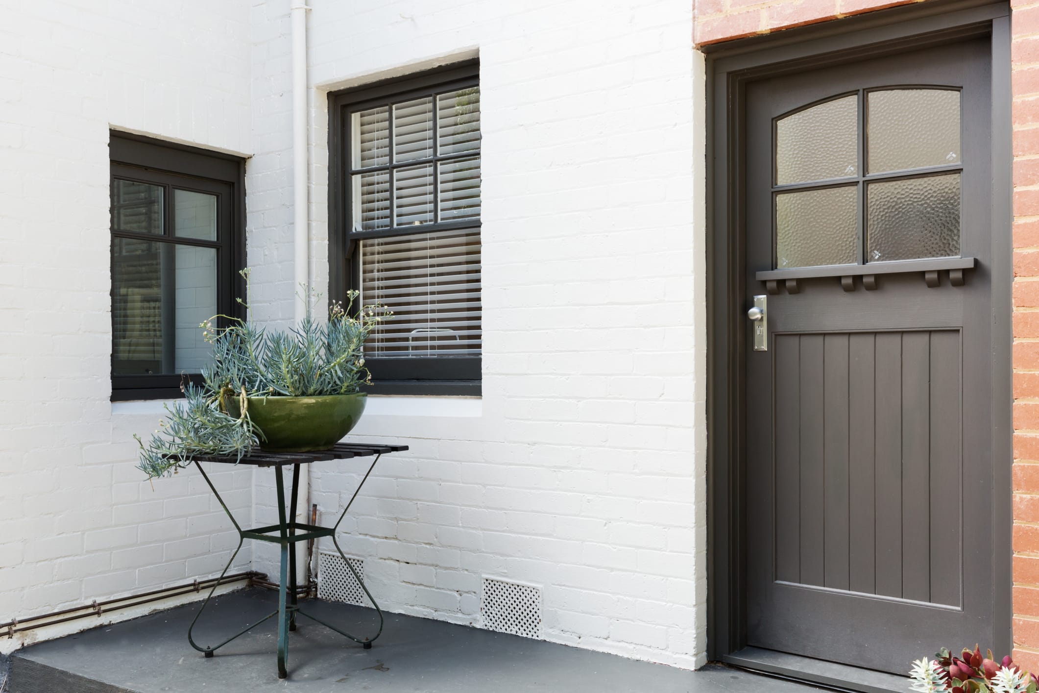
Word of caution, don’t start painting your white vinyl windows black without doing some homework.
Vinyl Safe Paint Products
Some paint manufacturers have developed special formulations for painting heat-sensitive exterior surfaces. The color palettes are pretty good and you should be able to find something that works.
Sherwin-Williams has VinylSafe Paint Colors. Here’s the VinylSafe color palette.
Benjamin Moore used to have a specific product for vinyl called REVIVE. It’s been discontinued and they’re recommending their Regal line for exterior vinyl. Check with your paint store pro for product and color guidance. Here’s a link about their Colors for Vinyl.
How do Color Pros use LRV for Paint and Material Colors?
Color consultants, architects, and designers use LRV data in several stages of color planning.
From a sustainability point of view, a wall color with a higher LRV supports lighting plans by helping to propagate daylight deep into the space. Thereby reducing the standard number of lighting fixtures required to enable employees to efficiently and safely perform their tasks.
Many more examples can be found in the workplace. Careful planning for proper visual ergonomics is paramount in color design. From individual work surfaces to the outside walkways, ramps, hand-railings and everything in between.
LRV is an instrumental measurement ideally captured with a sphere-based spectrophotometer using a D65 illuminant and 10 degree observer. The measurement is the proportion of visible light reflected by a stimulus (colored surface) weighted for the sensitivity to light of the human eye.
Examples of regulations and codes of practice to reference are BS 8300:2009 and BS8493:2008 + A1:2010.
In general, standards say there needs to be a set amount of LRV contrast between certain elements in the space for the purpose of visual ergonomics. Adequate LRV visual contrasts help people who are visually impaired navigate their environment – because they can (generally) pick up light and dark contrasts.
If you have normal or near normal vision, hue and chroma (color intensity) provides the visual cues you need to safely navigate through a space. It’s different for people who are visually impaired; their initial point of reference is light vs. dark and that’s sensed via the amount of light reflected from colored surfaces – which is exactly what LRV quantifies.
Different standards have different definitions of what the ideal visual contrast ratio between colored elements should be and how to get it.
What’s known as the American Contrast Ratio formula is: (B1 – B2) x 100 / B1, where B1 and B2 are the LRV of the lighter area and darker area, respectively.
The average target contrast ratio is 70% between colors. Again, there are different standards for what defines the ideal contrast ratio and how to calculate it.
How Do I Get LRV for Stuff Other than Paint Colors?
There are a few different options. Too complicated to cover in a blog post but we dig into all the detail in The Four Pillars of Color course on campchroma.com. Sign up. I’d love to welcome you into our mighty Camp Chroma tribe of Color Strategists.

A very clarifying explanation, Lori. In NCS System’s notation this is noted another way, but I think this is the same concept. I hadn’t thought about LRV as a helpful concept to lighting design.
I see you have my blog in your blogroll, I hadn’t noticed. So thank you very much, I’m honored!
Oh my pleasure to share your link with the tribe here on Color Budz, Isabel. Love connecting color friends and including blog links is a great way to do that.
NCS does speak to it a lil differently. The NCS is so cool – love how they deconstruct color and explain it. So smart.
Excellent article Lori! Will bookmark this for future reference. I am no color expert so every time I try to explain the difference between value and intensity, clients look at me like I have a third eye. Your explanation is way easier to understand!
xo
amanda
Thanks, Amanda. We’ve talked color before, AB, and I’d say you do pretty darn well with the topic! The podcast we did on lighting is awesome and still gets tons of downloads so others must agree with me!
As you say, NCS explains a lil differently,so your explanation is the complement that helps me to put all together. NCS notation really helps you understand components in “that” specific hue. I train my eye by watching color chips, trying to notice undertones and then analyze and contrast with the information given in the NCS notation.
Thanks again!
This is great Lori. An aspect of the color consulting process that isn’t always widely understood. It is helpful to have a source that explains LRV in succinct terms.
Remember that book writing idea! Great Stuff!
lol! Yes, Debra, I do remember your suggestion of my writing a book. In addition to being an incredibly talented artist, you are also a smart and successful businesswoman – I need to take your advice and put action on it! Thank you for commenting.
Really succinct post on an great topic. Interestingly, one of our National Galleries in Edinburgh has just painted one of its rooms in a deep charcoal, I suspect to lower the LRV possibly to protect the prints?
I’m still confused on how to actually use the LRV factor. I guess you have to already know what value you like or want in your space or, say, what an 80% color looks like in there to be able to gauge whether the potential colors you’re considering are a good fit for what you’re after.
I had no idea LRV was simply referring to a color’s VALUE!
Enjoyed your article!
Hi Nancy,
There are two significant ways to use LRV:
Once you get used to referring to LRV it helps you assess color. Many color order systems use numbers similar to LRV. They’re called notations. LRV is a form of a color notation that is universally used among all paint brands. Understanding notations, including LRV, means you can read the numbers and have a sense of the color without even seeing the chip or a sample.
Paying attention to LRV as you go thru the color selection process can help you zero in on the right color. For example, if you’re consistently attracted to the colors in the 40% LRV range, that’s a benchmark. You’ve established that colors in the 40% LRV range is what you’re gravitating to so you can move on to making decisions about other characteristics – like the specific hue.
Thank you ! helped with my course work
Hi, Lori very useful information helped me a lot! I just need to know when was this page last updated? I need this information ASAP for my bibliography for coursework thanks:)
Thank you so much, it will help.
Sorry to be a pest but, do you have any information about the Solar Reflectance Index and how it is used to design buildings by any chance?
First thought is LEED, second is the roofing industry, third is concrete and asphalt color control, and I’m sure there are more.
It’s important to mention that LRV is different from TSR, Total Solar Reflectance. Here’s an advanced quote from my book on LRV that explains the difference.
“LRV is a measure of light wave radiation in the visible spectrum. There are light waves that are not in the visible spectrum like infrared. Infrared contributes to heat build-up too and it is measured and
calculated separately from LRV. Total Solar Reflectance, or TSR, includes the visible, infrared, and ultraviolet wavelengths. TSR indicates how much total energy is reflected.” ~Lori Sawaya
Okay, I think I get it. Thanks again Lori:)