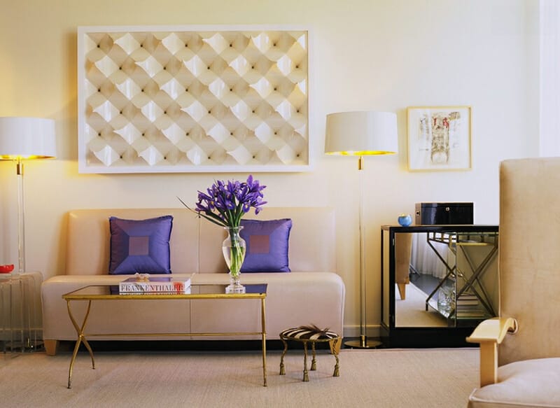
Saw this room by Interior Designer, Jan Showers and noticed how nicely it demonstrated what to do with colors many refer to as beige.
From a Color Strategist’s point of view, the colors in this room are near neutrals from the red, yellow-red, and yellow hue families. A color strategist’s insight about the use of color in this room would go something like this:
“The designer of this room created a human supportive environment using a range of near neutrals from the red, yellow-red, and yellow hue families. The color relationships are technically correct without being over-designed or contrived. It looks effortless. It’s harmonious, easy on the eyes and spirit.”
If you’re faced with a clashing combination of yellow and pink beige and are not sure how to work with it, one solution is to fill the gap between the two conflicted hue families. Fill the gap with a near neutral from the yellow-red hue family. Create a color scheme constructed of a range of near neutrals from neighboring hue families like was done in this room.

It’s important to speak to color in technically correct terms and this is a perfect example why that is so. By acknowledging that the clashing near neutrals involved are from the red hue family (the pink beige) and the yellow hue family (the yellow beige), we can plot the colors on a color wheel. When we plot the colors on a color wheel, we can see that the two colors, pink and yellow beige, are only one color apart. Which means the color geometry is off and the two fall short in terms of forming a harmonious color relationship.
By studying the color wheel, the answer is obvious. Fill the void, fill the gap, add what’s missing to create a balanced color scheme. In this case, that means a near neutral from the yellow-red hue family will round out the color scheme and create harmony among all three near neutral colors. To summarize:
- The reason why you want to identify hue family is so you can plot the color on a wheel.
- You want to plot color on a wheel according to its hue family because color wheels exhibit relationships for you.
- Color harmony is derived from color relationships.
- Harmonious colors make up pleasing color schemes.
- Everyone wants harmonious color schemes.
Ultimately, the goal of color design is pleasing color schemes and relationships. You reach that goal by relying on objective systems that measures, plots, and organizes so that color is consistently reproducible, repeatable, and most importantly controllable.
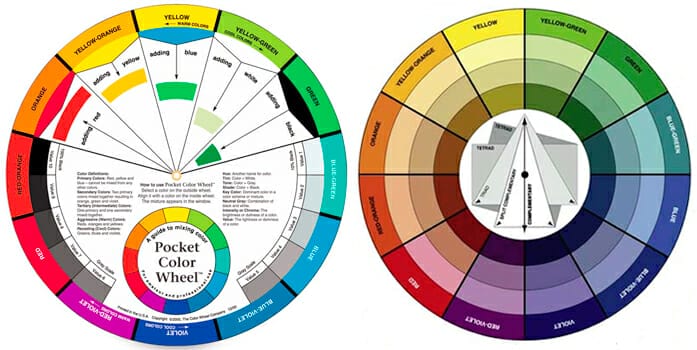
Now, a word about color wheels. I custom make the color wheels I use because common color wheels are not designed to answer color questions like what to do when you have a set of near neutrals that aren’t harmonizing. Or in other words, “What do I do if I have a boatload of beige and it looks ugly?”

The most popular color wheel is the one above and its primary objective is to demonstrate color mixing strategies; it says right on the front “A guide to mixing color”. Basic, emphasis on basic, color harmonies are shown on the back. The outer ring is the labeled hue parents, the next ring in is tints, next in is tones, the last ring closest to the white center contains shades.
People like to bash color wheels and say they aren’t useful. And I agree but not for the same reasons. Color wheels are useless to those who don’t understand how to use them. So, if you aren’t going to take the time to do the work necessary to learn about color wheels and how they function, then you should ignore them. You should keep on winging it, flying by the seat of your color intuitive pants, relying solely on your “eye for color” because color wheels are powerful design tools and in underinformed hands, they become a weapon of harmonious destruction.
What many don’t know about color wheels is that they are like infographics. One could argue that they were the first infographics. As infographics, their purpose is to summarize and represent a broader color concept. A color wheel can represent the following:
- a color theory
- a color mixing method
- a color system
- a color space
- color relationships and harmony
- and more
I created this color wheel below so I could illustrate how color relationships and harmonies work with near neutral colors. Near neutral colors are muted colors and chromatic grays.
If you understand hue families, creating harmonious color relationships is easier than fallin’ off a log. But you have to know how to properly identify and categorize color. Every color belongs to a hue family and it doesn’t matter if it’s a barely-there color or a vivid one — the geometric laws of color harmony apply to each and every color. The key is knowing a color’s hue family. It can be difficult to determine what hue family a color belongs to especially if it’s one of those shifty muted grays or a barely-there chromatic gray with hardly any discernable hue.
The good news is you can quit guessing! You don’t have to just eyeball it. The science of color, also known as colorimetry, is the answer to how to objectively determine not only a color’s hue family but other dimensions of color like value and chroma. Nothing’s hidden or under anything or clandestinely coded in a paint color formula. Colorimetry is clear, consistent and straightforward with zero amounts of confusing color-double-speak.
If you want to learn how to create color schemes like a color strategist, then sign up for the next Camp Chroma Online Color Course. You’ll learn about hue families and so much more.

Hi Lori,
Many homeowners ask how to downplay a perceived hue in a neutral paint color. For example, a greige that looks too gray and not beige enough. One suggestion is to add accessories in a color that is more gray so the eye will perceive the wall color as less gray. Any truth to this?