
Why the Definition of Greige is Hard
You’ve probably heard greige described as “cooler than beige but warmer than gray.” Sounds helpful, right? Not so much. It’s actually pretty confusing.
Colors like beige and gray can mean different things to different people. Plus, terms like “cooler” and “warmer” can be really subjective because they depend a lot on context and what you’re comparing them to. This kind of vague talk leads to lots of different ideas about what greige should look like.
Cooler and warmer is a matter of context; this blog post will help you understand why psychological color temperature can’t be determined without comparison.
Why Greige is So Tricky to Pin Down
What I think of as beige might not be what you call beige. And the same goes for gray.
Understanding that subjective color opinions don’t scale beyond one’s own head is one of those things you know for sure when you have a lot of experience working with people to help them choose colors.
Because when you listen to people describe how they see color, you realize how impossible it is to get everyone on the same page about what color names like beige, gray and greige should look like.
In other words, I could gather together a dozen paint chips for each color word. Lay them all out on a table separated into the three categories – the way I think the colors should be categorized.
You would organize the chips differently than me. For example, you’d feel that some of the colors I categorized as beige were too gray to be beige, etc.
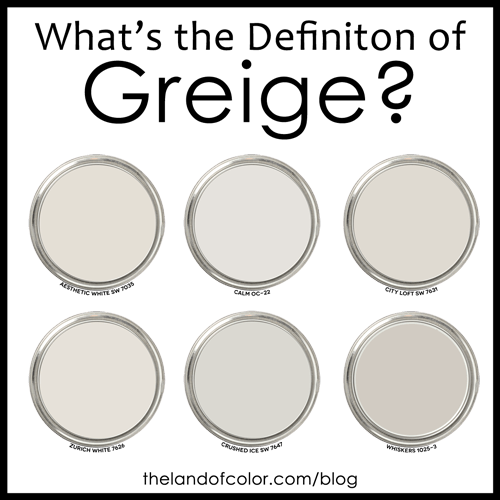
A Look at Popular Greige Colors
- Sherwin Williams: City Loft SW 7631, Aesthetic White SW 7035, Zurich White SW 7626, Crushed Ice SW 7647
- Benjamin Moore: Calm OC-22
- PPG: Whiskers 1025-3
These colors span a range of mixes between beige and gray, each bringing its own flavor to what might be considered greige.
Finding Your Perfect Greige
Ever tried all those greige colors everyone raves about online and still felt none of them were quite right? That’s because they don’t match your personal idea of what greige should be. That’s where the Color Strategist Color Wheel (CSCW) comes into play. By figuring out the hue family that matches your vision of greige and adjusting for your room’s lighting and decor, we can find your ideal color.
It’s kind of crazy. Because it’s such a simple solution – it’s just a matter of asking what do you think the perfect greige looks like since none of the examples you found online are it.
Then, using The Color Strategist Color Wheel, (CSCW) we simply figure out the hue family for your idea of the perfect greige. The next part is pretty straightforward. We just tweak the shade to get it just right for your room’s lighting and vibe. And here’s where The Paint Color DNA Table really shines. It’s hands-down THE go-to color tool for fine-tuning the color until it’s spot on. It’s the fastest and easiest way to make sure the greige you pick fits perfectly with your space, making the whole process pretty much foolproof.

Straight Talk About Color
In my 25 years as a color expert, I’ve seen that many people view greige as those light near-neutral, barely colorful grayed-down colors that pop up in just about every hue family—red, yellow, blue, pretty much the whole range.
Lots of times I wouldn’t describe their idea of perfect greige as greige but it doesn’t matter. Because trying to convince them that my idea of greige is right and theirs is wrong is pointless.
I know I’m not going to change their mind. As soon as I stop shuffling paint chips in front of them pointing to the colors I say are greige, they’re going to go right back into their own head and think about greige the way they always have – and that’s perfectly okay!
Demystifying Color with Objective Notations
When it comes to talking about colors clearly, nothing beats using objective color notations like Munsell’s hue, value, and chroma. This approach cuts through the confusion of personal color perceptions.

For example, take a look at the Colorography for Benjamin Moore’s Classic Gray in The Colorography Lab. A Colorography basically sketches out a color’s Munsell hue, value, and chroma. It’s a quick-look tool that features tangible color attributes – attributes that you can easily tweak using The Paint Color DNA Table.
If you want to test Classic Gray in your space, I recommend Samplize Peel & Stick samples because they’re decals and made with real paint.
Last but certainly not least, if you want to learn more about the color notations and systems that professional color experts use, check out my color trainings. The Four Pillars of Color would be the perfect course for you to learn how color really works.
Your thoughts on what makes the perfect greige are important, and they’re key to finding the right shade for you. Drop a comment below or share a color you think nails greige.
I chose Eider White, hoping it would be a nice greige. Instead, I have purple cabinets now. lol. I see it, terribly. However, no one else does. It is often pinkish purple. I hate it. My entire house is Eider White and it is the exact color I expected, OTHER than on my kitchen cabinets. I am attempting to use the DNA table to find a trim and ceiling color that might help with these purpleish/pinkish tones I see. The ONLY thing different in my kitchen, where I am seeing the purple/pink is, I used SW Dovetail on the lower cabinets. I do not have dovetail in any other room. However, both Eider White and Dovetail are from the Yellow family. I have not loved the dovetail from the first cabinet door. I think I have just realized why. The chroma is so similar, I do not think its offering enough contrast for me. Am I on the right track or am I in color left field?
I am clearly NOT a color expert as I am begging Lori’s help below with my own situation, but I offer the suggestion that maybe if you tweak your lighting to either more yellow or more white it might help diminish the pink tone? Not sure but maybe worth a try?? You know how light drives us crazy when picking colors maybe it can be an ally for you! Good Luck!!
Not out in color left field. You’re right. Eider and Dovetail are very similar. Biggest difference is Value, Dovetail is darker.
Colors that have the same or similar Chroma like Eider and Dovetail technically go together; because they relate in terms of Chroma. A color similar to Dovetail with less Chroma, one that’s more neutral, might have given you a stronger sense of contrast and the look you’re after.
As far as why Eider is flashing pink/purple, that could have a lot to do with the product, gloss level used on the cabinets IN ADDITION to the inherent quality of light and how it hits the cabinets differently from the product and finish on the walls.
I want BM Classic Gray for living room, but I want a lighter color that will transition into my kitchen with pale gray cabinets. I have White Dove as my trim color. HELP!
Okay so I rode the train to greige…specifically Elephant Breath by Ball and Farrow. Now I have a painter coming in two days and I don’t know what color to do the kitchen walls. Help!!
I do not want another grey or brownish color due to adjoining rooms – I feel it would be overkill. I am thinking a pale blue or aqua. Please help. I am really in a time crunch here. The tile and counters are white.