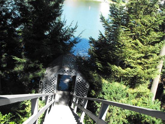
I consulted virtually with Paula Doelling-Lynn on this project for the Jenks family in Indiana. The house was built in 1985 and it’s approximately 3,700 sq. feet. Can you believe this amazing backyard? All the decking will be refreshed with new color too.
Original view of the front of the house. Spectacular tree line makes for the perfect, nestled and homey setting.
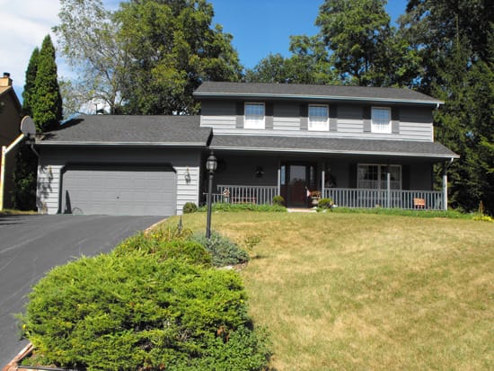
I hopped on a conference call with Paula and Joy so we could do a virtual color consultation and work out the color details for some virtual views. Before I could add color and send the virtuals via email, I had to prep the original photo first. Streamlined photos make for the best virtuals.

First idea was a palette using a dark value olive green and amped up contrast with deep plum-red shutters – a significant shift from the existing light, neutral grays.
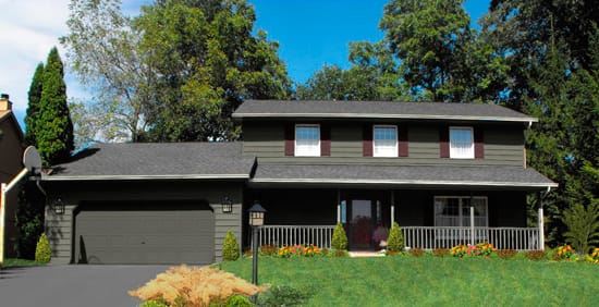
Since Carl’s preference and tolerances were geared toward a lighter palette we tried on a slightly lighter and warmer green and lesser contrast overall.
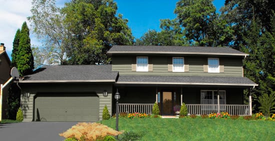
For comparison and as an alternative view moving even lighter in value, Paula suggested I virtually paint a lovely Sesame color on the body and pop in some interest with soft green shutters.
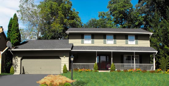
The power of virtual color is undeniable. It’s an amazing color tool. Here’s a tip for making those color visualizer and paint programs a bit easier to manage: Use the zoom tool. Zoom is your friend. This is the final virtual rendering submitted.
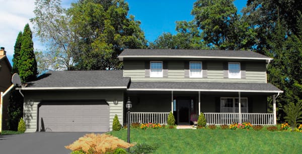
And here’s the “after”. Body color is Smoky Slate 511-5 by PPG – grab a Samplize of it here.
Trim is Capitol White CW-10 by Benjamin Moore – grab a Samplize of it here.
The shutter and garage color were custom but Kendall Charcoal HC-166 is similar – grab a Samplize of it here.
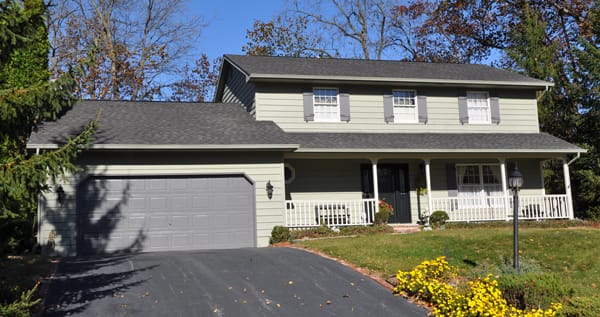
Note: Color varies monitor to monitor because color is device dependent. You should always get chips and test color.

How beautiful are these. Lori, you fascinate me. Architectural Paint Color Expert Extraordinaire, Graphic Design Guru, Creator/Producer of Color Budz, and Inventor of Virtual Prints Plus ‘Before + After’ – Love it and I know Joy and Carl Jenks love it 2. Can’t wait to hear their final choice.
Great virtual views of all the potential colour combinations. My favourite is the dark grey — I think it would look fantastic with an orange front door. But maybe that’s a bit too bold if the homeowners prefer lighter colours!!
Kelly
Kelly, I think the virtual you’re talking about is actually a deep olive green. I edited the post to be more clear about the color varies monitor to monitor hoo-ha.
Thanks so much for popping in, always glad to see you and your comment was very helpful.
Thanks, Paula. You’re always so encouraging and supportive – to not only me but many others in the paint and color industry!
I love this post! The garden/lakeside view is lovely; what a great project to have. My first inclination would have been to start with green, too, mostly because I love greens, especially when layered and those tall trees add a great backdrop.
Interesting story of progression; listening to the podcast as we speak – good point about the colour Lavender & it’s light reflective qualities…
What a beautiful property! Looks like a fun project…and your renderings are so crisp and clear to read. Not an easy task! Agreed – zoom is definitely your friend! Very curious to see which direction they will head.
Thanks Heather and Kelly. 🙂
Paula took the picture and she did a great job. The quality of the virtual hinges on the quality of the original picture. Good pic = good virtual.
Jake, my oldest, says the decorative grass in the foreground looks like a mustache. That cracked me up ‘cuz I think I agree with him! Definitely coulda made a better choice for plantings in that area. Obviously I am not a landscape designer. :0
Your first hunch to go with the dark olive is stunning. I, too would like to see an orange door. What are those color numbers by the way? And where is this house located?
EB, The house is in the Valparaiso, Indiana / Chicago, Illinois general area. The colors suggested and ultimately spec’d are all Pratt & Lambert. Cabot’s will be used for decking.
Here’s how the body colors shook out starting from the top: Randolph Olive CW809, Whale 14-25, Sesame 12-26
I’ll ask Paula what she thinks too. Give me a minute…
I’m working with ya Lori on this one in Lawrenceburg, Indiana. This is gonna be HUE-RIFFIC 2. We’ll have a response super soon with colors and product referrals!!
Thanks, PDL. Linda, we’re working on it.
Thank you Lori and Paula!
When my husband announced we needed to get our house painted, I decided 2010 would be the year to finally select a new color scheme – after 25 years as a bluish-Colonial, it needed a fresh look. Since my husband, Carl, mentioned in the late evening and mid-to-late Fall I knew that I had to get hopping on a color scheme before he contacted our painter. My first thought was to get online and surf the web for great color photos of Colonial houses. Hours later I became very discouraged as I couldn’t find a reputable website that provided different styles of homes with optional color choices.
I knew that I could count on Doelling Decorating Center, Inc. in Valparaiso, Indiana. Paula Doelling-Lynn had helped me with creating a scrumptious color palette in our Valparaiso home and our condo in Alexandria, Virginia. She was the ticket to our ‘new look’ – We contacted Paula to get our desired palette. Paula told us she had recently partnered with Lori Sawaya, Color Strategist extraordinaire!! We found ourselves a fit. Lori explained she would send Carl and I some choices of ‘virtually’ painted homes with the colors she and Paula professionally recommended via conference call. It was amazing because Lori virtually mixed Pratt & Lambert “Williamsburg” colors on photos through a ‘virtual color program’ she developed.
The virtual color process and conference color consultation was really exciting and affordable –(you won’t believe it, but my husband actually got involved in the process!). Carl and I highly recommend Paula and Lori’s color process and significant knowledge – they are exceptional color professionals.
Paint chips, brochures, and even large paint samples really do not help the customer — I find these items fun, but not really useful. Small paint jars and getting quarts of paint really didn’t cut it for Carl and I. On the other hand when you find a sharp color business like Color Complete, you need to look no further.
We’re so thankful to have worked with Lori and Paula!! Their service is smart – their color knowledge and professional delivery is remarkable. The project’s almost done. We’ll send you completed photos soon — “It’s to die for!”
Thanks again girls!!