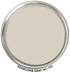
Hue Family Edgecomb Gray HC-173
In context of its Hue Family neighborhood, 2 Y (Yellow), on The Color Strategist Color Wheel. The pink arrows point to where it fits in among the other colors according to its Value 8.24 rounded to 8.25 and Chroma of 1.06 rounded to 1.00.
🎨 Color Review: Edgecomb Gray (Benjamin Moore HC-173)
Before we get into real-life applications, let’s look at Edgecomb Gray’s factual color DNA:
Brand: Benjamin Moore
Color Name & Number: Edgecomb Gray HC-173
HEX: #D7D0C2
L (Lightness): 83.7
C (Chroma): 7.9
h° (Hue Angle): 90.0
Munsell Hue Family: Yellow
Munsell Value / Chroma: 8.2 / 1.06
LRV: 64
Vibes:
Near Neutral, Low Chroma, Soft
How It Behaves in Real Homes
General Vibe / Emotional Impressions:
Edgecomb Gray feels soft, calm, and grounded. It’s one of those “just right” neutrals that doesn’t scream for attention but creates a warm, welcoming backdrop.
Popular Rooms / Surfaces Used:
Frequently used in open floor plans, entryways, living rooms, and kitchens — especially when paired with natural wood tones or creamy whites. Homeowners often choose it to create a connected, flexible color story across multiple rooms.
Standout Testimonials or Patterns:
Designers say it has a “putty-like” or “stone-washed linen” feel. Users report that it rarely reads “gray” in the traditional sense — it’s more of a soft, earthy greige that shifts depending on the light.
Lighting and Finish Observations
Natural Daylight:
In north-facing rooms, it can feel more muted and shadowed, emphasizing its gray side. In south-facing light, the yellow hue family emerges softly, lending a gentle warmth.
Warm Light (incandescent/sunset):
Takes on a cozy, beige-like warmth. Can lean more traditional in vibe, especially when paired with warmer woods or creamy trim.
Cool Light (LED/overcast):
Edges slightly cooler, but rarely turns cold. May look slightly grayer, but remains balanced.
Sheen Effects:
Flat and matte finishes give it a chalky, soft appearance. Higher sheens can highlight subtle undertones and cause shifts, especially near reflective surfaces.
Common surprises or “gotchas” to watch for:
Despite the name, it’s not a classic gray. It can look unexpectedly warm or beige in some lighting. If paired with truly cool grays or whites, it may appear “muddy” by comparison.
Comparisons to Other Whites / Neutrals
Compare to BM Revere Pewter:
Revere Pewter is darker, more chromatic, and has a green undertone from the Green-Yellow hue family. Edgecomb Gray is lighter, softer, and more flexible.
Compare to BM Balboa Mist:
Balboa Mist leans cooler and sits in the Yellow-Red hue family and can shift and show up purple-ish. Many report that Edgecomb Gray feels warmer and more grounded.
Compare to SW Accessible Beige:
Accessible Beige is deeper and reads more brown, while Edgecomb Gray has a lighter, more ethereal quality with more yellow-based warmth.
Position on the spectrum:
Warm–neutral, slightly earthy. Firmly in the muted–soft quadrant rather than bright or crisp.
Strategic Application Notes
Best Used For:
Creating continuity in open concept spaces. Pairs well with medium oak floors, greige stone countertops, and white trim. Ideal when you want something grounded but not heavy.
Avoid If:
You need a cool gray or plan to use crisp blue-white trim — it can look too warm or “off” in that context.
Looks Best With:
Paint: BM White Dove, BM Simply White, SW Alabaster
Countertops: Creamy quartz, light granite, warm marbles
Flooring: Mid-tone woods, travertine, pale oak
Fixtures: Aged brass, antique bronze, muted black hardware
Final Takeaway
Edgecomb Gray is a great choice if you need a neutral that plays well with warm finishes but doesn’t dominate the space. But be sure to test it in different lighting conditions — especially near bright whites or cool grays. It’s not just a soft color — it’s a strategic anchor when you want warmth and sophistication without going beige.


Hi Lori! Could you please tell me the difference between Edgecomb Gray and Natural Cream other than EG being slightly darker?
Hi Lori,
The Paint Color DNA Table is a great resource for comparing colors. This is what the comparison looks like in the Table.
