“We have only 11 unambiguous colour terms in English: White, Black, Grey, Yellow, Red, Blue, Green, Brown, Pink, Orange, Purple.” ~Berlin & Kaye Research 1969

This concept has been debated many times by a boatload of very smart people since 1969 and was revisited by the World Color Survey:
Recently the World Color Survey, a large-scale replication of Berlin and Kay’s experiments for which data has been collected from 110 pre-industrial societies, has reconfirmed the universal character of color categories (Kay & Regier, 2003; Kay et al., 2003; Regier, Kay, & Cook, 2005).
In summary, the centres of color categories of most cultures tend to fall in approximately the same positions; these are the positions known in English by the basic color terms black, white, red, yellow, blue, green and so forth.
A straightforward explanation for this universal character is that color categories are innate.
They are in a certain sense “hard wired” in the human brain. One view is that the categories are directly genetically encoded, and that every human being possesses a fully fledged repertoire of color categories, even though not all categories might be lexicalized (Rosch-Heider, 1972).
More subtle innatist accounts argue that certain neurophysical structures might be responsible for universal color categories.
Indeed, humans are a trichromatic species, meaning that anyone with normal color vision has the same three types of color-sensitive receptors in the retina.
Or, humans invariably process color in an opponent manner, placing white against black, blue against yellow and green against red. These shared neurophysical properties of color perception could possibly explain the shared categorization of color.
Source: Adaptive Behavior | First Published December 1, 2005 | Tony Belpaeme and Joris Bleys
I agree we all came pre-programmed (if you will) with an innate color sense and are naturally compelled to name and order color.
Without an established color order system, it is my opinion that once you get past a basic set of color terms, it becomes a hot mess of arbitrary, inconsistent, fussy and nonsensical color names.
Which is why I find words like beige, greige, khaki, putty, and sometimes even gray loosely descriptive – at best.
Unlike “pink” and “brown”, for example, they don’t say anything specific about color properties or what color sensation it is the person using those types of color names is experiencing.
In general, pink associates with light red and brown associates with dark orange and/or a mixture of hues. Known general color associations generally do a good job communicating the idea of a color to most people. . . in general. 🙂
Think about a box of crayons. While all the colors in the big box of 64 are fun, the basic eight are easier and more concise; I wonder if that’s why they are teacher preferred?

As a color consultant, when the loosely descriptive color names start to fly, I have to amp up the listening skills in order to hone in on what it is exactly the person means when, for example, they use the word “beige”.
Because unlike pink or brown, beige is all over the place and can mean pretty much anything. But, hey, that’s my job.
I’m the color expert and I’m supposed to know the difference between arbitrary color names and the orderliness of color systems. And it is indeed a stark comparison between arbitrary color names and ordered color systems and their identified hue families.
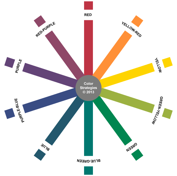
Each color order system identifies its own core hue families. The International Standards Organization recognizes four order systems: Munsell, NCS (Natural Color System), DIN 6164-2, and OSA-UCS.
I’m most familiar with Munsell and NCS and it’s interesting how their core hue family names align with Berlin and Kaye’s 11 color terms:


Both Munsell and NCS are based on human percepts of color but they differ. I teach you all about color systems like Munsell and NCS in my Camp Chroma Color Training program. Click here to learn more about becoming a certified Color Strategist.

I think color terminology, while great for pros, is very tough for most people. Over time, the thing I’ve found easiest in terms of communicating for my blog — though certainly not very accurate for your purposes especially given the differences in perception — is, odd as it may sound, food colors. If you say strawberry red, that’s clear within a certain parameter. Blueberry. Lemon vs saffron yellow. The beiges and grays are tough. And people don’t understand gray at all. I don’t envy the task when you don’t have a client who can’t “see” something. But they do need you!
Nice article about color names. As a local house painter myself, I did not realize I needed this refresher for mysef.