Here’s the Truth About Material Standards — and Color Strategy

I’ve been specifying exterior color 20+ years. I’ve analyzed thousands of homes across the country, collecting color data and working one-on-one with homeowners, designers, and contractors.
One thing I’ve noticed consistently?
Some older white vinyl windows — especially those from the 80s and 90s — still look crisp, bright, and clean.
Meanwhile, some windows installed just 10 years ago already show signs of succumbing to the weather: chalking or general wear.
If you’ve noticed it too, you’re not imagining it. Here’s what’s really going on — and how it impacts your exterior color strategy.
🔬 It’s Not the Weather — It’s the Materials
White uPVC windows are only as durable as their formula.
Older windows were often over-engineered. They used virgin PVC, higher loads of titanium dioxide (TiO₂) for UV protection, and thicker co-extruded outer layers designed for long-term performance.
Today’s mass-market windows?
Many are designed to hit a price point, not a legacy. That means:
- Lower-grade or recycled PVC
- Less TiO₂
- Thinner protective layers
- Fewer UV and heat stabilizers
And that shortcut shows up on the surface — literally.
🧭 How White Windows Complicate Color Strategy
From a technical standpoint, white windows are one of the easiest to measure. The portable color measurement devices I use love the flat, smooth, matte finish, uniform material.
But from a design perspective?
White is one of the hardest colors to work into a cohesive exterior palette.
Many choose white windows because they think “white goes with everything”. Not so fast.
Why? Because most other exterior finishes — roofing, stone, brick, siding — draw from regional, organic color harmonies. They have earth tone characteristics, near neutrals, neutrals, and muted colors in general. White is a different visual experience. It sits outside that range. It’s bright. It’s stark. It doesn’t blend — it demands contrast.
That contrast can be jarring.
Especially when someone tries to “pull” the white from the window frame and use it as a trim color. On paper, that seems like a safe strategy. In practice, the result can read arctic, harsh, even sterile. The curb appeal is high contrast — but not always in a good way.
🎯 My Real-World Advice: Choose a Window Color That Works With Your Palette
If you have the opportunity to choose your window color, here’s how I rank them:

🥇 1st Choice: Bronze
- It’s the most flexible, chameleon-like option.
- Bronze has a deep, quiet presence that flexes to support warm and cool materials.
- It plays well with stone, wood, brick, roofing — across styles and regions.

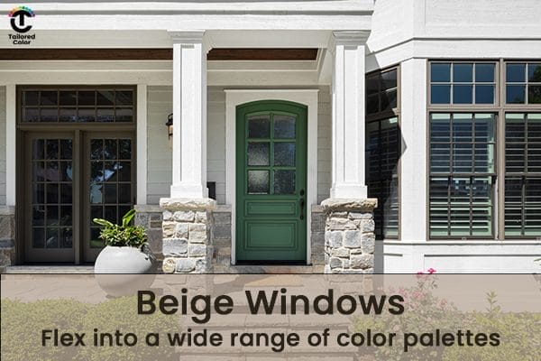
🥈 2nd Choice: Beige (from the Yellow Hue Family)
- Specifically, low chroma beiges with a subtle greenish signature.
- This type of beige reads as the most neutral — no obvious hue bias.
- It’s versatile and easy to harmonize with natural and man-made materials.

🥉 3rd (and last): White
- Not because it’s “bad” — but because it’s the least flexible.
- It’s visually demanding, and unless you have a well-calibrated strategy that balances its intensity, its high contrast attitude can hijack the entire facade.

🔲 What About Black?
- Choose bronze instead. Bronze is usually the easiest and most flexible choice if you want that dark, dramatic look — because it has some colorfulness, some chroma, to anchor it into the overall color scheme.
- Black, on the other hand, is more like white — it doesn’t automatically go with everything. There are different colors of black windows. I know because I’ve measured them and they can be just as visually demanding and limiting as white ones.
- Without a well-calibrated strategy, black’s high contrast and intensity can hijack the entire façade — dominating the color story rather than supporting it.
- Most importantly: if you’re thinking about painting your windows black, read this post first. You MUST consider LRV (Light Reflectance Value).
- Manufacturers include LRV in their color specifications to guide how dark you can go with a new repaint color — and ignoring it can lead to costly, noncompliant mistakes.
- 👉 LRV – The Best Guide for Paint Colors and More!
🛠 How I Navigate These Challenges

Every project starts with the same foundational step:
Measure everything measurable.
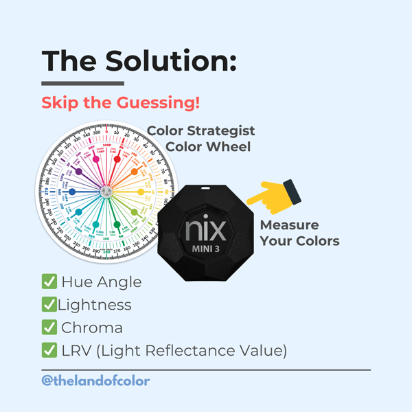
Using tools like the Nix Mini 3 colorimeter, I capture accurate color data for all fixed and important elements — including white windows.
From there, I build a custom color inventory that includes hue, value, chroma, and LRV for each element. That data becomes the framework for developing a Tailored Color Strategy™ — one that ensures colors work together, not against each other, across every finish and substrate.
No guesswork. No assumptions. No talk of undertones.
Just clear, measurable, and replicable results.
💡 Want to Learn How to Use the Same Tools and Framework?
If you’re a designer, consultant, or paint contractor and you want to streamline your workflow — and deliver exceptional results for every client — start with The Four Pillars of Color.
No previous experience or color know-how required. So DIY Homeowner/Color Enthusiast are welcome too!

Inside the course, I’ll teach you how to:
- Use tools like the Nix Mini 3 to measure color accurately
- Navigate hue, value, chroma — the real building blocks of color
- Leverage the Paint Color DNA Table (and the soon-to-launch AI version) to select and specify color like a pro
👉 Learn more at campchroma.com and join the professionals using science-based color strategy to level up their business.
