Taupe.
If you’re not sure exactly what taupe is, trust me when I tell you that you are not alone. Using words to define, communicate, and describe how we experience color is murky territory. Because everyone experiences color differently, there is no way we’re ever going to arrive at just one way to define taupe that everyone will agree with so let’s just get that out of the way right off the bat.
We can, however, do a deep dive into the color taupe and gain some clarity.
You should be able to look words up in glossaries found in the back of important books about color, or even just look color terms up in the dictionary and find consistency between what you learn here and trusted professional references.
So, let’s start this deep dive into the color called Taupe with the origin and etymology from Webster’s Dictionary:
Origin and Etymology of taupe
French, literally, mole, from Old French, from Latin talpa
“a brownish gray”

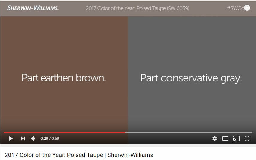
Sherwin-Williams named Poised Taupe as their 2017 Color of the Year and they describe it as “part earthen brown and part conservative gray”. Despite the clear hints directly from Sherwin-Williams that Poised Taupe is a grayish brown, it would seem a few have missed those clues.
As a result, since Sherwin-Williams’ announcement of their color of the year we have copious amounts of subjective color opinion posted on blogs, Instagram, Pinterest, pretty much everywhere. Descriptions for Poised Taupe include mauve, pink, purple undertones. I noticed one designer described it as a blue-gray.
So what the heck is going on?
Color 101
The reason for the inconsistency in subjective opinions out there on the interwebs is simple – it comes down to the quality of light. Change the light and you change the color.
What all those people offering up their subjective color opinion fail to do is qualify how they’re assessing the color. Are they evaluating Poised Taupe inside or outside? Overcast day or sunny? Incandescent light, LED, halogen, or fluorescent? Are they basing their opinion on a real paint chip or are they just looking at a swatch online and making their best guess? Are they looking at the paint color formula and making assumptions based on the list of colorants?
Fact is, we don’t know.
And that’s what makes all those well-intentioned opinions not very useful.
So, what are you supposed to do since you can’t trust the color opinions offered up on the interwebs?
Part of the problem is the language. Color words like Taupe, Tan, Beige, Sage, and Greige mean something different to everyone. So, the first thing we have to do is let go of the notion that the word taupe is conclusively meaningful because it’s not.
In order to have a truly meaningful conversation about Poised Taupe, we have to find a simple and reliable way to get everyone on the same page. And the way we do that is with numeric color notations like these:
For comparison (and for fun), I used three different sets of values and two nicely balanced illuminants to ascertain a hue/value/chroma notation for Poised Taupe. The values from easyRGB and the NIX Sensor both use a D65 Illuminant; that quality of light is like indirect daylight at noon. The Color Muse uses a D50 Illuminant; it’s a daylight quality too, just a little warmer and it does move Poised Taupe closer to the red hue family with a 1 YR hue notation – which could explain why some people perceive Poised Taupe as having a pink overtone.
As for those who see an edge of purple or blue, they’re likely viewing Poised Taupe in an unbalanced quality of light or there might be an issue with color acuity – or it might be a combination of both unbalanced light and poor color acuity. Again, we have no idea about the circumstances. I will say it’s not uncommon for near neutral colors like Poised Taupe that belong to the YR hue family to shift and look purple-ish in an incandescent-like quality of light.
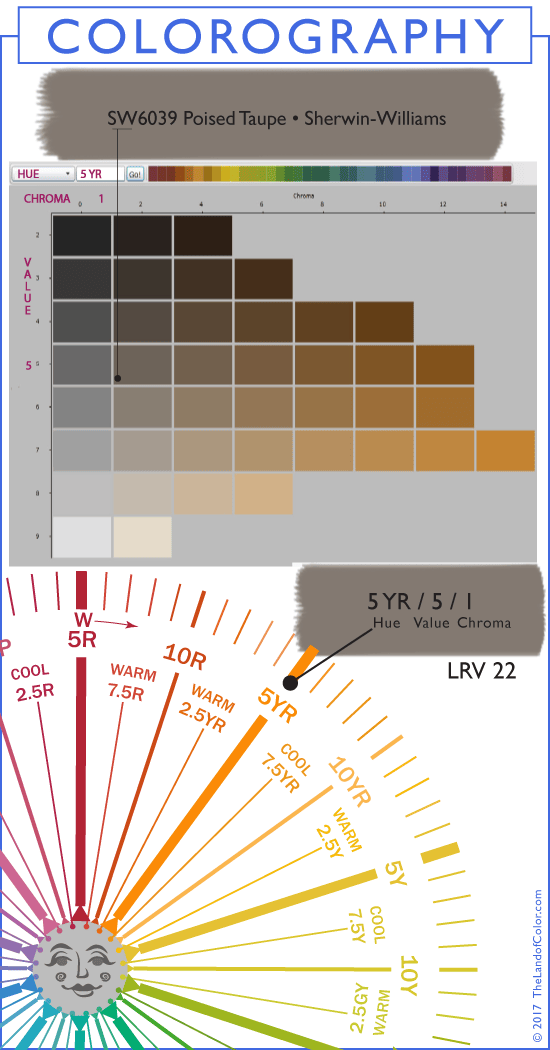
I did a Colorography of Poised Taupe for your reference because it provides context. Context is important so we can have objective conversations about its characteristics. It is objective because we’re basing our conversation on spectral data that quantifies the psychological dimensions of human color vision (hue/value/chroma) – which is darn handy to know. The D65 illuminant is best for comparing paint colors so I chose to plot Poised Taupe at 5 YR which is the orange hue family. And that makes sense because Sherwin-Williams categorized Poised Taupe as a grayish brown.
You’re probably wondering where color notations come from. It’s actually pretty easy to pull that information together. Unfortunately, only a few paint companies provide notations for their colors. To ascertain color notations for paint (or anything else) I measure the samples here at The Land of Color using a NIX and Color Muse, like you see in the image above, then use math voodoo to transform the spectral data into hue, value, chroma notations. The NIX and Color Muse have special built-in illuminants for measuring color and are designed to block out ambient light so it doesn’t pollute the data.
 Spectral data is like a color’s fingerprint or DNA and once we have it for a color we can figure out a color notation. As you have probably figured out, spectral data is far more accurate for identifying the intrinsic characteristics of a paint color than simply eyeballin’ it.
I looked up all the colors that are on leaf 232 with Poised Taupe in the new Sherwin-Williams fandeck. It was kind of surprising to see two other colors named Taupe on the one strip. I was curious what the spectral data – or fingerprints – for all seven of these colors would tell me. As it turns out all the colors on leaf 232 are in the same hue family, which is yellow-red – or orange.
That aligns with what Sherwin-Williams has been saying all along about Poised Taupe being a grayish brown. It makes sense because what most people call brown is technically a dark orange and Poised Taupe is several steps lighter as you can see in the Colorography graphic above.
Spectral data and color notations are a wonderfully supportive framework for the creative eye but it’s important to remember that we can’t color by numbers alone, a final visual assessment matters a lot. #myfavoritequote
Summary
- No one really knows what the hell the color Taupe is but at least Webster’s provided some direction. #keepingitreal
- Etymology is a fancy word for explaining where other words came from.
- Common descriptions for Poised Taupe include a big chunk of the visible spectrum: mauve, pink, purple, blue-gray.
- Luckily, Sherwin-Williams is consistent in how they define taupe because there are 3 colors named taupe on strip chip #232 in their new fandeck and they all belong to the orange hue family – including the 2017 color of the year, Poised Taupe.
- Color notations are derived from color measurements and one of the magical things about notations is they give us a consistent and objective point of departure to analyze, compare, and communicate color.
- If you’d like to learn more about how to unleash the magical powers of spectral data and color notations to predict how paint colors will behave in your space, I invite you to go to campchroma.com for information about how to sign up for my online color training course. I would love to have you join us.
Your Turn
How do you feel about Sherwin-Williams choice for their color of the year 2017?
Have you found all the different interpretations of taupe confusing?


Thank you for the informative and timely post. I am chuckling because just yesterday I was having a discussion with a client about Poised Taupe. In my opinion, the fact that SW named it Poised Taupe is a marketing head scratcher…Perhaps it is just me, but anything called “Taupe” brings to mind Hush Puppy shoes paired with a leisure suit. (I can say the same for “Mauve”). When I heard it was the new SW color of the year, I cringed even before I saw it.
When I plan palettes for my clients I do not provide the name of the color. I think it has a psychological effect, and takes away from the task at hand.
“Hush Puppy shoes paired with a leisure suit” – now THAT is a great name for a paint color. 😉
Thanks for your comment, Jane. #awesome
How interesting! I would never have imagined this to be from the orange family. If forced to guess, I’d have said it was RP. But I definitely see the red in it versus a taupe like SW 7633 Taupe Tone.
I’m not a big taupe person myself (I prefer colors lower on the grayscale, if I am expressing that correctly) but I don’t hate Poised Taupe. It looks fabulous with purple and lavender accents, though fewer customers will choose those. Also with pinks, blues and aquas.
In my mind, Poised Taupe (and similar colors) start to look bad with colors in the Y and GY segment of the deck. If my perception is true, I would love to know the scientific reason for this. I’ve always advised according to this ‘theory’ but it maybe BS. LOL
Hi Juli,
There is an ancient color meme that says “taupe hates yellow”. Problem is we don’t know what kind of taupe it’s speaking to. So while “taupe hates yellow” sounds like sage decorating advice, it doesn’t qualify what the color taupe actually is thus rendering the advice useless.
Many years ago, I saw a post about taupe on the Garden Web. It’s a “Taupe Hates” and “Taupe Loves” list. I wondered then, as I do now, exactly what color it was talking about. Intrigued me so much I saved the list:
Taupe Loves
– Pure white paint
– Dark stained wood
– Purple undertoned natural linens
– Stones that contain grey or blue
– Metals such as silver, chrome and stainless steel
– The companionship of grey or brown
– Dramatic accents of green, purple or red
– Clear glass
Taupe Hates
– Anything that contains yellow, such as buttery paint
– Golden woods, such as oak
– Yellow-hued linens
– Tan leathers
– Stones that contain beige
– Accessories that hint at yellow, such as dark cream porcelain.
Love hearing all the informative details about color! As for Poised Taupe, I’d never see myself using it.
I agree, Kim. Poised Taupe might be one of those colors that one either likes it or they really, really don’t like it.
I can’t imagine any of my clients asking for this color. The current trend, in my humble opinion, is still going for freshness, which this color is not.
That doesn’t mean there aren’t uses for this color, but I think SW missed the boat on this one.
Oh, it’s definitely muted. There’s never any follow up on Colors of the Year. Someone should do that!!!
Like, “Let’s take a look back at Pantone’s 2014 Color of the Year Radiant Orchid and analyze how it performed in the market.” If it would help, feel free to use images from my Color Trends Pinterest board.
The makeup of Poised Taupe may seem complicated to some but this just proves that color is a science based on numbers. I am so glad I took the Camp Chroma course to understand this. To the readers who do not think they have an eye for color, trust me, you don’t need one. Camp Chroma takes the mystery out of color matching.
Ken (The Old House Guy),
Thank you for your comments. It’s been my pleasure having you in class and getting to know you and your amazing work with old houses. Never know, your words of encouragement may reach a reader who needs a little reassurance and confidence from someone who’s been there, done that to take the leap and learn how color works. It really is something anybody can do.
I love my Color Muse! It has been a real time saver for me and eliminated the guessing game. So glad I took your course to have a deeper understanding of colorimetry. It amazes me that this knowledge is not more mainstream.
I love my Camp Chroma graduates. 🙂 #smartcookies
Thank you, Terri. I agree it is amazing that these proven, established color systems have been around and used across major industries for years yet so many, especially in architectural color, have never heard of them.
And I’m thoroughly enjoying your #30paintingsin30days series on Facebook – gorgeous work!