Should you stop talking about Marsala? If you don’t know how to read the notations Pantone provides, maybe you should.

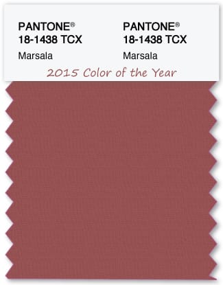
Based on what I’m reading across many corners of blogosphere, the implication is nobody knows what Marsala really looks like or that Pantone is vacillating about its color of the year.
Which could not be more incorrect. And I’m afraid that it’s evidence of a few gaps in color knowledge that I noticed several years ago beginning to loom, grow bigger and increasingly disruptive.
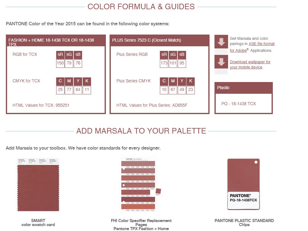
Here’s why one should not imply that it’s unknown what the “real” Marsala looks like.
They spell it out in black and white and clear as day: “We have color standards for every designer.”
Textile or graphic designer, plastics, ink, pigments, dyes etc.? What kind of designer are you? What context are you talking about for using Marsala? Then you should know what standard to use – and what Marsala looks like in your corner of color world.
Attempting to define Marsala divorced of standards is like trying to smell the number 9.
Pantone uses standards. Notations. Systems. Color systems with scientific reference and provenance. But just because there is a method to the Pantone numbers and letters doesn’t necessarily make it ideal.

I found a link about Pantone’s TPX color system ages ago and it’s long gone. I did save this excerpt:
Now, to the PANTONE Numbers themselves. We will use PANTONE 16-1541 TPX as an example. The numbering system for the PANTONE Textile Colors is based on a cylindrical color solid. The first two numbers, 16 in this case, represent the lightness value of the color, with 11 being the lightest, or closest to white, and 19 being the darkest, or closest to black. The third and fourth digits represent the hue value of the color. The top view of the cylinder represents a hue circle divided into 64 hues, with section #1 being a greenish-yellow hue. If you divide the circle into eight larger sectors, the hues rotate clockwise from the 12:00 position as Yellow, Orange, Red, Purple, Blue and Green. The fifth and sixth digits plot the distance of this color from the center of the color wheel, with 0 representing white, gray or black as the center point, and 64 representing the furthest point, where the color is the most saturated, or intense.
TPX = textile, paper edition. The ‘X’ was added to differentiate the latest editions from earlier editions.
Good luck finding an illustration of the Pantone color solid referenced in the quote – this is part of what I mean when I say it may be less than an ideal color system. Some people loathe Pantone systems because the organization is not streamlined, and some have trouble relating to the logic behind the alleged order.
Going forward, I think the gaps I mentioned are only going to get bigger.
Color theories, notations and systems are not difficult to understand and if you’re going to offer color as a professional service, you should learn as much as you possibly can. The whole Marsala debacle is a good example why. The rewards are 1,000 times over in ways you cannot imagine when you’re standing on the brink of choice between easy and hard work.
Rewards like knowing better than to say no one knows what Marsala is supposed to look like or how to use it.
