Pantone 2011 Color of the Year Prison Pink
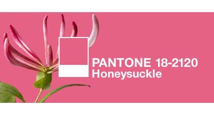
Pantone’s 2011 Color of the Year, Honeysuckle and Prison Pink. I can’t help but notice the similarity. This is Pantone’s Honeysuckle.

This is Ben Moore’s 1328 Deco Rose (click to snag a Samplize peel and stick sample) – which is said to be a close match to the original Baker Miller Pink or “Prison Pink”.

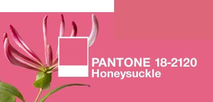
And here’s the swatch of Deco Rose on top of the Honeysuckle screen grab.

What do you think? Pantone’s 2011 Color of the Year Honeysuckle a dead ringer for the legendary Prison Pink?

Haha, your headline was way better than mine! It could definitely be identified as prison pink, so funny!
Not trying to be cute/funny here, but Elizabeth Brown just shared this one about an historical, pink house with gingerbread/etc. Talk about “Prison Pink” – How eerie is this?
Take a look: http://www.topix.com/album/detail/wellsville-ny/S2DOJBORTSGJBQQE
Pantone defines the RGB values as follows:
Cotton:
sRGB: R:217 G:79 B:112
Adobe RGB: R:189 G:80 B:111
Paper:
sRGB: R:214 G:80 B:118
Adobe RGB: R:187 G:81 B:116
…and the Lab values:
Cotton: L:55.08 a:58.07 b:13.85
Paper: L:54.84 a:57.82 b:9.76
ColorWerx – thanks for dropping in the info. Having real numbers makes a difference and in a way I was hoping they would show that Pantone’s Honeysuckle didn’t look quite as much like Prison Pink as I first thought. I’d have to say after playing a bit with the info you provided, it really does resemble historic references to the real deal Prison Pink. It is confusing tho because some people are looking at the chip and describing it as a very warm, pink salmon while others who have the chips are saying it’s more red than pink. ??? Color is so darn subjective.
What I do know is everything that’s out there about Pantone’s Honeysuckle makes me think prison pink. Whether or not it’s the perfect pitch of pink to incite the same results as the Baker Miller and subsequent studies, I guess we may never know.
I love the color, the name is a different story, lol. Prison pink, really!!