Share

Pale Oak OC-20 Hue Family
In context of its Hue Family neighborhood, 2 Y, on The Color Strategist Color Wheel. The pink arrows point to where Pale Oak OC-20 fits in among the other colors according to its Value 8.50 and Chroma of 0.73 rounded up to 0.75.
Color review for Pale Oak OC-20
All about Pale Oak OC-20 from Benjamin Moore.
It belongs to the yellow hue family over near the yellow-red hue family, as you can see on The Color Strategist Color Wheel above.
Colors from this Y to YR hue family neighborhood notoriously shift purple in certain qualities of light. Some people describe it as lavender, some call it a pale plum-brown.
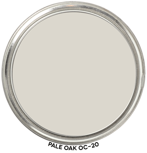
In a balanced quality of light it’s going to look like a near neutral warm gray-beige, it could possibly have moments of peachy-pinkish overtones.
If you do any research on this color, you will find people quite adamant that it has no discernible hue parent it’s just a “greige” (the word greige means something different to everyone, there is no single definition of color appearance)
While others will report that Pale Oak looks purple -ish.
That’s because of its hue family and because it’s a low Chroma color.
How -or if- it shifts or shows moments of overtones is determined by the light.
The light is boss and Pale Oak is known to be an inconstant, chameleon color so test thoroughly in your space.
Paint a sample so you can move the color around the room. I recommend Samplize Paint-Peel-and-Stick Color Sample Decals.
Don’t choose the best lit wall in the whole room and test it in that one spot directly on the wall, you have to move this one in and out of the shadows.
🎨 Color Review: Pale Oak (Benjamin Moore OC-20)
Before we get into real-life applications, let’s look at Pale Oak’s factual color DNA:

Colorography Overview
Brand: Benjamin Moore
Color Name & Number: Pale Oak OC-20
HEX: #DED8CF
Lightness (L): 86.0
Chroma (C): 6.3
Hue Angle: 91.2°
Munsell Family: 10 YR
Munsell Value / Chroma: 8.8 / 1.8
LRV: 69.58
Average Perceived Color Temperature: Warm
Vibes: Near Neutral, Low Chroma, Soft
How It Behaves in Real Homes
General Vibe / Emotional Impressions: Pale Oak reads calm, approachable, and collected. It’s often used when clients want something “not too beige, not too gray” — a soft landing place that doesn’t dominate the room.
Popular Rooms / Surfaces Used: Frequently chosen for whole-house walls, especially open-plan living areas, bedrooms, and hallways. Its subtle presence also works well on cabinetry in transitional kitchens.
Standout Testimonials or Patterns: Designers note that Pale Oak gracefully adapts to different materials and light conditions. Homeowners often call it “the perfect in-between” — sophisticated without being stark.
Lighting and Finish Observations
Natural Daylight (north, south, etc.): In north light, it retains its softness without looking dingy. In southern exposure, its warm side is more apparent.
Warm Light (incandescent / sunset): Takes on a gentle warmth that feels inviting and grounded.
Cool Light (LED / overcast): Can lean slightly more muted or shadowy but rarely shifts into gray territory.
Sheen Effects (flat, satin, gloss): Flat finishes enhance its subtlety; satin or eggshell brings a refined glow. Gloss finishes are rare but elegant on trim or cabinetry.
Common surprises or “gotchas”: Some expect more contrast from Pale Oak than it delivers. Its soft value and low chroma mean it won’t pop dramatically against white trim unless the trim is very crisp.
Comparisons to Other Whites / Neutrals
Compare to Classic Gray OC-23: Classic Gray is lighter (L=88.0 vs. 86.0), cooler in hue (h=97.3° vs. 91.2°), and also low in chroma. Both are Near Neutral and Soft, but Pale Oak is a bit warmer and more grounded.
Compare to Edgecomb Gray HC-173: Edgecomb Gray has similar lightness (L=85.8), but slightly more chroma (C=7.7) and a warmer hue angle (h=89.4°). Edgecomb feels a touch richer.
Compare to Balboa Mist OC-27: Balboa Mist is cooler (h=99.7°), lower in chroma (C=4.5), and a hair lighter (L=86.5). Pale Oak reads warmer and more balanced in most spaces.
Pale Oak sits solidly in the Warm, Near Neutral, Low Chroma quadrant — ideal when you want calm without starkness.
Strategic Application Notes
Best Used For: Open concept homes, bedrooms, living areas, or spaces with mixed materials where you want a graceful color that ties things together without stealing focus.
Avoid If: You need high contrast with white trim or want a very bold or saturated statement.
Looks Best With: Crisp whites (like Chantilly Lace), soft black metals, natural oak finishes, unlacquered brass, and creamy textiles. Coordinates well with muted greens and earthy clays from the Paint Color DNA Table.
Final Takeaway
This is a great choice if you need a warm neutral that’s soft, subtle, and versatile. But be sure to test it in various lights — it’s not a showstopper, it’s a harmonizer. It’s not just a pretty color — it’s a strategic move when you want cohesion without blandness.

