When you search color topics on Google, the search engine does not vet the results it delivers for accuracy or quality. It renders search results on unique algorithms that change continuously.

What that means is you take a risk every time you Google for color information. What’s at risk is the integrity of your Color Point of View. How it’s at risk comes in a couple different packages. For example, you stumble on information that’s just whackadoodle, off the charts wrong. As another example, you manage to Google your way to a reputable source but the highly technical way in which it’s presented throws you for a loop. Not one to give up, you info-chug your way through the material determined to understand it. As a result, the conclusions you arrive at all by yourself may or may not be correct. So, the choices are pollute your Color Point of View with information of sketchy origin, or populate it with your own conclusions in which you are not 100% confident.
Thanks a lot, Google.
What I know for sure is real-deal-color-knowledge does not come in a pretty package. In fact, it’s usually pretty raw. My experience is standard blogging rules of inserting a pretty picture every two or three paragraphs does not apply because amazing knowledge stands on its own. Real-deal-color-experts know the knowledge they have to share is amazing and don’t see a need to frame their intelligence with fluff just so readers don’t get overwhelmed or bored. If you’re truly interested in absorbing their knowledge, you’re going to dig in and stick with it.

It’s an observation I struggle with because I have an affinity for the heady color knowledge you can only get delivered technical and raw from the educated world of color science – but I also have a blog. I want people to read my blog posts. So, I feel compelled to play the pretty picture game and punctuate with images the extraordinary color expertise I have curated and want to share.

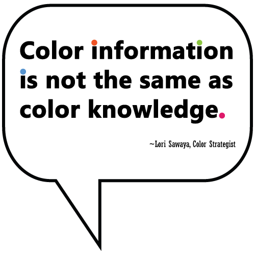
Color information is not the same as color knowledge.
This is a much bigger issue than the obligatory use of images distracting from the quality of the content.
Everyone knows you can get tons of free color information on the interwebs. However, what a search engine can’t give you is the correct context for that information. That’s huge because context is crucial when it comes to all things color.
John C. Jay sums it up quite eloquently:
“Idea of context is more important today than ever before because we have this habit today of thinking that information is knowledge. It’s not. Just because you can Google it doesn’t mean you have context for anything.” ~John C. Jay
Remember that the next time someone tells you to “Just Google it.”
The reason I built Camp Chroma (an online color training program) was to solve the problems I talked about in this blog post. I wanted to create a destination for all you seekers of color knowledge that you could trust.
Furthermore, you don’t have to try to figure out all the colorimetry and color science stuff. I already did that. It took me a few decades, but the good news is you can benefit from my experience and wisdom.
I translate the heady, technical color information into nuggets of knowledge and skills that you can instantly put into practice. And I don’t just tell you about it, I show you how to do it.
As far as color in context, that’s easier than you might think. The biggest mistake people make when talking about color is speaking to color in abstract terms. Color in context of a color system or color in context of a hue family tells a much more complete and cogent story compared to just talking about colors one or a few at a time.
If this sounds like another pitch for Camp Chroma, yeah, I suppose it is.
However, you have to understand that’s it’s difficult for me to point out everything that I know is wrong in paint and architectural color design world and not offer solutions.
It’s one thing to have the wherewithal to point out what’s wrong; it’s another thing entirely to also have solutions to fix it.

Hello,
Enjoy so very much your publications on colour. Trying to see undertones in a textile is different now that I am 73 years old. Which are the colurs that are the hardest to see as our eyes are older? Had a pair of glasses in office to show us how we see colours as we age. It is rather scarey.
Maybe I should pass off choosing fabrics should be passed onto younger eyes.
Thank you,