For years, Apple has built a reputation for creating stunning displays that make everything look better, from photos and videos to websites and apps. It’s a common belief, especially among color consultants and interior design professionals, that if you care about color, you must use Apple products. Many even go so far as to say that Apple displays are “more accurate” and that you can’t be a serious designer unless you work on a Mac.
But is this belief grounded in reality? Or is it a well-polished myth that confuses visual appeal with true color accuracy?
The truth is more nuanced — and more important — than many realize. Especially in industries like interior design, paint color consulting, and architectural color strategy, where neutral, low-chroma colors dominate the palette, the kind of display you use could actually distort your perception rather than enhance it.
In this post, we’re going to break down what makes Apple displays look so good, why that’s not the same as being accurate, and how it all falls apart when you’re working with the kinds of colors that matter most in the built environment.
Part 1: What Makes Apple Displays Look So Good?
Let’s start by understanding what makes Apple displays visually appealing. Apple invests heavily in the aesthetics of perception, optimizing displays to look beautiful right out of the box. Here’s how they do it:
1. Wide Gamut (Display P3)
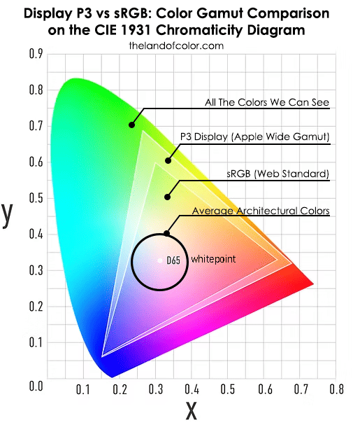
Apple uses the Display P3 color space, a wider-gamut color profile originally developed for digital cinema. Compared to the standard sRGB color space (used on most websites and many non-Apple screens), Display P3 includes a larger range of vibrant reds and greens.
Result: Photos and videos appear more saturated and lively, especially in skin tones, flowers, and sunsets. To the average viewer, they look more “real.”
2. High Contrast and Brightness
Retina displays are bright and sharp, with deep blacks and high contrast. This creates the perception of depth and clarity, enhancing the illusion of color richness.
Result: Colors appear more defined, crisp, and dynamic — even if they aren’t technically accurate.
3. Factory Calibration
Apple factory-calibrates their screens to deliver a consistent visual experience across devices. MacBook, iMac, iPhone, and iPad all aim to render colors similarly.
Result: Users feel confident that what they see is reliable — but again, that’s consistency, not objective accuracy.
4. Color Management Engine
Apple’s ecosystem includes robust color management support (ICC profiles, ColorSync). This matters for pro users working in color-managed workflows (e.g., photography and video).
Result: Smooth, predictable conversions between color spaces within Apple’s environment.
So yes, Apple displays look great. But that’s not the same thing as accurately reflecting the real-world appearance of color — especially when it comes to the subtle, desaturated colors that dominate architectural and interior design.
Part 2: The Problem with Display P3 for Real-World Color
Let’s get into the science.
What Is Display P3?
Display P3 is a color gamut — essentially, a range of colors a device can display. It’s about 25% larger than sRGB, and it stretches farther into saturated red and green territories.
But here’s the catch: it doesn’t give you more precision in the middle.

And the middle — the center of the color gamut — is where most architectural colors live. We’re talking about:
- Greiges
- Beiges
- Soft whites
- Muted blues and greens
- Earthy browns
- Complex neutrals
These colors have low chroma (i.e., they’re desaturated) and fall well within the range sRGB can already display.
P3 Adds No Value to Low Chroma Colors
The extra gamut that P3 offers is completely irrelevant for the colors that designers, painters, and architects use most. Those colors don’t live in the outer ring of the color gamut — they cluster in the neutral-to-near-neutral zones.
That means:
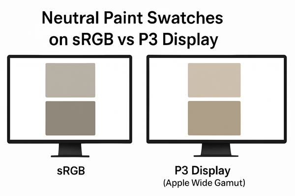
- A high-end Apple display and a mid-range calibrated PC monitor have the potential to render the same soft gray-beige nearly identically. Apple has no tangible advantage.
- P3 doesn’t make neutral colors clearer, more accurate, or easier to interpret.
- In some cases, P3 displays can make low-chroma colors look slightly off — especially if the screen is also using features like True Tone or Night Shift.
Part 3: Apple’s True Tone and Night Shift Are the Enemies of Color Accuracy
Apple’s True Tone and Night Shift features are designed for user comfort, not color precision.
True Tone
This feature adjusts the display’s white point based on ambient lighting conditions. So if you’re in a warm, low-light room, your screen may shift warmer to match.
Great for reading. Terrible for judging paint colors.
Why? Because it introduces uncontrolled variables into your visual environment. The same color can look different from hour to hour or room to room — without you even noticing.
Night Shift
This feature filters out blue light to help reduce eye strain before bed. Again, helpful for comfort, but disastrous for neutral color work.
If you’re trying to judge the characteristics of a warm gray or align a paint color dollop to a quartz countertop, these screen shifts make you prone to misjudging hue, chroma, and temperature.
Part 4: Perceived Beauty vs. Scientific Accuracy
Let’s put it plainly: Apple optimizes for beauty, not truth.
Their displays are designed to make colors appear vibrant, appealing, and emotionally resonant. That’s excellent for watching movies, editing photos, or scrolling Instagram — but it’s not the same as seeing what a color actually is in real life.
Architectural color design requires:
- Measurable, repeatable data (LCH, LAB, Munsell, etc.)
- Specify the light source used to judge color appearance
- Objective (not subjective) Standard Operating Procedure for Color
If you’re sourcing fabric, paint, tile, or stone, your decisions must be grounded in human-readable hue/value/chroma color notations, not screen renderings. A screen can’t show you whether a color has enough chroma to hold up next to a bold wood floor. It can’t reveal if a paint color is a 7 or an 8 in Light Reflectance Value (LRV). And it certainly can’t show you how a color will react in north-facing vs. south-facing light; those online visualizers are fun to experiment with but they are not serious color tools.
| Feature | Display P3 Adds Value? | Explanation |
| Saturated reds and greens | ✅ | Wider gamut captures deeper chroma |
| Brightness & contrast | ✅ | Improves visual appeal |
| Low-chroma neutrals | ❌ | Already within sRGB |
| Real-world color matching | ❌ | Screen ≠ surface |
Part 5: The Real Solution — Measuring Color, Not Eyeballing It
If you’re serious about color accuracy, here’s what matters more than your brand of laptop:
1. Use a Colorimeter or Spectrophotometer
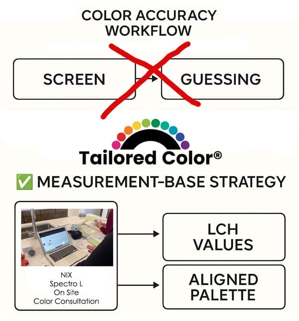
Devices like the Nix Mini 3, Nix Spectro L, or Spectro 2 measure color data from physical samples and give you human-readable color notations, LCh (Lightness, Chroma, Hue Angle).
Nix Mini 3 is the ideal device and price point to get comfortable with a color measurement tool. It’s one heck of a deal because it’s over-engineered for its price point. To say you’re getting a lot of bang for your buck is an understatement. Speed, accuracy, super portable – it fits in your pocket.
I recommend the Nix Spectro L to all my professional Color Strategists. All color measurement devices capture a color’s energy. Spectrophotometers, which is what the Nix Spectro L is, capture the most. What that means is there is more color data to work with, and you can do more stuff and figure out higher-level color conundrums.
The Nix Spectro 2 is ideal for my friends in the print and graphics sphere who do amazing things with ink and paper.
You need a color measurement device because it eliminates the guesswork entirely. You’re not eyeballing, guessing, or crowd-sourcing opinions about what the color looks like. Simply measure the color and know exactly what hue family, chroma, and lightness a color falls into. Easy. Done. Moving on.
2. Evaluate Color in Consistent Lighting
Lighting in stores and showrooms is the worst. It’s always best to evaluate color in situ, where the color will eventually live. Indirect daylight is best. Not too sunny, not too shady.
3. Reference Real Samples
Digital swatches are approximations. Physical fan decks, sample boards, and material chips let you test in context and under real lighting.
4. Use Color Alignment Tools
Rather than comparing color by perception alone, use tools that align color attributes scientifically, such as the Paint Color DNA Table right here on The Land of Color. It is so powerful because it lets you organize and select colors based on their measurable DNA: hue, value, and chroma.
Part 6: Let’s Talk About PC Monitors
Are PC monitors less accurate?

Not necessarily. While cheaper monitors may have poor calibration out of the box, many professional-grade PC monitors (like those from Eizo, BenQ, or ASUS ProArt) offer excellent color performance — often with hardware-level calibration and sRGB presets that are more accurate than many consumer Apple displays.
The difference is, Apple calibrates for a certain look. Professional PC monitors calibrate for neutral accuracy.
So if you’re using a high-quality PC display with proper lighting and color measurement tools, you are likely working with more reliable color data than someone making decisions on a MacBook Pro in a café with True Tone enabled.
Conclusion: Apple’s Not the Problem — the Myth Is
Let’s be clear: Apple makes beautiful, high-quality displays. But color accuracy — the kind needed for architectural paint, interiors, and finishes — isn’t about beauty.
It’s about:
- Repeatable measurements
- Objective color models
- Identified Light Sources
- Tools that work outside the RGB bubble
So no, Apple is not better at displaying color — especially not the neutral and low-chroma colors that dominate real-world design. If anything, their enhancements can mask the subtlety of these colors and lead to mismatches and poor decisions.

If you’re working in architectural color, interior design, or color strategy, the smartest thing you can do is let go of the screen myth — and start working with measurable color data.
Because it’s not the 1900s. Shuffling paint chips, trying to see undertones is – full stop – an antiquated approach to color. Professional color tools and apps have never been better, more affordable or accessible. The Paint Color DNA Table is a perfect example – stay tuned because we have a VERY exciting update coming soon.
🎯 Ready to Stop Guessing and Start Measuring?
The Tailored Color Kit gives you everything you need to make confident, science-backed color decisions. It includes the Nix Mini 3 — a pro-grade color sensor that measures real-world surfaces — plus the Color Strategist Color Wheel, your visual shortcut to harmony using hue, value, and chroma.
Whether you’re choosing paint colors, matching finishes, or aligning design materials, this kit takes the guesswork out of color — and replaces it with precision.
🔗 Grab your Tailored Color Kit now and start making color choices you can trust.
