Hue Family Caliente AF-290
Here’s Caliente AF-290 by Benjamin Moore in context of its Hue Family neighborhood, 6 R (Red), on The Color Strategist Color Wheel. The pink arrows point to where Caliente AF-290 fits in among the other colors according to its Value 3.50 rounded to 8.00 and Chroma of 8.02 rounded to 8.00.Caliente AF-290 Color Review
Caliente AF-290 is a vivid and energetic shade from Benjamin Moore’s Affinity Collection, standing out as a bold and expressive choice for anyone looking to make a dramatic statement with their decor. With its origins deeply rooted in the red hue family, specifically in the 6 R neighborhood, Caliente brings both warmth and passion into any space it graces.
Caliente Color Characteristics
On the Munsell Color System, Caliente AF-290 sits at a Value of 3.50, indicating that it is on the darker end of the value scale, which measures the lightness or darkness of a color. This lower value contributes to the depth and intensity of Caliente, making it a dominant presence in any design scheme. Its Chroma, or color purity, is measured at 8.02, confirming that this is a color with considerable saturation and vibrancy. This combination of deep value and high chroma gives Caliente a lush, immersive quality that is both engaging and commanding.
Visual Impact and Usability
Caliente AF-290’s strong visual impact makes it an excellent choice for focal points in interior design. It is particularly striking when used on accent walls, front doors, or even cabinetry where its rich, red tones can shine vividly against more neutral backgrounds. However, the potency of Caliente means it should be used thoughtfully to avoid overwhelming a space. It pairs exceptionally well with soft grays, creamy whites, and sophisticated blues, which help balance its intensity while allowing its vivacity to remain the centerpiece of any palette.
Caliente Psychological Effects
Red, the color family to which Caliente belongs, is often associated with energy, passion, and excitement. These attributes make Caliente AF-290 a stimulating choice in environments where dynamism and vitality are desired. It’s an ideal hue for dining areas where it can enhance the energy of social gatherings, or in a home office where it might stimulate creativity and motivation.
A Red Bedroom?
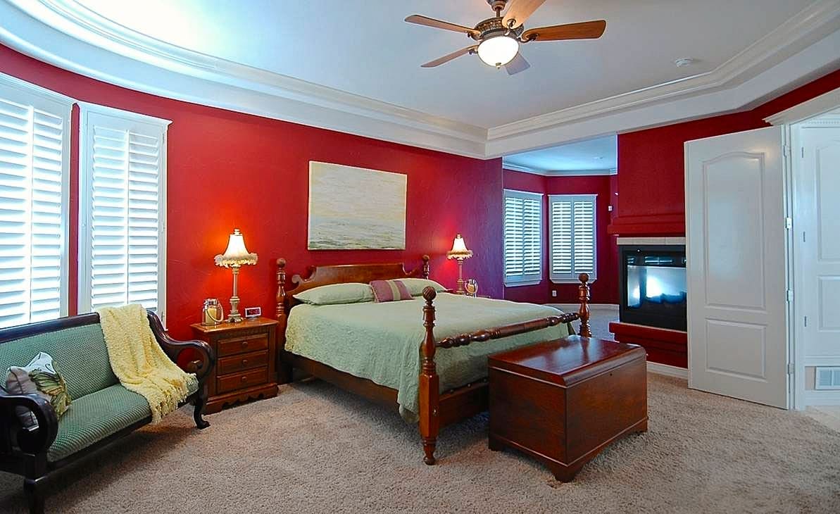
I want to challenge the commonly held belief that red, due to its energizing qualities, is unsuitable for bedrooms and disrupts sleep. Contrary to this popular notion, my personal experience with Benjamin Moore’s Caliente AF-290 in two different homes—one in Hilliard, Ohio (Fig. A) and another in El Paso, Texas (Fig. B)—illustrates a different story.


This misconception is a classic example of oversimplified “pop color psychology,” which suggests that red, with its associations with energy, passion, and excitement, might be too intense for a bedroom setting. However, the effect of a color on mood and atmosphere is much more nuanced than such broad generalizations suggest. It’s crucial to consider the specific characteristics of a color, including its value (lightness or darkness) and chroma (intensity of color).
Caliente AF-290, while a deep red, has a lower chroma so it’s not overwhelming, making it surprisingly versatile and cozy, particularly in the evening. This makes it an excellent choice for a primary suite, where it adds a rich, warm ambiance rather than overwhelming the senses. In my bedrooms, Caliente proved to be soothing and restful, contradicting the myth that red is too over-the-top for peaceful spaces. This experience underscores the importance of considering all three dimensions of a color’s attributes rather than relying on overly simplified, reductive color psychology.
Comparative Analysis
When compared to other reds in the Benjamin Moore lineup, Caliente AF-290 stands out for its boldness and depth. Unlike softer reds like Benjamin Moore’s Chili Pepper, which offers a more muted, earthy approach, Caliente provides a purer, more unadulterated red. This makes it a go-to option for those looking to embrace a full, unabashed red without the brown or orange undertones often present in more subdued variants.
Historical and Cultural Context
Historically, red is a color of significance in many cultures, symbolizing everything from prosperity and good fortune to caution and courage. In interior design, red can be a nod to such cultural significances, bringing not only visual warmth but also a sense of tradition and depth to spaces. Caliente, with its robust and open-hearted hue, embraces these traditional associations but with a modern twist that aligns well with contemporary design trends.
Design Recommendations
For those considering incorporating Caliente AF-290 into their decor, consider the following tips:
- Paint Recommendation: When choosing a paint, it’s really best to stick with the original brand for the most accurate color. I’ve used Benjamin Moore’s Caliente AF-290 in their Aura matte finish twice now, and I can’t recommend it enough. The Aura base, combined with Benjamin Moore’s exclusive Gennex colorants, is known for its superior coverage—which means how many square feet a gallon covers —and its exceptional hide, which is how well the new color hides the old one beneath it. Aura matte is definitely one of my go-to paints for its smooth finish and impressive durability. It’s a solid choice that consistently delivers great results.
- Consider Your Personal Color Tolerance: I love red in general and Caliente is 100% in my wheelhouse of preferred colors. If you’re a “red person” like me, this one is a winner. In fact, I would LOVE to see Caliente in nail polish and lipstick too.
- Coordinating Colors: I found Caliente extremely flexible and easy to work with. I combined it with a deep eggplant in my Ohio home. In Texas, I went with a spring green and pale yellow.
- Lighting Considerations: Caliente conjures a cozy atmosphere. If your room gets a lot of sunlight during the day, Caliente will lean in to that and you might find yourself wanting to adjust the air conditioning to cool it off. In my case, my bedroom in El Paso, Texas faced southwest, which wasn’t an issue since we mostly used it in the evenings and at night, when the room naturally cooled down. And in my Hilliard, Ohio house, the bedroom faced north and the midwestern climate made Cliente’s intensity a nonissue.
Final Thoughts
Benjamin Moore’s Caliente AF-290 is not just a paint color; it’s a statement. It’s for those who are not afraid to embrace color fully and who understand the dynamic power it has to transform spaces. Whether you’re looking to create a captivating first impression in an entryway or a cozy bedroom, Caliente offers both the warmth of the red hue family and the boldness of a color made to stand out.


