Share

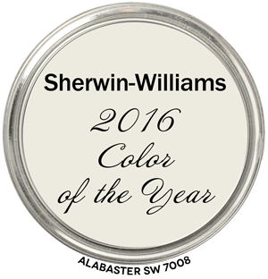
Alabaster SW 7008 Hue Family
In context of its Hue Family neighborhood, 5 Y (Yellow), on The Color Strategist Color Wheel. The pink arrows point to where it fits in among the other colors according to its Value 9.20 rounded to 9.25 and Chroma of 0.66 rounded to 0.75.
🎨 Color Review: Sherwin-Williams SW 7008 Alabaster
Before we get into real-life applications, let’s look at Alabaster’s factual color DNA:
Colorography Overview
- Brand: Sherwin-Williams
- Color Name & Number: Alabaster SW 7008
- HEX: #EDE8DC
- L (Lightness): 93.0
- C (Chroma): 5.6
- h° (Hue Angle): 100.0
- Munsell Hue Family: 5.3Y
- Munsell Value / Chroma: 9.2 / 0.8 (approx)
- LRV: 82
Vibes: Off White, Near Neutral, Washed Out
How It Behaves in Real Homes
Alabaster is known for feeling warm without being creamy. It carries a calm, balancing presence and avoids starkness or coolness.
- General Vibe / Emotional Impressions: Soft, calm, natural. Peaceful and timeless — a grounded white that doesn’t feel sterile or too “builder-grade.”
- Popular Rooms / Surfaces Used: Walls, trim, ceilings. Extremely popular in kitchens, living rooms, and bathrooms. Used in new builds and farmhouse styles.
- Standout Testimonials or Patterns: “Perfect soft white without going yellow.” “Doesn’t glare in the sun but still feels clean.” “Plays well with wood tones and stone.”
Lighting and Finish Observations
- Natural Daylight: Slightly cooler in north light, softly warm in southern/western exposures.
- Warm Light: Can look creamy but rarely yellow.
- Cool Light: May read more pared-back or neutral.
- Sheen Effects: Glossier finishes brighten it; matte keeps it soft.
- Common surprises: Can look beige next to crisp whites like SW High Reflective White.
Comparisons to Other Whites / Neutrals
- SW Pure White: Cleaner, more neutral — Alabaster is softer.
- BM White Dove: Slightly grayer — Alabaster is brighter and less shaded.
- SW Greek Villa: Warmer and more yellow — Alabaster is more restrained.
- Position: Slightly warm, muted, soft — stable in the near-neutral zone.
Strategic Application Notes
- Best Used For: Whole-home schemes, traditional or farmhouse styles, calm interiors.
- Avoid If: You want a crisp, modern white or are using icy cool tones.
- Looks Best With: Wood tones, aged brass, soft greiges, muted blues/greens, warm taupes, stone, earthy tile, off-black metals.
Final Takeaway
This is a great choice if you need a white that brings warmth and softness without tipping into yellow. Be sure to pair it with mellow tones — it’s not meant for icy whites or high contrast. It’s not just a pretty color — it’s a strategic move when you want a white that supports calm, timeless interiors without shouting for attention.


