Share

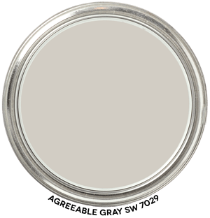
Agreeable Gray SW 7029 Hue Family
In context of its Hue Family neighborhood, 2 Y, on The Color Strategist Color Wheel. The pink arrows point to where it fits in among the other colors according to its Value 8.00 and Chroma of 0.74 rounded to 0.75.
AGREEABLE GRAY NOTES:
Agreeable Gray belongs to the yellow hue family over near the yellow-red hue family.
You can see where it plots out on The Color Strategist Color Wheel above.
In a balanced quality of light, Agreeable Gray looks like a mid-tone, warm, near neutral gray.
However, in certain qualities of light it can shift and look purplish.
Near neutrals from Agreeable Gray’s hue family neighborhood are notorious for shifting purple in unbalanced qualities of light. See infographic below.
Which is why you will find a range of opinions about what it looks like – or as some people call it undertones. The problem, as you may have realized by now, is that the theory of undertones is just someone’s opinion about what they think a color looks like – to them – in whatever lighting and context they happen to be in.
Some people say Agreeable Gray has a “green undertone” while others insist it’s “just a warm neutral gray” with no hint of any other color. And then we have the instances where it actually shows up and flashes purple quite noticeably in their space.
If it does shift and shows up in your space in a way you don’t want it to, then you know you need to try near neutral grays from a different hue family neighborhood. If it’s flashing purple or even blue, I’d start with a color from a hue family that is outside that big purple parenthesis you see up there in the infographic.
How do you find those colors? The Color DNA Table. You can easily sort thousands of paint colors by hue angle, hue family, value, chroma and even LRV. It’s an amazing tool that puts you in control of color.
Color strategy doesn’t get any easier than this! It’s always best to test. I recommend Samplize Peel & Stick samples because they’re made with real paint.
🎨 Color Review: Agreeable Gray (Sherwin Williams 7029)
Before we get into real-life applications, let’s look at Agreeable Gray’s factual color DNA:

Colorography Overview
Brand: Sherwin Williams
Color Name & Number: Agreeable Gray 7029
HEX: #D2CDC3
Lightness (L): 82.53
Chroma (C): 5.541
Hue Angle: 91
Munsell Hue Family: 2.3 Y
Munsell Value / Chroma: 8 / 0.74
LRV: 60
Average Perceived Color Temperature: Warm
Vibes: Near Neutral, High Value, Grayed, Light, Whispery, Ethereal, Relaxing, Washed Out
How It Behaves in Real Homes
Agreeable Gray 7029 tends to create a calm, low-contrast environment that feels restful and open. Frequently used in living rooms, bedrooms, and transitional spaces, it gives the impression of a settled, softly structured interior. Homeowners often describe it as “safe” or “goes-with-everything,” making it a go-to choice for staging and resale. Despite the name, this is less a true gray and more a mellow, warm neutral with a quiet, anchoring presence.
Lighting and Finish Observations
In north-facing light, Agreeable Gray can appear slightly cooler and more subdued, aligning with its grayed and washed-out perceived appearance. South-facing and incandescent lighting highlight its warmth and bring out more of its whispery and ethereal qualities. Under cool LED or overcast skies, the color can feel more muted or dusty, reinforcing its near-neutral and relaxing character. In higher sheens, such as satin or semi-gloss, the color’s subtle yellow hue angle may become more noticeable, adding a trace of warmth.
Strategic Application Notes
Best Used For: Open concept areas, bedrooms, hallways, and homes aiming for a versatile, market-friendly look.
Avoid If: You need a strong contrast color, deep saturation, or a clearly cool-toned neutral.
Looks Best With: Warm off-whites, soft whites with yellow-based hues, natural fibers, matte black fixtures, warm wood tones, and brushed brass or antique bronze metals. Pairing with higher chroma colors should be done cautiously to preserve its near-neutral identity.
Final Takeaway
This is a great choice if you want a warm, soft neutral that blends seamlessly across rooms, but be sure to test it in varied light to avoid unexpected shifts. It’s not just a pretty color — it’s a strategic move when you want broad appeal and soothing continuity.

