Why You Can’t Pick Paint Colors Online: The Color Constancy Problem
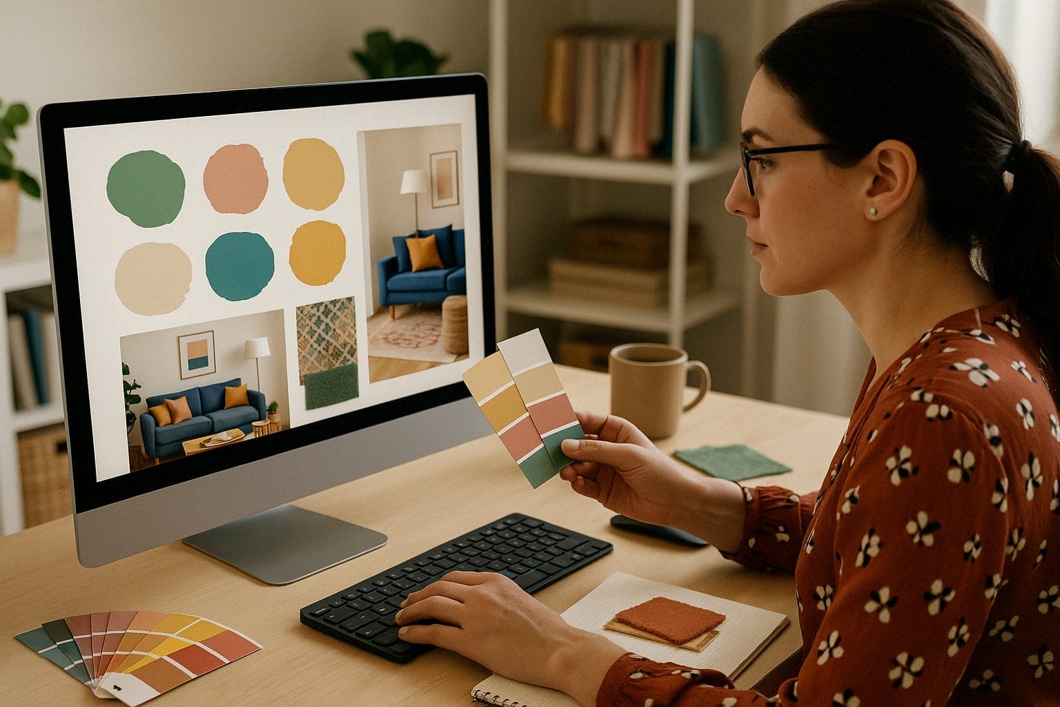
This happens all the time. Someone who’s determined to figure out how color works ends up totally confused by what a photo seems to show. It’s a perfect example of why people get stuck in a loop of color indecision—scrolling forums, comparing photos, and trying to figure out “undertones” from glowing digital paint chips.
A friend asked me to help pick a new wall color for her kitchen. She’s got maple cabinets that turned to a golden honey tone as they’ve aged and a countertop with a good amount of veining. She sent me a photo. At first glance, I thought, “She needs a light taupe”—because the background of the countertop looked taupe-ish. But then the darker veining started to read green? It kind of shifts every time I look at it and now I’m second-guessing my second guesses. Can someone please just confirm what I think I’m seeing?

The Brain Science Behind Why You Can’t Trust Your Eyes on Screens
Our brains are wired with an incredible tool called color constancy. This function helps us perceive colors as relatively stable, even when lighting conditions change. A red apple still looks red whether you’re indoors at night or outside in bright sun.
But here’s the catch: color constancy only works in real-world environments. It relies on consistent, reflective light and environmental context—which screens simply don’t provide.
When you stare at a digital photo on your phone, you’re not seeing color the way your brain was designed to interpret it in the real world. You’re seeing pixel-based, colored light without the environmental context your visual system relies on to make sense of what it’s seeing.
You’re seeing light emitted by RGB pixels without the benefit of surrounding cues or fixed illumination. Your visual system has nothing to latch onto. So it overcorrects, constantly recalibrating its assumptions. The result? Color that feels like the more you look at it, the more it changes.
That’s why you can’t settle on whether the veining in the counter top looks “pink-beige” or “taupe”. The image changes as your brain tries—and fails—to apply real-world constancy functions to a synthetic visual experience (online color).
That’s also why dragging digital paint chips over a digital photo won’t give you reliable answers.
If Undertones Worked, You Wouldn’t Second Guess Every Choice
Let’s be real: if the undertone approach worked the way people say it does, picking colors wouldn’t feel so stressful. You wouldn’t be crowd-sourcing opinions, drowning in samples, or rearranging chips over and over.
One of the most common myths in color is the idea of ‘undertones.’ Did you know that undertones are not fixed properties of color? They’re actually a product of perception, influenced by lighting, context, and even personal bias. That’s why I teach measurable, repeatable color science principles—so you can be confident your colors relate from an energy/DNA level.
The undertones theory is based on subjective perception, and the language around it isn’t standardized. Ask three designers about a color’s undertone and you might get five different answers.
This isn’t on you. The theory itself is the problem.
Let’s fix it.
The Pivot: From Subjective Undertones to Measurable Color DNA
Instead of relying on vague, shifting impressions, we can use color science to decode what’s really happening.
Every color has a measurable identity—what we call its Color DNA. It’s made up of three parts:
- Hue angle – the actual color family it belongs to
- Value (lightness) – how light or dark it is
- Chroma – how much colorfulness or grayness it contains
These aren’t guesses—they’re measurable values from the go-to color system used across industries from paint and textiles to manufacturing. Once you know a color’s DNA, you can compare it to others using real data—not the endless back-and-forth of shuffling color chips.
And no—you don’t have to be a scientist to do this. You just need the right tools.

How the Nix Mini 3 and Color Strategist Wheel Work Together
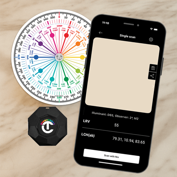
For fixed surfaces—like countertops, cabinets, and floors—guessing won’t cut it. You’ve got to measure the actual color. That’s where the Nix Mini 3 comes in.
This handheld device scans real-world surfaces and gives you the hue angle, chroma, and lightness values. It works anytime, anywhere—no wi-fi required. Just pair it with your phone and use the Nix app.
Once you have the hue angle, pull out the Color Strategist Color Wheel and find the matching hue angle a.k.a. family. No more assuming, no more guessing—you’ll know what you’re looking at.
What About Paint Colors?
When it comes to paint, you don’t need to measure every paint chip—we’ve already done it for you.
The Paint Color DNA Table includes hue angle, value, and chroma data for complete collections from brands like Benjamin Moore, Sherwin-Williams, Behr, and more.

Want to know if a paint color works with your finishes? Just look up the data and compare. No more buying dozens of samples or hoping a digital mockup looks the same in person.
This Is What a Failproof Color Strategy Looks Like
In The Four Pillars of Color course over on campchroma.com, we teach people how to use these tools and frameworks to build coherent, human-supportive color strategies for every space. We help you:
- Decode the undertones that aren’t undertones of fixed finishes and important elements
- Align paint and materials based on shared color characteristics like hue families
- Avoid jarring clashes and color fatigue
- Create spaces that feel intentional, grounded, and color-energy aligned
This isn’t about opinions.
It’s about making confident color decisions.
It’s about knowing what you’re doing.
Ready to Stop Second-Guessing Your Colors?
✅ Enroll in The Four Pillars of Color at CampChroma.com. You’ll learn how to use hue angle, value, and chroma to decode any color confidently—and so much more!
✅ Subscribe to the Paint Color DNA Table to look up the real color DNA of paint colors from all major brands—no visual gymnastics required.
✅ Grab a Nix Mini 3 and start scanning your surfaces in real life. All you need is the hue angle, and the Color Strategist Wheel will tell you exactly what that means.
You’re not crazy. The undertone method is flawed.
You don’t need more opinions. You need better data.
And you’ve come to the right place to get it.
