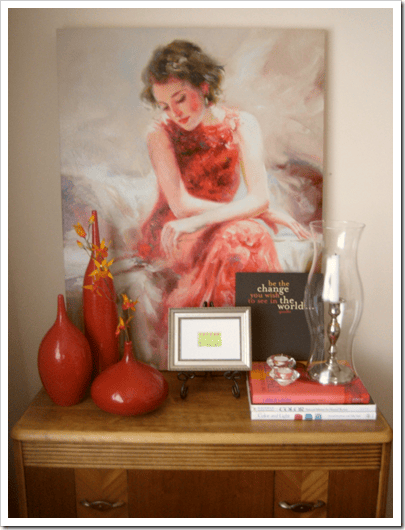
Guilty pleasure admission – I love cruising blogosphere for well-executed table vignettes. Example above was styled by Maria Killam of Colour Me Happy. So when I spied a new post about “proper scale and height” over at the Garden Web Decorating Forum, I couldn’t click fast enough to open the thread.

One of my forum friends was struggling with where to hang a picture; she put up green tape as a size-guide. She wants the picture to relate to items she owns and wants to use: a lamp, a chest, and chair. Presto change-o in Photoshop and the addition of a few accessories from my digital files and I was able to show her my response to the design dilemma.

A few forum members expressed that the picture was too low. Someone else mentioned a ‘design rule’ that states the picture above the chest should not be wider than the piece of furniture. Others were confused as to why I didn’t simply center the picture to the wall so it hovered above all the elements. Whether the picture is too wide for the chest or not isn’t important — those are the elements we have to work with and the challenge is to make it work.

My idea to assemble the elements into one cohesive composition was based on The Rule of Thirds. It’s the blue grid you see superimposed on the picture above. Three equal boxes across and three equal boxes down.
The Rule of Thirds is the easiest way to manage stuff within contained parameters. It’s called a rule but it’s more like a guideline. You can implement this guideline no matter what dimension you are designing *in*. Two-dimensional, business card or billboard. Or, three-dimensional, cozy corner or bowling alley.
Bottom line is there is “x” amount of stuff to fit in “x” amount of space. Additionally, you want some white space also known as negative space for really important reasons like a visual break. Not enough white space or negative space is another way to define cluttered or busy.
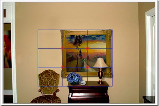
The guideline gives you a couple options to arrange elements. I marked the hot spots where the lines intersect in the center with orange circles. The hot spots can be used as targets for the arrangement of elements, but I chose to use the nine boxes instead. The chair back fills one box, the hydrangea another, and the lamp occupies the last one in the bottom row.
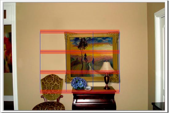
You can also use the lines. Referencing the horizontal lines, it is easy to see where the top of the picture should hit on the wall. Using my grid as a guide, I lined up the top of the frame with the top blue line.

In this picture you can see how to use the vertical lines to guide placement of elements too. Notice the little tree under the orange line in the center of the picture? It lines up very near the center of the chest. That’s no accident. What it tells us is the artist is aware of this rule of design too and I simply capitalized on their well-trained eye.
The left side of the picture hits in a prime open space between the chair and the chest. Also, we have two boxes, or two-thirds, left empty. Just the kind of “white” space we need so the vignette doesn’t look too crowded or cluttered.
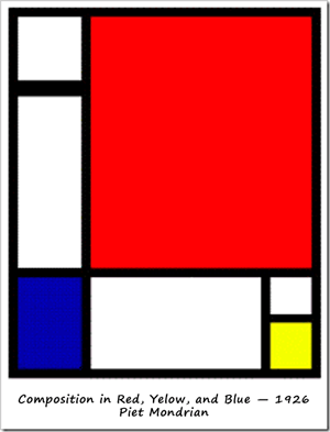
Mondrian believed that mathematics and art were closely connected. He used the simplest geometrical shapes and primary colours (blue, red, yellow). His point of view lies in the fact that any shape is possible to create with basic geometric shapes as well as any color can be created with different combinations of red, blue, and yellow. The golden rectangle is one of the basic shapes to appear in Mondrian’s art.
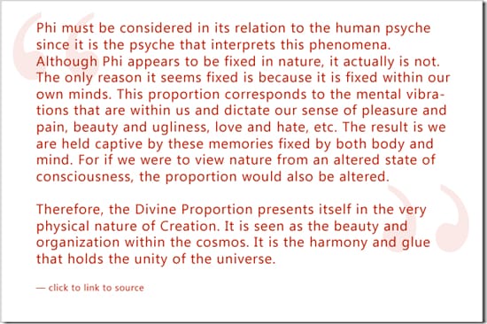
Like the Rule of Thirds, Golden Rectangles are based on Divine Proportion. The concept of Divine Proportion is also known as The Golden Mean, The Golden Section, The Golden Ratio, The Magic Ratio, The Fibanocci Spiral, The Fibanocci Series of numbers or simply Phi. Phi after the Greek sculptor, Phidias.
The essence of Phi is mathematical. Yet it’s not the formulas that capture our visceral attention and long gazes of appreciation. There is something romantic and captivating about how Divine Proportion infiltrates our surroundings both natural and built.
One of my forum friends, kiki_redo, sent me an email with a useful link:
An interesting use of the Fibonacci sequence is for converting miles to kilometers. For instance, if you want to know how many kilometers 8 miles is, take the Fibonacci number (8) and look at the next one (13). 8 miles is about 13 kilometers. This works because it so happens that the conversion factor between miles and kilometers (1.609) is roughly equal to ? (1.618).
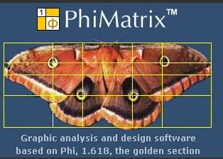
How do you think you could use this fundamental principle of design? Compositions for photography, interior decorating, maybe a new business card? For about $20 Phi Matrix Software is insanely fun and helpful. Click on the picture to learn more.
©2010 Color Strategies, LLC
We know color. We customize environments and create unique atmospheres exclusively for you. Take the first step now. Email me or call 915 • 490 • 2921.
