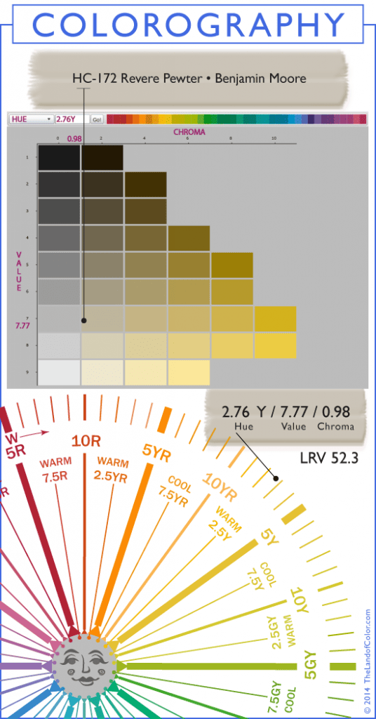
Pretty cool information isn’t it?
It’s based on colorimetry which is the science of quantifying the human perception of color.
I like to call it color math.
If you want to learn about colorimetry a.k.a. color math, you should check out my online color training program. It’s called Camp Chroma.
I teach you how I made this infographic and more.
Specifically, I take complex color concepts, like colorimetry, and break it down into plain English anyone can understand.
It’s like Colorimetry 101 or Color Math for Dummies.
And I promise you do not have to be the least bit mathematically inclined.
Math is actually a challenge for me, not in my wheelhouse at all, so if I can leverage colorimetry and color measurements to manage color like a boss, anybody can.
Check out Camp Chroma now: TESTIMONIALS
The course is online and on demand, available 24/7/365.

Colorography is where art meets the science of color. Using quick, at-a-glance infographics, you understand everything you need to know about a paint color including hue family, value, chroma, overtones and LRV.
We dissect and map color characteristics for you.
That means you can quit guessing about the inherent qualities and thoroughly understand what the color is all about before you spend a dime on a sample.
Check out more Colorographies for more colors on my paint color review blog over at Camp Chroma.

the most looked up color on the internet for Benjamin Moore. It’s a great color, but I don’t think it can be used in a semi- or dark room. needs loads of light to look great.
I gently lol disagree about revere pewter needing loads of light to look good. I have revere in 3 rooms now and each looks amazing. Totally different lighting in all. Not a ton of natural light in any and normal purchased lighting in all. I absolutely love this color. I believe it is what you pair it with i.e. undertones undertones and what your hard fixtures are all about. Great post by the way. All the technical science info. Very helpful to me–a color junkie!
Thanks for your comment, Robin. And I agree with Lynne that Revere Pewter is the most looked up color. So many different experiences using the color. Seems like it is a true chameleon of a paint color!
I believe it is what you pair it with i.e. undertones undertones and what your hard fixtures are all about. Great post by the way. All the technical science info. Very helpful to me–a color junkie! Where such information?
Hi intleshan,
Guess the answer is I’m the source of such information! 🙂 First, I transform a color’s spectral data, or fingerprint, into useable nuggets of information. Next, it’s important to put that information into a practical format so it’s meaningful. That practical format is called the psychophysical dimensions of color: hue, value, chroma and LRV.
Last, to make it even more meaningful, practical and useable I use the psychophysical dimensions of color to illustrate the target color in CONTEXT of its own hue family and in CONTEXT of a color wheel.
Never, ever underestimate the value and power of a color wheel! 😉
Well, I’m here to tell you that Revere Pewter in my house with tons of natural light looks like Paul revere’s muddy boots…………
LOL! 🙂
Millicent, you made my Monday. I laughed out loud so loud both my dogs came running to see what was going on!
Sorry about the muddy boot situation – hope you find your perfect color.