Navigating color displays in a paint store — or a fandeck, or a color order system — is like just about everything in life: you have to learn how to use the tools before they actually help you.

But that’s not how most people approach color.
They walk into a paint store expecting intuition to take over. They expect to instantly see what works. They expect the staff to have magic wands. They expect the color tools — those massive displays and flip-through fandecks — to be self-explanatory, like toys instead of technical tools. Or they assume past experience in art or design will translate to mastery of the professional color systems that industries rely on for consistency.
Those expectations? Totally unrealistic.
Expecting to walk into a paint store and just know what to do — which colors will coordinate, how light will affect them, or how they’ll behave in a space — is like expecting to fix a car without ever popping the hood.
When I got my first car, day one, my dad handed me the keys and taught me how to change a tire. Because knowing the basics wasn’t optional.

I knew absolutely nothing about cars — how would I? Someone had to teach me.
His best advice:
a) Always have the right tools (including a plastic container with a lid for the lug nuts — because trust me, fishing them out of the grass is the worst).
b) Loosen the lug nuts before jacking up the car. Otherwise, good luck getting them off once the tire’s in the air.
That stuck.
And it applies to color.
If you don’t know how to use the tools — if no one ever taught you how color is organized — no amount of “designer instinct” will get you consistent results. Color isn’t magic. It’s measurable. Learn how to read it, and you’ll finally see it — clearly, confidently, and consistently.
Let’s start with one of the core tools: a color notation from the Munsell color system.
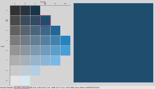
Here’s an example: 10B 3/6 it’s highlighted in pink.

It’s not a formula. It’s not a mix. And it’s definitely not Pantone. This is a standardized color notation — think of it like a color’s bio. It tells you the hue (10B = blue), the value (3 = dark), and the chroma (6 = colorful). When you know how to read that, you know the color. No guesswork, no wishful thinking.
Color order system notations, like Munsell , are a qualified standard used to communicate color. Notations are like a bio for each color. Read the notation and you know the color.

So if you’re tired of second-guessing paint choices or wondering why a color looked great in the store but off in your space…
→ Start with the Four Pillars of Color — it’s the foundation for understanding hue, value, and chroma in a practical, usable way.
→ Or jump right into the Paint Color DNA Table — scan a color with a Nix Mini 3 and instantly get the Lightness, Chroma, Hue Angle, and LRV. The real data behind what your eyes are reacting to.
Because once you see how color really works?
That’s when the magic actually starts.
